
We truly believe that everybody has an innate sense of imagination and creativity. But the challenge lies in harnessing this creativity and channelling it into a tangible design.
In this blog, we would like to share with you our process of bringing imagination alive through our designs!
The Starting TroubleDrawing reference to the all-famous Bajaj advertisement, there is always the starting trouble. In order to overcome this, answering a few simple questions is necessary. The first question is “What is the intent and purpose of this creation?”. This is a good starting point to plan and draft a layout.
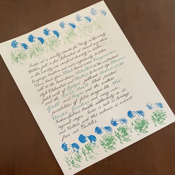
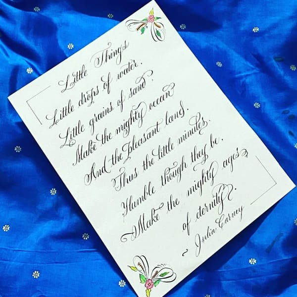
For instance, while we were drafting our Brush Calligraphy workbook for the workshop, we needed a cover-page. In order to make the cover-page attractive and also give an insight into the contents of the workbook, we created an art-work around the title using brush pens and designed it to represent brush calligraphy. The intent was to create a cover-page while the purpose was to represent the contents of the workbook.

Now that we have a starting point, what is the next logical step? The next question to answer is “Who is our audience?”. This is also an essential question to answer since the design should appeal to the chosen audience. The audience may be of a definite age group, men or women centric, professionals or homebodies and so on. Accordingly, the design elements can be decided. Design elements are representations of a concept, like florals, animals, botanicals, industrial objects and so on. In case the artwork is created for an event or a celebration, elements that represent the event can be used. For instance, we can use bells or reindeer for creating Christmas cards.
In response to this question for the cover-page, we wanted to create a design that is playful, suitable for a wide range of audience ranging from 8 years of age to 60 years and beyond, be gender neutral and reflect comfort. This led to us choosing a gnome holding a brush in a whimsical setting such as an enchanted forest. This is to signify that learning brush calligraphy through this workbook would transport the person to a cosy and comfortable environment.
At this stage, we can notice the draft design begins to formalize.
What colour do you choose?The next question goes “What is the colour palette?”. This is the next essential thing to finalize the draft from pencil to colour. Choosing a colour palette goes hand in hand with the first two questions that we have answered. Colour is a unique representation of mood. Every colour in the colour wheel has a significance and a representation. For instance, red colour is often symbolised with passion, while blue is associated with commitment and sincerity. Earthy tones like shades of brown or shades of green can represent different seasons. Using this concept of colour, we can connect the first two responses to choose a final colour palette.
SIn the case of the cover-page, we wanted to go with something that is universally appealing, whimsical, playful and colourful like the rainbow. We wanted the colours to stand out and attract the audience on first impression. Voila! And that’s how we created this design. On that note, you can buy our brush calligraphy kit here!
P.S: We used the same process to create Christmas cards for a client!


In a nutshell, the following three questions can help us turn an idea into something tangible:
- - Intent and Purpose of creating a design
- - Intended audience
- - Colour palette
So, this is our process of bringing a thought and an idea to life! We would be thrilled to know in the comments section below if you found this useful!


Comments
AndrewDiowl
1091m2love – Unique name, design feels artistic and expression of individuality.
AndrewDiowl
1091m2love – Unique name, design feels artistic and expression of individuality.
AndrewDiowl
1091m2love – Unique name, design feels artistic and expression of individuality.
AndrewDiowl
1091m2love – Unique name, design feels artistic and expression of individuality.
AndrewDiowl
1091m2love – Unique name, design feels artistic and expression of individuality.
AndrewDiowl
1091m2love – Unique name, design feels artistic and expression of individuality.
AndrewDiowl
1091m2love – Unique name, design feels artistic and expression of individuality.
AndrewDiowl
1091m2love – Unique name, design feels artistic and expression of individuality.
AndrewDiowl
1091m2love – Unique name, design feels artistic and expression of individuality.
AndrewDiowl
1091m2love – Unique name, design feels artistic and expression of individuality.
AndrewDiowl
1091m2love – Unique name, design feels artistic and expression of individuality.
AndrewDiowl
1091m2love – Unique name, design feels artistic and expression of individuality.
AndrewDiowl
1091m2love – Unique name, design feels artistic and expression of individuality.
AndrewDiowl
1091m2love – Unique name, design feels artistic and expression of individuality.
AndrewDiowl
1091m2love – Unique name, design feels artistic and expression of individuality.
AndrewDiowl
1091m2love – Unique name, design feels artistic and expression of individuality.
AndrewDiowl
1091m2love – Unique name, design feels artistic and expression of individuality.
AndrewDiowl
1091m2love – Unique name, design feels artistic and expression of individuality.
AndrewDiowl
1091m2love – Unique name, design feels artistic and expression of individuality.
AndrewDiowl
1091m2love – Unique name, design feels artistic and expression of individuality.
AndrewDiowl
1091m2love – Unique name, design feels artistic and expression of individuality.
AndrewDiowl
1091m2love – Unique name, design feels artistic and expression of individuality.
AndrewDiowl
1091m2love – Unique name, design feels artistic and expression of individuality.
AndrewDiowl
1091m2love – Unique name, design feels artistic and expression of individuality.
AndrewDiowl
1091m2love – Unique name, design feels artistic and expression of individuality.
AndrewDiowl
1091m2love – Unique name, design feels artistic and expression of individuality.
AndrewDiowl
1091m2love – Unique name, design feels artistic and expression of individuality.
AndrewDiowl
1091m2love – Unique name, design feels artistic and expression of individuality.
AndrewDiowl
1091m2love – Unique name, design feels artistic and expression of individuality.
AndrewDiowl
1091m2love – Unique name, design feels artistic and expression of individuality.
zaimy-online-937
займ без проверок оформить займ без фото документов
zaem-90
беспроцентный займ https://zaimy-61.ru
online-zaymy-486
займ без переплат займ на карту за несколько минут
Stevensep
embersk9wish – Heartwarming mission, site honors service dogs with love and gratitude.
MichaelFaP
скачать с вконтакте
Stevensep
embersk9wish – Heartwarming mission, site honors service dogs with love and gratitude.
Stevensep
embersk9wish – Heartwarming mission, site honors service dogs with love and gratitude.
Stevensep
embersk9wish – Heartwarming mission, site honors service dogs with love and gratitude.
Stevensep
embersk9wish – Heartwarming mission, site honors service dogs with love and gratitude.
Stevensep
embersk9wish – Heartwarming mission, site honors service dogs with love and gratitude.
Stevensep
embersk9wish – Heartwarming mission, site honors service dogs with love and gratitude.
Stevensep
embersk9wish – Heartwarming mission, site honors service dogs with love and gratitude.
Stevensep
embersk9wish – Heartwarming mission, site honors service dogs with love and gratitude.
Stevensep
embersk9wish – Heartwarming mission, site honors service dogs with love and gratitude.
Stevensep
embersk9wish – Heartwarming mission, site honors service dogs with love and gratitude.
Stevensep
embersk9wish – Heartwarming mission, site honors service dogs with love and gratitude.
Stevensep
embersk9wish – Heartwarming mission, site honors service dogs with love and gratitude.
Stevensep
embersk9wish – Heartwarming mission, site honors service dogs with love and gratitude.
Stevensep
embersk9wish – Heartwarming mission, site honors service dogs with love and gratitude.
Stevensep
embersk9wish – Heartwarming mission, site honors service dogs with love and gratitude.
Stevensep
embersk9wish – Heartwarming mission, site honors service dogs with love and gratitude.
Stevensep
embersk9wish – Heartwarming mission, site honors service dogs with love and gratitude.
Stevensep
embersk9wish – Heartwarming mission, site honors service dogs with love and gratitude.
Stevensep
embersk9wish – Heartwarming mission, site honors service dogs with love and gratitude.
Stevensep
embersk9wish – Heartwarming mission, site honors service dogs with love and gratitude.
Stevensep
embersk9wish – Heartwarming mission, site honors service dogs with love and gratitude.
Stevensep
embersk9wish – Heartwarming mission, site honors service dogs with love and gratitude.
Stevensep
embersk9wish – Heartwarming mission, site honors service dogs with love and gratitude.
Stevensep
embersk9wish – Heartwarming mission, site honors service dogs with love and gratitude.
Stevensep
embersk9wish – Heartwarming mission, site honors service dogs with love and gratitude.
Stevensep
embersk9wish – Heartwarming mission, site honors service dogs with love and gratitude.
Stevensep
embersk9wish – Heartwarming mission, site honors service dogs with love and gratitude.
Stevensep
embersk9wish – Heartwarming mission, site honors service dogs with love and gratitude.
Stevensep
embersk9wish – Heartwarming mission, site honors service dogs with love and gratitude.
zaimy-online-756
займ с плохой кредитной https://zaimy-65.ru
online-zaymy-374
взять займ онлайн https://zaimy-63.ru
zaem-212
займ срочно без отказа займ всем
TrumanLam
??????? ??????? ?????????? ?? ?????????? ???????????????. ?????? ?????, ?? ????????? ?? ??????????? ????????????, ??? ???????. ???? ?????? ??????? ?????? ? ????????????. ??????? ???????? ?? ???????? ??????, ???? ??? ????????? ????????????. fortuna-distillery ???????? ?????? ???????????, ? ???????????? ?????????. ?? ??? ??????? ?????????????, ?????? ? ???? ????????. ????????? ???????? ?????? ??????? ???????? ?????. ?????????? ???????????? ???????, ?? ????????? ?????????? ????.
zaim online 970
нужен займ мфо https://zaimy-59.ru
zaimy 983
денежный кредит займ https://zaimy-57.ru
zaymy onlayn 241
займ онлайн без отказа https://zaimy-54.ru
Paulcralp
jammykspeaks – Powerful voice, content feels authentic, motivational and full of passion.
Paulcralp
jammykspeaks – Powerful voice, content feels authentic, motivational and full of passion.
Paulcralp
jammykspeaks – Powerful voice, content feels authentic, motivational and full of passion.
Paulcralp
jammykspeaks – Powerful voice, content feels authentic, motivational and full of passion.
Paulcralp
jammykspeaks – Powerful voice, content feels authentic, motivational and full of passion.
Paulcralp
jammykspeaks – Powerful voice, content feels authentic, motivational and full of passion.
Paulcralp
jammykspeaks – Powerful voice, content feels authentic, motivational and full of passion.
Paulcralp
jammykspeaks – Powerful voice, content feels authentic, motivational and full of passion.
Paulcralp
jammykspeaks – Powerful voice, content feels authentic, motivational and full of passion.
Paulcralp
jammykspeaks – Powerful voice, content feels authentic, motivational and full of passion.
Paulcralp
jammykspeaks – Powerful voice, content feels authentic, motivational and full of passion.
Paulcralp
jammykspeaks – Powerful voice, content feels authentic, motivational and full of passion.
Paulcralp
jammykspeaks – Powerful voice, content feels authentic, motivational and full of passion.
Paulcralp
jammykspeaks – Powerful voice, content feels authentic, motivational and full of passion.
Paulcralp
jammykspeaks – Powerful voice, content feels authentic, motivational and full of passion.
Paulcralp
jammykspeaks – Powerful voice, content feels authentic, motivational and full of passion.
Paulcralp
jammykspeaks – Powerful voice, content feels authentic, motivational and full of passion.
Paulcralp
jammykspeaks – Powerful voice, content feels authentic, motivational and full of passion.
Paulcralp
jammykspeaks – Powerful voice, content feels authentic, motivational and full of passion.
Paulcralp
jammykspeaks – Powerful voice, content feels authentic, motivational and full of passion.
Paulcralp
jammykspeaks – Powerful voice, content feels authentic, motivational and full of passion.
Paulcralp
jammykspeaks – Powerful voice, content feels authentic, motivational and full of passion.
Paulcralp
jammykspeaks – Powerful voice, content feels authentic, motivational and full of passion.
Paulcralp
jammykspeaks – Powerful voice, content feels authentic, motivational and full of passion.
Paulcralp
jammykspeaks – Powerful voice, content feels authentic, motivational and full of passion.
Paulcralp
jammykspeaks – Powerful voice, content feels authentic, motivational and full of passion.
Paulcralp
jammykspeaks – Powerful voice, content feels authentic, motivational and full of passion.
Paulcralp
jammykspeaks – Powerful voice, content feels authentic, motivational and full of passion.
Paulcralp
jammykspeaks – Powerful voice, content feels authentic, motivational and full of passion.
Paulcralp
jammykspeaks – Powerful voice, content feels authentic, motivational and full of passion.
MarkGuamn
walkunchained – Inspiring tone, message of freedom and courage comes across clearly.
MarkGuamn
walkunchained – Inspiring tone, message of freedom and courage comes across clearly.
MarkGuamn
walkunchained – Inspiring tone, message of freedom and courage comes across clearly.
MarkGuamn
walkunchained – Inspiring tone, message of freedom and courage comes across clearly.
MarkGuamn
walkunchained – Inspiring tone, message of freedom and courage comes across clearly.
MarkGuamn
walkunchained – Inspiring tone, message of freedom and courage comes across clearly.
MarkGuamn
walkunchained – Inspiring tone, message of freedom and courage comes across clearly.
MarkGuamn
walkunchained – Inspiring tone, message of freedom and courage comes across clearly.
MarkGuamn
walkunchained – Inspiring tone, message of freedom and courage comes across clearly.
MarkGuamn
walkunchained – Inspiring tone, message of freedom and courage comes across clearly.
MarkGuamn
walkunchained – Inspiring tone, message of freedom and courage comes across clearly.
MarkGuamn
walkunchained – Inspiring tone, message of freedom and courage comes across clearly.
MarkGuamn
walkunchained – Inspiring tone, message of freedom and courage comes across clearly.
MarkGuamn
walkunchained – Inspiring tone, message of freedom and courage comes across clearly.
MarkGuamn
walkunchained – Inspiring tone, message of freedom and courage comes across clearly.
MarkGuamn
walkunchained – Inspiring tone, message of freedom and courage comes across clearly.
MarkGuamn
walkunchained – Inspiring tone, message of freedom and courage comes across clearly.
MarkGuamn
walkunchained – Inspiring tone, message of freedom and courage comes across clearly.
MarkGuamn
walkunchained – Inspiring tone, message of freedom and courage comes across clearly.
MarkGuamn
walkunchained – Inspiring tone, message of freedom and courage comes across clearly.
MarkGuamn
walkunchained – Inspiring tone, message of freedom and courage comes across clearly.
MarkGuamn
walkunchained – Inspiring tone, message of freedom and courage comes across clearly.
MarkGuamn
walkunchained – Inspiring tone, message of freedom and courage comes across clearly.
MarkGuamn
walkunchained – Inspiring tone, message of freedom and courage comes across clearly.
MarkGuamn
walkunchained – Inspiring tone, message of freedom and courage comes across clearly.
MarkGuamn
walkunchained – Inspiring tone, message of freedom and courage comes across clearly.
MarkGuamn
walkunchained – Inspiring tone, message of freedom and courage comes across clearly.
MarkGuamn
walkunchained – Inspiring tone, message of freedom and courage comes across clearly.
MarkGuamn
walkunchained – Inspiring tone, message of freedom and courage comes across clearly.
MarkGuamn
walkunchained – Inspiring tone, message of freedom and courage comes across clearly.
AnthonyObete
tranquilleeyecream – Calm aesthetic, visuals match beauty and relaxation concept perfectly.
AnthonyObete
tranquilleeyecream – Calm aesthetic, visuals match beauty and relaxation concept perfectly.
AnthonyObete
tranquilleeyecream – Calm aesthetic, visuals match beauty and relaxation concept perfectly.
AnthonyObete
tranquilleeyecream – Calm aesthetic, visuals match beauty and relaxation concept perfectly.
AnthonyObete
tranquilleeyecream – Calm aesthetic, visuals match beauty and relaxation concept perfectly.
AnthonyObete
tranquilleeyecream – Calm aesthetic, visuals match beauty and relaxation concept perfectly.
AnthonyObete
tranquilleeyecream – Calm aesthetic, visuals match beauty and relaxation concept perfectly.
AnthonyObete
tranquilleeyecream – Calm aesthetic, visuals match beauty and relaxation concept perfectly.
AnthonyObete
tranquilleeyecream – Calm aesthetic, visuals match beauty and relaxation concept perfectly.
AnthonyObete
tranquilleeyecream – Calm aesthetic, visuals match beauty and relaxation concept perfectly.
AnthonyObete
tranquilleeyecream – Calm aesthetic, visuals match beauty and relaxation concept perfectly.
AnthonyObete
tranquilleeyecream – Calm aesthetic, visuals match beauty and relaxation concept perfectly.
AnthonyObete
tranquilleeyecream – Calm aesthetic, visuals match beauty and relaxation concept perfectly.
AnthonyObete
tranquilleeyecream – Calm aesthetic, visuals match beauty and relaxation concept perfectly.
AnthonyObete
tranquilleeyecream – Calm aesthetic, visuals match beauty and relaxation concept perfectly.
AnthonyObete
tranquilleeyecream – Calm aesthetic, visuals match beauty and relaxation concept perfectly.
AnthonyObete
tranquilleeyecream – Calm aesthetic, visuals match beauty and relaxation concept perfectly.
AnthonyObete
tranquilleeyecream – Calm aesthetic, visuals match beauty and relaxation concept perfectly.
AnthonyObete
tranquilleeyecream – Calm aesthetic, visuals match beauty and relaxation concept perfectly.
AnthonyObete
tranquilleeyecream – Calm aesthetic, visuals match beauty and relaxation concept perfectly.
AnthonyObete
tranquilleeyecream – Calm aesthetic, visuals match beauty and relaxation concept perfectly.
AnthonyObete
tranquilleeyecream – Calm aesthetic, visuals match beauty and relaxation concept perfectly.
AnthonyObete
tranquilleeyecream – Calm aesthetic, visuals match beauty and relaxation concept perfectly.
AnthonyObete
tranquilleeyecream – Calm aesthetic, visuals match beauty and relaxation concept perfectly.
AnthonyObete
tranquilleeyecream – Calm aesthetic, visuals match beauty and relaxation concept perfectly.
AnthonyObete
tranquilleeyecream – Calm aesthetic, visuals match beauty and relaxation concept perfectly.
AnthonyObete
tranquilleeyecream – Calm aesthetic, visuals match beauty and relaxation concept perfectly.
AnthonyObete
tranquilleeyecream – Calm aesthetic, visuals match beauty and relaxation concept perfectly.
AnthonyObete
tranquilleeyecream – Calm aesthetic, visuals match beauty and relaxation concept perfectly.
AnthonyObete
tranquilleeyecream – Calm aesthetic, visuals match beauty and relaxation concept perfectly.
MatthewMoume
stopkrasner – Strong political tone, site expresses clear intent and decisive messaging.
MatthewMoume
stopkrasner – Strong political tone, site expresses clear intent and decisive messaging.
MatthewMoume
stopkrasner – Strong political tone, site expresses clear intent and decisive messaging.
MatthewMoume
stopkrasner – Strong political tone, site expresses clear intent and decisive messaging.
MatthewMoume
stopkrasner – Strong political tone, site expresses clear intent and decisive messaging.
MatthewMoume
stopkrasner – Strong political tone, site expresses clear intent and decisive messaging.
MatthewMoume
stopkrasner – Strong political tone, site expresses clear intent and decisive messaging.
MatthewMoume
stopkrasner – Strong political tone, site expresses clear intent and decisive messaging.
MatthewMoume
stopkrasner – Strong political tone, site expresses clear intent and decisive messaging.
MatthewMoume
stopkrasner – Strong political tone, site expresses clear intent and decisive messaging.
MatthewMoume
stopkrasner – Strong political tone, site expresses clear intent and decisive messaging.
MatthewMoume
stopkrasner – Strong political tone, site expresses clear intent and decisive messaging.
MatthewMoume
stopkrasner – Strong political tone, site expresses clear intent and decisive messaging.
MatthewMoume
stopkrasner – Strong political tone, site expresses clear intent and decisive messaging.
MatthewMoume
stopkrasner – Strong political tone, site expresses clear intent and decisive messaging.
MatthewMoume
stopkrasner – Strong political tone, site expresses clear intent and decisive messaging.
MatthewMoume
stopkrasner – Strong political tone, site expresses clear intent and decisive messaging.
MatthewMoume
stopkrasner – Strong political tone, site expresses clear intent and decisive messaging.
MatthewMoume
stopkrasner – Strong political tone, site expresses clear intent and decisive messaging.
MatthewMoume
stopkrasner – Strong political tone, site expresses clear intent and decisive messaging.
MatthewMoume
stopkrasner – Strong political tone, site expresses clear intent and decisive messaging.
MatthewMoume
stopkrasner – Strong political tone, site expresses clear intent and decisive messaging.
MatthewMoume
stopkrasner – Strong political tone, site expresses clear intent and decisive messaging.
MatthewMoume
stopkrasner – Strong political tone, site expresses clear intent and decisive messaging.
MatthewMoume
stopkrasner – Strong political tone, site expresses clear intent and decisive messaging.
MatthewMoume
stopkrasner – Strong political tone, site expresses clear intent and decisive messaging.
MatthewMoume
stopkrasner – Strong political tone, site expresses clear intent and decisive messaging.
MatthewMoume
stopkrasner – Strong political tone, site expresses clear intent and decisive messaging.
MatthewMoume
stopkrasner – Strong political tone, site expresses clear intent and decisive messaging.
MatthewMoume
stopkrasner – Strong political tone, site expresses clear intent and decisive messaging.
JessieCrymn
https://factava.com.ua/znachennya-imen/ester-znachennia-imeni-rozkryttia-taiemnyts-imeni-yoho-vplyv-na-kharakter-i-zhyttia/
Danielpedge
albanysuperducks – Fun and quirky, visuals bring playful excitement to life.
Danielpedge
albanysuperducks – Fun and quirky, visuals bring playful excitement to life.
Danielpedge
albanysuperducks – Fun and quirky, visuals bring playful excitement to life.
Danielpedge
albanysuperducks – Fun and quirky, visuals bring playful excitement to life.
Danielpedge
albanysuperducks – Fun and quirky, visuals bring playful excitement to life.
Danielpedge
albanysuperducks – Fun and quirky, visuals bring playful excitement to life.
Danielpedge
albanysuperducks – Fun and quirky, visuals bring playful excitement to life.
Danielpedge
albanysuperducks – Fun and quirky, visuals bring playful excitement to life.
Danielpedge
albanysuperducks – Fun and quirky, visuals bring playful excitement to life.
Danielpedge
albanysuperducks – Fun and quirky, visuals bring playful excitement to life.
Danielpedge
albanysuperducks – Fun and quirky, visuals bring playful excitement to life.
Danielpedge
albanysuperducks – Fun and quirky, visuals bring playful excitement to life.
Danielpedge
albanysuperducks – Fun and quirky, visuals bring playful excitement to life.
Danielpedge
albanysuperducks – Fun and quirky, visuals bring playful excitement to life.
Danielpedge
albanysuperducks – Fun and quirky, visuals bring playful excitement to life.
Danielpedge
albanysuperducks – Fun and quirky, visuals bring playful excitement to life.
Danielpedge
albanysuperducks – Fun and quirky, visuals bring playful excitement to life.
Danielpedge
albanysuperducks – Fun and quirky, visuals bring playful excitement to life.
Danielpedge
albanysuperducks – Fun and quirky, visuals bring playful excitement to life.
Danielpedge
albanysuperducks – Fun and quirky, visuals bring playful excitement to life.
Danielpedge
albanysuperducks – Fun and quirky, visuals bring playful excitement to life.
Danielpedge
albanysuperducks – Fun and quirky, visuals bring playful excitement to life.
Danielpedge
albanysuperducks – Fun and quirky, visuals bring playful excitement to life.
Danielpedge
albanysuperducks – Fun and quirky, visuals bring playful excitement to life.
Danielpedge
albanysuperducks – Fun and quirky, visuals bring playful excitement to life.
Danielpedge
albanysuperducks – Fun and quirky, visuals bring playful excitement to life.
Danielpedge
albanysuperducks – Fun and quirky, visuals bring playful excitement to life.
Danielpedge
albanysuperducks – Fun and quirky, visuals bring playful excitement to life.
Danielpedge
albanysuperducks – Fun and quirky, visuals bring playful excitement to life.
Danielpedge
albanysuperducks – Fun and quirky, visuals bring playful excitement to life.
Christophercycle
saveshelterpets – Touching initiative, site feels compassionate and community-focused.
Christophercycle
saveshelterpets – Touching initiative, site feels compassionate and community-focused.
Christophercycle
saveshelterpets – Touching initiative, site feels compassionate and community-focused.
Christophercycle
saveshelterpets – Touching initiative, site feels compassionate and community-focused.
Christophercycle
saveshelterpets – Touching initiative, site feels compassionate and community-focused.
Christophercycle
saveshelterpets – Touching initiative, site feels compassionate and community-focused.
Christophercycle
saveshelterpets – Touching initiative, site feels compassionate and community-focused.
Christophercycle
saveshelterpets – Touching initiative, site feels compassionate and community-focused.
Christophercycle
saveshelterpets – Touching initiative, site feels compassionate and community-focused.
Christophercycle
saveshelterpets – Touching initiative, site feels compassionate and community-focused.
Christophercycle
saveshelterpets – Touching initiative, site feels compassionate and community-focused.
Christophercycle
saveshelterpets – Touching initiative, site feels compassionate and community-focused.
Christophercycle
saveshelterpets – Touching initiative, site feels compassionate and community-focused.
Christophercycle
saveshelterpets – Touching initiative, site feels compassionate and community-focused.
Christophercycle
saveshelterpets – Touching initiative, site feels compassionate and community-focused.
Christophercycle
saveshelterpets – Touching initiative, site feels compassionate and community-focused.
Christophercycle
saveshelterpets – Touching initiative, site feels compassionate and community-focused.
Christophercycle
saveshelterpets – Touching initiative, site feels compassionate and community-focused.
Christophercycle
saveshelterpets – Touching initiative, site feels compassionate and community-focused.
Christophercycle
saveshelterpets – Touching initiative, site feels compassionate and community-focused.
Christophercycle
saveshelterpets – Touching initiative, site feels compassionate and community-focused.
Christophercycle
saveshelterpets – Touching initiative, site feels compassionate and community-focused.
Christophercycle
saveshelterpets – Touching initiative, site feels compassionate and community-focused.
Christophercycle
saveshelterpets – Touching initiative, site feels compassionate and community-focused.
Christophercycle
saveshelterpets – Touching initiative, site feels compassionate and community-focused.
Christophercycle
saveshelterpets – Touching initiative, site feels compassionate and community-focused.
Christophercycle
saveshelterpets – Touching initiative, site feels compassionate and community-focused.
Christophercycle
saveshelterpets – Touching initiative, site feels compassionate and community-focused.
Christophercycle
saveshelterpets – Touching initiative, site feels compassionate and community-focused.
Christophercycle
saveshelterpets – Touching initiative, site feels compassionate and community-focused.
ThomasLoods
georgetowndowntownmasterplan – Informative and civic-minded, content clearly explains planning goals.
ThomasLoods
georgetowndowntownmasterplan – Informative and civic-minded, content clearly explains planning goals.
ThomasLoods
georgetowndowntownmasterplan – Informative and civic-minded, content clearly explains planning goals.
ThomasLoods
georgetowndowntownmasterplan – Informative and civic-minded, content clearly explains planning goals.
ThomasLoods
georgetowndowntownmasterplan – Informative and civic-minded, content clearly explains planning goals.
ThomasLoods
georgetowndowntownmasterplan – Informative and civic-minded, content clearly explains planning goals.
ThomasLoods
georgetowndowntownmasterplan – Informative and civic-minded, content clearly explains planning goals.
ThomasLoods
georgetowndowntownmasterplan – Informative and civic-minded, content clearly explains planning goals.
ThomasLoods
georgetowndowntownmasterplan – Informative and civic-minded, content clearly explains planning goals.
ThomasLoods
georgetowndowntownmasterplan – Informative and civic-minded, content clearly explains planning goals.
ThomasLoods
georgetowndowntownmasterplan – Informative and civic-minded, content clearly explains planning goals.
ThomasLoods
georgetowndowntownmasterplan – Informative and civic-minded, content clearly explains planning goals.
ThomasLoods
georgetowndowntownmasterplan – Informative and civic-minded, content clearly explains planning goals.
ThomasLoods
georgetowndowntownmasterplan – Informative and civic-minded, content clearly explains planning goals.
ThomasLoods
georgetowndowntownmasterplan – Informative and civic-minded, content clearly explains planning goals.
ThomasLoods
georgetowndowntownmasterplan – Informative and civic-minded, content clearly explains planning goals.
ThomasLoods
georgetowndowntownmasterplan – Informative and civic-minded, content clearly explains planning goals.
ThomasLoods
georgetowndowntownmasterplan – Informative and civic-minded, content clearly explains planning goals.
ThomasLoods
georgetowndowntownmasterplan – Informative and civic-minded, content clearly explains planning goals.
ThomasLoods
georgetowndowntownmasterplan – Informative and civic-minded, content clearly explains planning goals.
ThomasLoods
georgetowndowntownmasterplan – Informative and civic-minded, content clearly explains planning goals.
ThomasLoods
georgetowndowntownmasterplan – Informative and civic-minded, content clearly explains planning goals.
ThomasLoods
georgetowndowntownmasterplan – Informative and civic-minded, content clearly explains planning goals.
ThomasLoods
georgetowndowntownmasterplan – Informative and civic-minded, content clearly explains planning goals.
ThomasLoods
georgetowndowntownmasterplan – Informative and civic-minded, content clearly explains planning goals.
ThomasLoods
georgetowndowntownmasterplan – Informative and civic-minded, content clearly explains planning goals.
ThomasLoods
georgetowndowntownmasterplan – Informative and civic-minded, content clearly explains planning goals.
ThomasLoods
georgetowndowntownmasterplan – Informative and civic-minded, content clearly explains planning goals.
ThomasLoods
georgetowndowntownmasterplan – Informative and civic-minded, content clearly explains planning goals.
ThomasLoods
georgetowndowntownmasterplan – Informative and civic-minded, content clearly explains planning goals.
MichaelAlure
Похоронные услуги с кремацией
Williamgat
cranberrystreetcafe – Cozy and charming, design evokes warmth and delicious experiences.
Williamgat
cranberrystreetcafe – Cozy and charming, design evokes warmth and delicious experiences.
Williamgat
cranberrystreetcafe – Cozy and charming, design evokes warmth and delicious experiences.
Williamgat
cranberrystreetcafe – Cozy and charming, design evokes warmth and delicious experiences.
Williamgat
cranberrystreetcafe – Cozy and charming, design evokes warmth and delicious experiences.
Williamgat
cranberrystreetcafe – Cozy and charming, design evokes warmth and delicious experiences.
Williamgat
cranberrystreetcafe – Cozy and charming, design evokes warmth and delicious experiences.
Williamgat
cranberrystreetcafe – Cozy and charming, design evokes warmth and delicious experiences.
Williamgat
cranberrystreetcafe – Cozy and charming, design evokes warmth and delicious experiences.
Williamgat
cranberrystreetcafe – Cozy and charming, design evokes warmth and delicious experiences.
Williamgat
cranberrystreetcafe – Cozy and charming, design evokes warmth and delicious experiences.
Williamgat
cranberrystreetcafe – Cozy and charming, design evokes warmth and delicious experiences.
Williamgat
cranberrystreetcafe – Cozy and charming, design evokes warmth and delicious experiences.
Williamgat
cranberrystreetcafe – Cozy and charming, design evokes warmth and delicious experiences.
Williamgat
cranberrystreetcafe – Cozy and charming, design evokes warmth and delicious experiences.
Williamgat
cranberrystreetcafe – Cozy and charming, design evokes warmth and delicious experiences.
Williamgat
cranberrystreetcafe – Cozy and charming, design evokes warmth and delicious experiences.
Williamgat
cranberrystreetcafe – Cozy and charming, design evokes warmth and delicious experiences.
Williamgat
cranberrystreetcafe – Cozy and charming, design evokes warmth and delicious experiences.
Williamgat
cranberrystreetcafe – Cozy and charming, design evokes warmth and delicious experiences.
Williamgat
cranberrystreetcafe – Cozy and charming, design evokes warmth and delicious experiences.
Williamgat
cranberrystreetcafe – Cozy and charming, design evokes warmth and delicious experiences.
Williamgat
cranberrystreetcafe – Cozy and charming, design evokes warmth and delicious experiences.
Williamgat
cranberrystreetcafe – Cozy and charming, design evokes warmth and delicious experiences.
Williamgat
cranberrystreetcafe – Cozy and charming, design evokes warmth and delicious experiences.
Williamgat
cranberrystreetcafe – Cozy and charming, design evokes warmth and delicious experiences.
Williamgat
cranberrystreetcafe – Cozy and charming, design evokes warmth and delicious experiences.
Williamgat
cranberrystreetcafe – Cozy and charming, design evokes warmth and delicious experiences.
Williamgat
cranberrystreetcafe – Cozy and charming, design evokes warmth and delicious experiences.
Williamgat
cranberrystreetcafe – Cozy and charming, design evokes warmth and delicious experiences.
Robertkem
t-walls-of-kuwait-iraq – Historical and impactful, visuals convey memory and meaning strongly.
Robertkem
t-walls-of-kuwait-iraq – Historical and impactful, visuals convey memory and meaning strongly.
Robertkem
t-walls-of-kuwait-iraq – Historical and impactful, visuals convey memory and meaning strongly.
Robertkem
t-walls-of-kuwait-iraq – Historical and impactful, visuals convey memory and meaning strongly.
Robertkem
t-walls-of-kuwait-iraq – Historical and impactful, visuals convey memory and meaning strongly.
Robertkem
t-walls-of-kuwait-iraq – Historical and impactful, visuals convey memory and meaning strongly.
Robertkem
t-walls-of-kuwait-iraq – Historical and impactful, visuals convey memory and meaning strongly.
Robertkem
t-walls-of-kuwait-iraq – Historical and impactful, visuals convey memory and meaning strongly.
Robertkem
t-walls-of-kuwait-iraq – Historical and impactful, visuals convey memory and meaning strongly.
Robertkem
t-walls-of-kuwait-iraq – Historical and impactful, visuals convey memory and meaning strongly.
Robertkem
t-walls-of-kuwait-iraq – Historical and impactful, visuals convey memory and meaning strongly.
Robertkem
t-walls-of-kuwait-iraq – Historical and impactful, visuals convey memory and meaning strongly.
Robertkem
t-walls-of-kuwait-iraq – Historical and impactful, visuals convey memory and meaning strongly.
Robertkem
t-walls-of-kuwait-iraq – Historical and impactful, visuals convey memory and meaning strongly.
Robertkem
t-walls-of-kuwait-iraq – Historical and impactful, visuals convey memory and meaning strongly.
Robertkem
t-walls-of-kuwait-iraq – Historical and impactful, visuals convey memory and meaning strongly.
Robertkem
t-walls-of-kuwait-iraq – Historical and impactful, visuals convey memory and meaning strongly.
Robertkem
t-walls-of-kuwait-iraq – Historical and impactful, visuals convey memory and meaning strongly.
Robertkem
t-walls-of-kuwait-iraq – Historical and impactful, visuals convey memory and meaning strongly.
Robertkem
t-walls-of-kuwait-iraq – Historical and impactful, visuals convey memory and meaning strongly.
Robertkem
t-walls-of-kuwait-iraq – Historical and impactful, visuals convey memory and meaning strongly.
Robertkem
t-walls-of-kuwait-iraq – Historical and impactful, visuals convey memory and meaning strongly.
Robertkem
t-walls-of-kuwait-iraq – Historical and impactful, visuals convey memory and meaning strongly.
Robertkem
t-walls-of-kuwait-iraq – Historical and impactful, visuals convey memory and meaning strongly.
Robertkem
t-walls-of-kuwait-iraq – Historical and impactful, visuals convey memory and meaning strongly.
Robertkem
t-walls-of-kuwait-iraq – Historical and impactful, visuals convey memory and meaning strongly.
Robertkem
t-walls-of-kuwait-iraq – Historical and impactful, visuals convey memory and meaning strongly.
Robertkem
t-walls-of-kuwait-iraq – Historical and impactful, visuals convey memory and meaning strongly.
Robertkem
t-walls-of-kuwait-iraq – Historical and impactful, visuals convey memory and meaning strongly.
Robertkem
t-walls-of-kuwait-iraq – Historical and impactful, visuals convey memory and meaning strongly.
JamesAveri
rideformissingchildren – Heartfelt cause, presentation honors the mission beautifully and respectfully.
JamesAveri
rideformissingchildren – Heartfelt cause, presentation honors the mission beautifully and respectfully.
JamesAveri
rideformissingchildren – Heartfelt cause, presentation honors the mission beautifully and respectfully.
JamesAveri
rideformissingchildren – Heartfelt cause, presentation honors the mission beautifully and respectfully.
JamesAveri
rideformissingchildren – Heartfelt cause, presentation honors the mission beautifully and respectfully.
JamesAveri
rideformissingchildren – Heartfelt cause, presentation honors the mission beautifully and respectfully.
JamesAveri
rideformissingchildren – Heartfelt cause, presentation honors the mission beautifully and respectfully.
JamesAveri
rideformissingchildren – Heartfelt cause, presentation honors the mission beautifully and respectfully.
JamesAveri
rideformissingchildren – Heartfelt cause, presentation honors the mission beautifully and respectfully.
JamesAveri
rideformissingchildren – Heartfelt cause, presentation honors the mission beautifully and respectfully.
JamesAveri
rideformissingchildren – Heartfelt cause, presentation honors the mission beautifully and respectfully.
JamesAveri
rideformissingchildren – Heartfelt cause, presentation honors the mission beautifully and respectfully.
JamesAveri
rideformissingchildren – Heartfelt cause, presentation honors the mission beautifully and respectfully.
JamesAveri
rideformissingchildren – Heartfelt cause, presentation honors the mission beautifully and respectfully.
JamesAveri
rideformissingchildren – Heartfelt cause, presentation honors the mission beautifully and respectfully.
JamesAveri
rideformissingchildren – Heartfelt cause, presentation honors the mission beautifully and respectfully.
JamesAveri
rideformissingchildren – Heartfelt cause, presentation honors the mission beautifully and respectfully.
JamesAveri
rideformissingchildren – Heartfelt cause, presentation honors the mission beautifully and respectfully.
JamesAveri
rideformissingchildren – Heartfelt cause, presentation honors the mission beautifully and respectfully.
JamesAveri
rideformissingchildren – Heartfelt cause, presentation honors the mission beautifully and respectfully.
JamesAveri
rideformissingchildren – Heartfelt cause, presentation honors the mission beautifully and respectfully.
JamesAveri
rideformissingchildren – Heartfelt cause, presentation honors the mission beautifully and respectfully.
JamesAveri
rideformissingchildren – Heartfelt cause, presentation honors the mission beautifully and respectfully.
JamesAveri
rideformissingchildren – Heartfelt cause, presentation honors the mission beautifully and respectfully.
JamesAveri
rideformissingchildren – Heartfelt cause, presentation honors the mission beautifully and respectfully.
JamesAveri
rideformissingchildren – Heartfelt cause, presentation honors the mission beautifully and respectfully.
JamesAveri
rideformissingchildren – Heartfelt cause, presentation honors the mission beautifully and respectfully.
JamesAveri
rideformissingchildren – Heartfelt cause, presentation honors the mission beautifully and respectfully.
JamesAveri
rideformissingchildren – Heartfelt cause, presentation honors the mission beautifully and respectfully.
JamesAveri
rideformissingchildren – Heartfelt cause, presentation honors the mission beautifully and respectfully.
RomainAveri
romain4reform – Clear, reform-focused tone, visuals convey honesty and strong leadership.
RomainAveri
romain4reform – Clear, reform-focused tone, visuals convey honesty and strong leadership.
RomainAveri
romain4reform – Clear, reform-focused tone, visuals convey honesty and strong leadership.
RomainAveri
romain4reform – Clear, reform-focused tone, visuals convey honesty and strong leadership.
RomainAveri
romain4reform – Clear, reform-focused tone, visuals convey honesty and strong leadership.
RomainAveri
romain4reform – Clear, reform-focused tone, visuals convey honesty and strong leadership.
RomainAveri
romain4reform – Clear, reform-focused tone, visuals convey honesty and strong leadership.
RomainAveri
romain4reform – Clear, reform-focused tone, visuals convey honesty and strong leadership.
RomainAveri
romain4reform – Clear, reform-focused tone, visuals convey honesty and strong leadership.
RomainAveri
romain4reform – Clear, reform-focused tone, visuals convey honesty and strong leadership.
RomainAveri
romain4reform – Clear, reform-focused tone, visuals convey honesty and strong leadership.
RomainAveri
romain4reform – Clear, reform-focused tone, visuals convey honesty and strong leadership.
RomainAveri
romain4reform – Clear, reform-focused tone, visuals convey honesty and strong leadership.
RomainAveri
romain4reform – Clear, reform-focused tone, visuals convey honesty and strong leadership.
RomainAveri
romain4reform – Clear, reform-focused tone, visuals convey honesty and strong leadership.
RomainAveri
romain4reform – Clear, reform-focused tone, visuals convey honesty and strong leadership.
RomainAveri
romain4reform – Clear, reform-focused tone, visuals convey honesty and strong leadership.
RomainAveri
romain4reform – Clear, reform-focused tone, visuals convey honesty and strong leadership.
RomainAveri
romain4reform – Clear, reform-focused tone, visuals convey honesty and strong leadership.
RomainAveri
romain4reform – Clear, reform-focused tone, visuals convey honesty and strong leadership.
RomainAveri
romain4reform – Clear, reform-focused tone, visuals convey honesty and strong leadership.
RomainAveri
romain4reform – Clear, reform-focused tone, visuals convey honesty and strong leadership.
RomainAveri
romain4reform – Clear, reform-focused tone, visuals convey honesty and strong leadership.
RomainAveri
romain4reform – Clear, reform-focused tone, visuals convey honesty and strong leadership.
RomainAveri
romain4reform – Clear, reform-focused tone, visuals convey honesty and strong leadership.
RomainAveri
romain4reform – Clear, reform-focused tone, visuals convey honesty and strong leadership.
RomainAveri
romain4reform – Clear, reform-focused tone, visuals convey honesty and strong leadership.
RomainAveri
romain4reform – Clear, reform-focused tone, visuals convey honesty and strong leadership.
RomainAveri
romain4reform – Clear, reform-focused tone, visuals convey honesty and strong leadership.
RomainAveri
romain4reform – Clear, reform-focused tone, visuals convey honesty and strong leadership.
Davidisorp
kim4commonsense – The campaign feels approachable, visuals and tone are relatable.
Davidisorp
kim4commonsense – The campaign feels approachable, visuals and tone are relatable.
Davidisorp
kim4commonsense – The campaign feels approachable, visuals and tone are relatable.
Davidisorp
kim4commonsense – The campaign feels approachable, visuals and tone are relatable.
Davidisorp
kim4commonsense – The campaign feels approachable, visuals and tone are relatable.
Davidisorp
kim4commonsense – The campaign feels approachable, visuals and tone are relatable.
Davidisorp
kim4commonsense – The campaign feels approachable, visuals and tone are relatable.
Davidisorp
kim4commonsense – The campaign feels approachable, visuals and tone are relatable.
Davidisorp
kim4commonsense – The campaign feels approachable, visuals and tone are relatable.
Davidisorp
kim4commonsense – The campaign feels approachable, visuals and tone are relatable.
Davidisorp
kim4commonsense – The campaign feels approachable, visuals and tone are relatable.
Davidisorp
kim4commonsense – The campaign feels approachable, visuals and tone are relatable.
Davidisorp
kim4commonsense – The campaign feels approachable, visuals and tone are relatable.
Davidisorp
kim4commonsense – The campaign feels approachable, visuals and tone are relatable.
Davidisorp
kim4commonsense – The campaign feels approachable, visuals and tone are relatable.
Davidisorp
kim4commonsense – The campaign feels approachable, visuals and tone are relatable.
Davidisorp
kim4commonsense – The campaign feels approachable, visuals and tone are relatable.
Davidisorp
kim4commonsense – The campaign feels approachable, visuals and tone are relatable.
Davidisorp
kim4commonsense – The campaign feels approachable, visuals and tone are relatable.
Davidisorp
kim4commonsense – The campaign feels approachable, visuals and tone are relatable.
Davidisorp
kim4commonsense – The campaign feels approachable, visuals and tone are relatable.
Davidisorp
kim4commonsense – The campaign feels approachable, visuals and tone are relatable.
Davidisorp
kim4commonsense – The campaign feels approachable, visuals and tone are relatable.
Davidisorp
kim4commonsense – The campaign feels approachable, visuals and tone are relatable.
Davidisorp
kim4commonsense – The campaign feels approachable, visuals and tone are relatable.
Davidisorp
kim4commonsense – The campaign feels approachable, visuals and tone are relatable.
Davidisorp
kim4commonsense – The campaign feels approachable, visuals and tone are relatable.
Davidisorp
kim4commonsense – The campaign feels approachable, visuals and tone are relatable.
Davidisorp
kim4commonsense – The campaign feels approachable, visuals and tone are relatable.
Davidisorp
kim4commonsense – The campaign feels approachable, visuals and tone are relatable.
Gabrielfathy
The Inheritance Games Canada: A thrilling mystery game where players unravel secrets, solve puzzles, and compete for a billionaire’s fortune. Perfect for fans of strategy and suspense: official Inheritance Games website
Amandaisorp
electamandamurphy – Inspiring campaign, message of progress and empathy shines through.
Amandaisorp
electamandamurphy – Inspiring campaign, message of progress and empathy shines through.
Amandaisorp
electamandamurphy – Inspiring campaign, message of progress and empathy shines through.
Amandaisorp
electamandamurphy – Inspiring campaign, message of progress and empathy shines through.
Amandaisorp
electamandamurphy – Inspiring campaign, message of progress and empathy shines through.
Amandaisorp
electamandamurphy – Inspiring campaign, message of progress and empathy shines through.
Amandaisorp
electamandamurphy – Inspiring campaign, message of progress and empathy shines through.
Amandaisorp
electamandamurphy – Inspiring campaign, message of progress and empathy shines through.
Amandaisorp
electamandamurphy – Inspiring campaign, message of progress and empathy shines through.
Amandaisorp
electamandamurphy – Inspiring campaign, message of progress and empathy shines through.
Amandaisorp
electamandamurphy – Inspiring campaign, message of progress and empathy shines through.
Amandaisorp
electamandamurphy – Inspiring campaign, message of progress and empathy shines through.
Amandaisorp
electamandamurphy – Inspiring campaign, message of progress and empathy shines through.
Amandaisorp
electamandamurphy – Inspiring campaign, message of progress and empathy shines through.
Amandaisorp
electamandamurphy – Inspiring campaign, message of progress and empathy shines through.
Amandaisorp
electamandamurphy – Inspiring campaign, message of progress and empathy shines through.
Amandaisorp
electamandamurphy – Inspiring campaign, message of progress and empathy shines through.
Amandaisorp
electamandamurphy – Inspiring campaign, message of progress and empathy shines through.
Amandaisorp
electamandamurphy – Inspiring campaign, message of progress and empathy shines through.
Amandaisorp
electamandamurphy – Inspiring campaign, message of progress and empathy shines through.
Amandaisorp
electamandamurphy – Inspiring campaign, message of progress and empathy shines through.
Amandaisorp
electamandamurphy – Inspiring campaign, message of progress and empathy shines through.
Amandaisorp
electamandamurphy – Inspiring campaign, message of progress and empathy shines through.
Amandaisorp
electamandamurphy – Inspiring campaign, message of progress and empathy shines through.
Amandaisorp
electamandamurphy – Inspiring campaign, message of progress and empathy shines through.
Amandaisorp
electamandamurphy – Inspiring campaign, message of progress and empathy shines through.
Amandaisorp
electamandamurphy – Inspiring campaign, message of progress and empathy shines through.
Amandaisorp
electamandamurphy – Inspiring campaign, message of progress and empathy shines through.
Amandaisorp
electamandamurphy – Inspiring campaign, message of progress and empathy shines through.
Amandaisorp
electamandamurphy – Inspiring campaign, message of progress and empathy shines through.
MelvinUnoxy
Замена лобового стекла автомобиля — это ответственная процедура, требующая профессионализма и качественного материала. Если стекло повреждено трещинами или сколами, важно своевременно заменить лобовое стекло, чтобы избежать ухудшения видимости и повышения риска аварии. Специалисты быстро и аккуратно выполнят работу, используя современное оборудование и проверенные технологии: Замена лобового стекла автомобиля
Samuellar
southbyfreenoms – Fun, quirky branding with energetic layout and friendly design.
Samuellar
southbyfreenoms – Fun, quirky branding with energetic layout and friendly design.
Samuellar
southbyfreenoms – Fun, quirky branding with energetic layout and friendly design.
Samuellar
southbyfreenoms – Fun, quirky branding with energetic layout and friendly design.
Samuellar
southbyfreenoms – Fun, quirky branding with energetic layout and friendly design.
Samuellar
southbyfreenoms – Fun, quirky branding with energetic layout and friendly design.
Samuellar
southbyfreenoms – Fun, quirky branding with energetic layout and friendly design.
Samuellar
southbyfreenoms – Fun, quirky branding with energetic layout and friendly design.
Samuellar
southbyfreenoms – Fun, quirky branding with energetic layout and friendly design.
Samuellar
southbyfreenoms – Fun, quirky branding with energetic layout and friendly design.
Samuellar
southbyfreenoms – Fun, quirky branding with energetic layout and friendly design.
Samuellar
southbyfreenoms – Fun, quirky branding with energetic layout and friendly design.
Samuellar
southbyfreenoms – Fun, quirky branding with energetic layout and friendly design.
Samuellar
southbyfreenoms – Fun, quirky branding with energetic layout and friendly design.
Samuellar
southbyfreenoms – Fun, quirky branding with energetic layout and friendly design.
Samuellar
southbyfreenoms – Fun, quirky branding with energetic layout and friendly design.
Samuellar
southbyfreenoms – Fun, quirky branding with energetic layout and friendly design.
Samuellar
southbyfreenoms – Fun, quirky branding with energetic layout and friendly design.
Samuellar
southbyfreenoms – Fun, quirky branding with energetic layout and friendly design.
Samuellar
southbyfreenoms – Fun, quirky branding with energetic layout and friendly design.
Samuellar
southbyfreenoms – Fun, quirky branding with energetic layout and friendly design.
Samuellar
southbyfreenoms – Fun, quirky branding with energetic layout and friendly design.
Samuellar
southbyfreenoms – Fun, quirky branding with energetic layout and friendly design.
Samuellar
southbyfreenoms – Fun, quirky branding with energetic layout and friendly design.
Samuellar
southbyfreenoms – Fun, quirky branding with energetic layout and friendly design.
Samuellar
southbyfreenoms – Fun, quirky branding with energetic layout and friendly design.
Samuellar
southbyfreenoms – Fun, quirky branding with energetic layout and friendly design.
Samuellar
southbyfreenoms – Fun, quirky branding with energetic layout and friendly design.
Samuellar
southbyfreenoms – Fun, quirky branding with energetic layout and friendly design.
Samuellar
southbyfreenoms – Fun, quirky branding with energetic layout and friendly design.
HarryAveri
harryandeddies – Cozy restaurant vibe, visuals and menu presentation feel deliciously inviting.
HarryAveri
harryandeddies – Cozy restaurant vibe, visuals and menu presentation feel deliciously inviting.
HarryAveri
harryandeddies – Cozy restaurant vibe, visuals and menu presentation feel deliciously inviting.
HarryAveri
harryandeddies – Cozy restaurant vibe, visuals and menu presentation feel deliciously inviting.
HarryAveri
harryandeddies – Cozy restaurant vibe, visuals and menu presentation feel deliciously inviting.
HarryAveri
harryandeddies – Cozy restaurant vibe, visuals and menu presentation feel deliciously inviting.
HarryAveri
harryandeddies – Cozy restaurant vibe, visuals and menu presentation feel deliciously inviting.
HarryAveri
harryandeddies – Cozy restaurant vibe, visuals and menu presentation feel deliciously inviting.
HarryAveri
harryandeddies – Cozy restaurant vibe, visuals and menu presentation feel deliciously inviting.
HarryAveri
harryandeddies – Cozy restaurant vibe, visuals and menu presentation feel deliciously inviting.
HarryAveri
harryandeddies – Cozy restaurant vibe, visuals and menu presentation feel deliciously inviting.
HarryAveri
harryandeddies – Cozy restaurant vibe, visuals and menu presentation feel deliciously inviting.
HarryAveri
harryandeddies – Cozy restaurant vibe, visuals and menu presentation feel deliciously inviting.
HarryAveri
harryandeddies – Cozy restaurant vibe, visuals and menu presentation feel deliciously inviting.
HarryAveri
harryandeddies – Cozy restaurant vibe, visuals and menu presentation feel deliciously inviting.
HarryAveri
harryandeddies – Cozy restaurant vibe, visuals and menu presentation feel deliciously inviting.
HarryAveri
harryandeddies – Cozy restaurant vibe, visuals and menu presentation feel deliciously inviting.
HarryAveri
harryandeddies – Cozy restaurant vibe, visuals and menu presentation feel deliciously inviting.
HarryAveri
harryandeddies – Cozy restaurant vibe, visuals and menu presentation feel deliciously inviting.
HarryAveri
harryandeddies – Cozy restaurant vibe, visuals and menu presentation feel deliciously inviting.
HarryAveri
harryandeddies – Cozy restaurant vibe, visuals and menu presentation feel deliciously inviting.
HarryAveri
harryandeddies – Cozy restaurant vibe, visuals and menu presentation feel deliciously inviting.
HarryAveri
harryandeddies – Cozy restaurant vibe, visuals and menu presentation feel deliciously inviting.
HarryAveri
harryandeddies – Cozy restaurant vibe, visuals and menu presentation feel deliciously inviting.
HarryAveri
harryandeddies – Cozy restaurant vibe, visuals and menu presentation feel deliciously inviting.
HarryAveri
harryandeddies – Cozy restaurant vibe, visuals and menu presentation feel deliciously inviting.
HarryAveri
harryandeddies – Cozy restaurant vibe, visuals and menu presentation feel deliciously inviting.
HarryAveri
harryandeddies – Cozy restaurant vibe, visuals and menu presentation feel deliciously inviting.
HarryAveri
harryandeddies – Cozy restaurant vibe, visuals and menu presentation feel deliciously inviting.
HarryAveri
harryandeddies – Cozy restaurant vibe, visuals and menu presentation feel deliciously inviting.
Michaellar
cuttingthered – Sharp branding, message delivers confidence and determination effectively.
Michaellar
cuttingthered – Sharp branding, message delivers confidence and determination effectively.
Michaellar
cuttingthered – Sharp branding, message delivers confidence and determination effectively.
Michaellar
cuttingthered – Sharp branding, message delivers confidence and determination effectively.
Michaellar
cuttingthered – Sharp branding, message delivers confidence and determination effectively.
Michaellar
cuttingthered – Sharp branding, message delivers confidence and determination effectively.
Michaellar
cuttingthered – Sharp branding, message delivers confidence and determination effectively.
Michaellar
cuttingthered – Sharp branding, message delivers confidence and determination effectively.
Michaellar
cuttingthered – Sharp branding, message delivers confidence and determination effectively.
Michaellar
cuttingthered – Sharp branding, message delivers confidence and determination effectively.
Michaellar
cuttingthered – Sharp branding, message delivers confidence and determination effectively.
Michaellar
cuttingthered – Sharp branding, message delivers confidence and determination effectively.
Michaellar
cuttingthered – Sharp branding, message delivers confidence and determination effectively.
Michaellar
cuttingthered – Sharp branding, message delivers confidence and determination effectively.
Michaellar
cuttingthered – Sharp branding, message delivers confidence and determination effectively.
Michaellar
cuttingthered – Sharp branding, message delivers confidence and determination effectively.
Michaellar
cuttingthered – Sharp branding, message delivers confidence and determination effectively.
Michaellar
cuttingthered – Sharp branding, message delivers confidence and determination effectively.
Michaellar
cuttingthered – Sharp branding, message delivers confidence and determination effectively.
Michaellar
cuttingthered – Sharp branding, message delivers confidence and determination effectively.
Michaellar
cuttingthered – Sharp branding, message delivers confidence and determination effectively.
Michaellar
cuttingthered – Sharp branding, message delivers confidence and determination effectively.
Michaellar
cuttingthered – Sharp branding, message delivers confidence and determination effectively.
Michaellar
cuttingthered – Sharp branding, message delivers confidence and determination effectively.
Michaellar
cuttingthered – Sharp branding, message delivers confidence and determination effectively.
Michaellar
cuttingthered – Sharp branding, message delivers confidence and determination effectively.
Michaellar
cuttingthered – Sharp branding, message delivers confidence and determination effectively.
Michaellar
cuttingthered – Sharp branding, message delivers confidence and determination effectively.
Michaellar
cuttingthered – Sharp branding, message delivers confidence and determination effectively.
Tinalex
tinacurrin – Artistic and bold, site radiates passion and expressive creativity.
Tinalex
tinacurrin – Artistic and bold, site radiates passion and expressive creativity.
Tinalex
tinacurrin – Artistic and bold, site radiates passion and expressive creativity.
Tinalex
tinacurrin – Artistic and bold, site radiates passion and expressive creativity.
Tinalex
tinacurrin – Artistic and bold, site radiates passion and expressive creativity.
Tinalex
tinacurrin – Artistic and bold, site radiates passion and expressive creativity.
Tinalex
tinacurrin – Artistic and bold, site radiates passion and expressive creativity.
Tinalex
tinacurrin – Artistic and bold, site radiates passion and expressive creativity.
Tinalex
tinacurrin – Artistic and bold, site radiates passion and expressive creativity.
Tinalex
tinacurrin – Artistic and bold, site radiates passion and expressive creativity.
Tinalex
tinacurrin – Artistic and bold, site radiates passion and expressive creativity.
Tinalex
tinacurrin – Artistic and bold, site radiates passion and expressive creativity.
Tinalex
tinacurrin – Artistic and bold, site radiates passion and expressive creativity.
Tinalex
tinacurrin – Artistic and bold, site radiates passion and expressive creativity.
Tinalex
tinacurrin – Artistic and bold, site radiates passion and expressive creativity.
Tinalex
tinacurrin – Artistic and bold, site radiates passion and expressive creativity.
Tinalex
tinacurrin – Artistic and bold, site radiates passion and expressive creativity.
Tinalex
tinacurrin – Artistic and bold, site radiates passion and expressive creativity.
Tinalex
tinacurrin – Artistic and bold, site radiates passion and expressive creativity.
Tinalex
tinacurrin – Artistic and bold, site radiates passion and expressive creativity.
Tinalex
tinacurrin – Artistic and bold, site radiates passion and expressive creativity.
Tinalex
tinacurrin – Artistic and bold, site radiates passion and expressive creativity.
Tinalex
tinacurrin – Artistic and bold, site radiates passion and expressive creativity.
Tinalex
tinacurrin – Artistic and bold, site radiates passion and expressive creativity.
Tinalex
tinacurrin – Artistic and bold, site radiates passion and expressive creativity.
Tinalex
tinacurrin – Artistic and bold, site radiates passion and expressive creativity.
Tinalex
tinacurrin – Artistic and bold, site radiates passion and expressive creativity.
Tinalex
tinacurrin – Artistic and bold, site radiates passion and expressive creativity.
Tinalex
tinacurrin – Artistic and bold, site radiates passion and expressive creativity.
Tinalex
tinacurrin – Artistic and bold, site radiates passion and expressive creativity.
Richardscugs
nyscanalconference – Informative and organized, layout suits event communication well.
Richardscugs
nyscanalconference – Informative and organized, layout suits event communication well.
Richardscugs
nyscanalconference – Informative and organized, layout suits event communication well.
Richardscugs
nyscanalconference – Informative and organized, layout suits event communication well.
Richardscugs
nyscanalconference – Informative and organized, layout suits event communication well.
Richardscugs
nyscanalconference – Informative and organized, layout suits event communication well.
Richardscugs
nyscanalconference – Informative and organized, layout suits event communication well.
Richardscugs
nyscanalconference – Informative and organized, layout suits event communication well.
Richardscugs
nyscanalconference – Informative and organized, layout suits event communication well.
Richardscugs
nyscanalconference – Informative and organized, layout suits event communication well.
Richardscugs
nyscanalconference – Informative and organized, layout suits event communication well.
Richardscugs
nyscanalconference – Informative and organized, layout suits event communication well.
Richardscugs
nyscanalconference – Informative and organized, layout suits event communication well.
Richardscugs
nyscanalconference – Informative and organized, layout suits event communication well.
Richardscugs
nyscanalconference – Informative and organized, layout suits event communication well.
Richardscugs
nyscanalconference – Informative and organized, layout suits event communication well.
Richardscugs
nyscanalconference – Informative and organized, layout suits event communication well.
Richardscugs
nyscanalconference – Informative and organized, layout suits event communication well.
Richardscugs
nyscanalconference – Informative and organized, layout suits event communication well.
Richardscugs
nyscanalconference – Informative and organized, layout suits event communication well.
Richardscugs
nyscanalconference – Informative and organized, layout suits event communication well.
Richardscugs
nyscanalconference – Informative and organized, layout suits event communication well.
Richardscugs
nyscanalconference – Informative and organized, layout suits event communication well.
Richardscugs
nyscanalconference – Informative and organized, layout suits event communication well.
Richardscugs
nyscanalconference – Informative and organized, layout suits event communication well.
Richardscugs
nyscanalconference – Informative and organized, layout suits event communication well.
Richardscugs
nyscanalconference – Informative and organized, layout suits event communication well.
Richardscugs
nyscanalconference – Informative and organized, layout suits event communication well.
Richardscugs
nyscanalconference – Informative and organized, layout suits event communication well.
Richardscugs
nyscanalconference – Informative and organized, layout suits event communication well.
Justinfib
justinhicksformissouri – Strong campaign message, design feels authentic and community-focused.
Justinfib
justinhicksformissouri – Strong campaign message, design feels authentic and community-focused.
Justinfib
justinhicksformissouri – Strong campaign message, design feels authentic and community-focused.
Justinfib
justinhicksformissouri – Strong campaign message, design feels authentic and community-focused.
Justinfib
justinhicksformissouri – Strong campaign message, design feels authentic and community-focused.
Justinfib
justinhicksformissouri – Strong campaign message, design feels authentic and community-focused.
Justinfib
justinhicksformissouri – Strong campaign message, design feels authentic and community-focused.
Justinfib
justinhicksformissouri – Strong campaign message, design feels authentic and community-focused.
Justinfib
justinhicksformissouri – Strong campaign message, design feels authentic and community-focused.
Justinfib
justinhicksformissouri – Strong campaign message, design feels authentic and community-focused.
Justinfib
justinhicksformissouri – Strong campaign message, design feels authentic and community-focused.
Justinfib
justinhicksformissouri – Strong campaign message, design feels authentic and community-focused.
Justinfib
justinhicksformissouri – Strong campaign message, design feels authentic and community-focused.
Justinfib
justinhicksformissouri – Strong campaign message, design feels authentic and community-focused.
Justinfib
justinhicksformissouri – Strong campaign message, design feels authentic and community-focused.
Justinfib
justinhicksformissouri – Strong campaign message, design feels authentic and community-focused.
Justinfib
justinhicksformissouri – Strong campaign message, design feels authentic and community-focused.
Justinfib
justinhicksformissouri – Strong campaign message, design feels authentic and community-focused.
Justinfib
justinhicksformissouri – Strong campaign message, design feels authentic and community-focused.
Justinfib
justinhicksformissouri – Strong campaign message, design feels authentic and community-focused.
Justinfib
justinhicksformissouri – Strong campaign message, design feels authentic and community-focused.
Justinfib
justinhicksformissouri – Strong campaign message, design feels authentic and community-focused.
Justinfib
justinhicksformissouri – Strong campaign message, design feels authentic and community-focused.
Justinfib
justinhicksformissouri – Strong campaign message, design feels authentic and community-focused.
Justinfib
justinhicksformissouri – Strong campaign message, design feels authentic and community-focused.
Justinfib
justinhicksformissouri – Strong campaign message, design feels authentic and community-focused.
Justinfib
justinhicksformissouri – Strong campaign message, design feels authentic and community-focused.
Justinfib
justinhicksformissouri – Strong campaign message, design feels authentic and community-focused.
Justinfib
justinhicksformissouri – Strong campaign message, design feels authentic and community-focused.
Justinfib
justinhicksformissouri – Strong campaign message, design feels authentic and community-focused.
HaroldSer
supportsros – Compassionate tone, clear visuals support their advocacy with sincerity.
JasonGuamn
daybirdsyr – Energetic vibe, visuals and tone reflect creativity and modern living.
JasonGuamn
daybirdsyr – Energetic vibe, visuals and tone reflect creativity and modern living.
HaroldSer
supportsros – Compassionate tone, clear visuals support their advocacy with sincerity.
JasonGuamn
daybirdsyr – Energetic vibe, visuals and tone reflect creativity and modern living.
JasonGuamn
daybirdsyr – Energetic vibe, visuals and tone reflect creativity and modern living.
JasonGuamn
daybirdsyr – Energetic vibe, visuals and tone reflect creativity and modern living.
JasonGuamn
daybirdsyr – Energetic vibe, visuals and tone reflect creativity and modern living.
JasonGuamn
daybirdsyr – Energetic vibe, visuals and tone reflect creativity and modern living.
JasonGuamn
daybirdsyr – Energetic vibe, visuals and tone reflect creativity and modern living.
HaroldSer
supportsros – Compassionate tone, clear visuals support their advocacy with sincerity.
JasonGuamn
daybirdsyr – Energetic vibe, visuals and tone reflect creativity and modern living.
JasonGuamn
daybirdsyr – Energetic vibe, visuals and tone reflect creativity and modern living.
HaroldSer
supportsros – Compassionate tone, clear visuals support their advocacy with sincerity.
JasonGuamn
daybirdsyr – Energetic vibe, visuals and tone reflect creativity and modern living.
HaroldSer
supportsros – Compassionate tone, clear visuals support their advocacy with sincerity.
JasonGuamn
daybirdsyr – Energetic vibe, visuals and tone reflect creativity and modern living.
JasonGuamn
daybirdsyr – Energetic vibe, visuals and tone reflect creativity and modern living.
HaroldSer
supportsros – Compassionate tone, clear visuals support their advocacy with sincerity.
JasonGuamn
daybirdsyr – Energetic vibe, visuals and tone reflect creativity and modern living.
JasonGuamn
daybirdsyr – Energetic vibe, visuals and tone reflect creativity and modern living.
HaroldSer
supportsros – Compassionate tone, clear visuals support their advocacy with sincerity.
HaroldSer
supportsros – Compassionate tone, clear visuals support their advocacy with sincerity.
JasonGuamn
daybirdsyr – Energetic vibe, visuals and tone reflect creativity and modern living.
JasonGuamn
daybirdsyr – Energetic vibe, visuals and tone reflect creativity and modern living.
JasonGuamn
daybirdsyr – Energetic vibe, visuals and tone reflect creativity and modern living.
JasonGuamn
daybirdsyr – Energetic vibe, visuals and tone reflect creativity and modern living.
JasonGuamn
daybirdsyr – Energetic vibe, visuals and tone reflect creativity and modern living.
HaroldSer
supportsros – Compassionate tone, clear visuals support their advocacy with sincerity.
JasonGuamn
daybirdsyr – Energetic vibe, visuals and tone reflect creativity and modern living.
HaroldSer
supportsros – Compassionate tone, clear visuals support their advocacy with sincerity.
JasonGuamn
daybirdsyr – Energetic vibe, visuals and tone reflect creativity and modern living.
HaroldSer
supportsros – Compassionate tone, clear visuals support their advocacy with sincerity.
HaroldSer
supportsros – Compassionate tone, clear visuals support their advocacy with sincerity.
HaroldSer
supportsros – Compassionate tone, clear visuals support their advocacy with sincerity.
HaroldSer
supportsros – Compassionate tone, clear visuals support their advocacy with sincerity.
HaroldSer
supportsros – Compassionate tone, clear visuals support their advocacy with sincerity.
HaroldSer
supportsros – Compassionate tone, clear visuals support their advocacy with sincerity.
HaroldSer
supportsros – Compassionate tone, clear visuals support their advocacy with sincerity.
HaroldSer
supportsros – Compassionate tone, clear visuals support their advocacy with sincerity.
HaroldSer
supportsros – Compassionate tone, clear visuals support their advocacy with sincerity.
OscarFog
oscarthegaydog – Whimsical and delightful, brand personality shines through humor and charm.
OscarFog
oscarthegaydog – Whimsical and delightful, brand personality shines through humor and charm.
OscarFog
oscarthegaydog – Whimsical and delightful, brand personality shines through humor and charm.
OscarFog
oscarthegaydog – Whimsical and delightful, brand personality shines through humor and charm.
OscarFog
oscarthegaydog – Whimsical and delightful, brand personality shines through humor and charm.
OscarFog
oscarthegaydog – Whimsical and delightful, brand personality shines through humor and charm.
OscarFog
oscarthegaydog – Whimsical and delightful, brand personality shines through humor and charm.
OscarFog
oscarthegaydog – Whimsical and delightful, brand personality shines through humor and charm.
OscarFog
oscarthegaydog – Whimsical and delightful, brand personality shines through humor and charm.
OscarFog
oscarthegaydog – Whimsical and delightful, brand personality shines through humor and charm.
OscarFog
oscarthegaydog – Whimsical and delightful, brand personality shines through humor and charm.
OscarFog
oscarthegaydog – Whimsical and delightful, brand personality shines through humor and charm.
OscarFog
oscarthegaydog – Whimsical and delightful, brand personality shines through humor and charm.
OscarFog
oscarthegaydog – Whimsical and delightful, brand personality shines through humor and charm.
OscarFog
oscarthegaydog – Whimsical and delightful, brand personality shines through humor and charm.
OscarFog
oscarthegaydog – Whimsical and delightful, brand personality shines through humor and charm.
OscarFog
oscarthegaydog – Whimsical and delightful, brand personality shines through humor and charm.
OscarFog
oscarthegaydog – Whimsical and delightful, brand personality shines through humor and charm.
OscarFog
oscarthegaydog – Whimsical and delightful, brand personality shines through humor and charm.
OscarFog
oscarthegaydog – Whimsical and delightful, brand personality shines through humor and charm.
OscarFog
oscarthegaydog – Whimsical and delightful, brand personality shines through humor and charm.
OscarFog
oscarthegaydog – Whimsical and delightful, brand personality shines through humor and charm.
OscarFog
oscarthegaydog – Whimsical and delightful, brand personality shines through humor and charm.
OscarFog
oscarthegaydog – Whimsical and delightful, brand personality shines through humor and charm.
OscarFog
oscarthegaydog – Whimsical and delightful, brand personality shines through humor and charm.
OscarFog
oscarthegaydog – Whimsical and delightful, brand personality shines through humor and charm.
OscarFog
oscarthegaydog – Whimsical and delightful, brand personality shines through humor and charm.
OscarFog
oscarthegaydog – Whimsical and delightful, brand personality shines through humor and charm.
OscarFog
oscarthegaydog – Whimsical and delightful, brand personality shines through humor and charm.
OscarFog
oscarthegaydog – Whimsical and delightful, brand personality shines through humor and charm.
GeorgefeR
exodusalliance – Empowering theme, site feels hopeful and mission-driven throughout.
GeorgefeR
exodusalliance – Empowering theme, site feels hopeful and mission-driven throughout.
GeorgefeR
exodusalliance – Empowering theme, site feels hopeful and mission-driven throughout.
GeorgefeR
exodusalliance – Empowering theme, site feels hopeful and mission-driven throughout.
GeorgefeR
exodusalliance – Empowering theme, site feels hopeful and mission-driven throughout.
GeorgefeR
exodusalliance – Empowering theme, site feels hopeful and mission-driven throughout.
GeorgefeR
exodusalliance – Empowering theme, site feels hopeful and mission-driven throughout.
GeorgefeR
exodusalliance – Empowering theme, site feels hopeful and mission-driven throughout.
GeorgefeR
exodusalliance – Empowering theme, site feels hopeful and mission-driven throughout.
GeorgefeR
exodusalliance – Empowering theme, site feels hopeful and mission-driven throughout.
GeorgefeR
exodusalliance – Empowering theme, site feels hopeful and mission-driven throughout.
GeorgefeR
exodusalliance – Empowering theme, site feels hopeful and mission-driven throughout.
GeorgefeR
exodusalliance – Empowering theme, site feels hopeful and mission-driven throughout.
GeorgefeR
exodusalliance – Empowering theme, site feels hopeful and mission-driven throughout.
GeorgefeR
exodusalliance – Empowering theme, site feels hopeful and mission-driven throughout.
GeorgefeR
exodusalliance – Empowering theme, site feels hopeful and mission-driven throughout.
GeorgefeR
exodusalliance – Empowering theme, site feels hopeful and mission-driven throughout.
GeorgefeR
exodusalliance – Empowering theme, site feels hopeful and mission-driven throughout.
GeorgefeR
exodusalliance – Empowering theme, site feels hopeful and mission-driven throughout.
GeorgefeR
exodusalliance – Empowering theme, site feels hopeful and mission-driven throughout.
GeorgefeR
exodusalliance – Empowering theme, site feels hopeful and mission-driven throughout.
GeorgefeR
exodusalliance – Empowering theme, site feels hopeful and mission-driven throughout.
GeorgefeR
exodusalliance – Empowering theme, site feels hopeful and mission-driven throughout.
GeorgefeR
exodusalliance – Empowering theme, site feels hopeful and mission-driven throughout.
GeorgefeR
exodusalliance – Empowering theme, site feels hopeful and mission-driven throughout.
GeorgefeR
exodusalliance – Empowering theme, site feels hopeful and mission-driven throughout.
GeorgefeR
exodusalliance – Empowering theme, site feels hopeful and mission-driven throughout.
GeorgefeR
exodusalliance – Empowering theme, site feels hopeful and mission-driven throughout.
GeorgefeR
exodusalliance – Empowering theme, site feels hopeful and mission-driven throughout.
GeorgefeR
exodusalliance – Empowering theme, site feels hopeful and mission-driven throughout.
EricZep
teamtadros – The mission feels bold, visuals highlight unity and determination.
EricZep
teamtadros – The mission feels bold, visuals highlight unity and determination.
EricZep
teamtadros – The mission feels bold, visuals highlight unity and determination.
EricZep
teamtadros – The mission feels bold, visuals highlight unity and determination.
EricZep
teamtadros – The mission feels bold, visuals highlight unity and determination.
EricZep
teamtadros – The mission feels bold, visuals highlight unity and determination.
EricZep
teamtadros – The mission feels bold, visuals highlight unity and determination.
EricZep
teamtadros – The mission feels bold, visuals highlight unity and determination.
EricZep
teamtadros – The mission feels bold, visuals highlight unity and determination.
EricZep
teamtadros – The mission feels bold, visuals highlight unity and determination.
EricZep
teamtadros – The mission feels bold, visuals highlight unity and determination.
EricZep
teamtadros – The mission feels bold, visuals highlight unity and determination.
EricZep
teamtadros – The mission feels bold, visuals highlight unity and determination.
EricZep
teamtadros – The mission feels bold, visuals highlight unity and determination.
EricZep
teamtadros – The mission feels bold, visuals highlight unity and determination.
EricZep
teamtadros – The mission feels bold, visuals highlight unity and determination.
EricZep
teamtadros – The mission feels bold, visuals highlight unity and determination.
EricZep
teamtadros – The mission feels bold, visuals highlight unity and determination.
EricZep
teamtadros – The mission feels bold, visuals highlight unity and determination.
EricZep
teamtadros – The mission feels bold, visuals highlight unity and determination.
EricZep
teamtadros – The mission feels bold, visuals highlight unity and determination.
EricZep
teamtadros – The mission feels bold, visuals highlight unity and determination.
EricZep
teamtadros – The mission feels bold, visuals highlight unity and determination.
EricZep
teamtadros – The mission feels bold, visuals highlight unity and determination.
EricZep
teamtadros – The mission feels bold, visuals highlight unity and determination.
EricZep
teamtadros – The mission feels bold, visuals highlight unity and determination.
EricZep
teamtadros – The mission feels bold, visuals highlight unity and determination.
EricZep
teamtadros – The mission feels bold, visuals highlight unity and determination.
EricZep
teamtadros – The mission feels bold, visuals highlight unity and determination.
EricZep
teamtadros – The mission feels bold, visuals highlight unity and determination.
ArthurBiz
DRINKIO — отличный сервис с высоким уровнем обслуживания. Курьер приехал быстро, заказ был аккуратно упакован. Всё соответствует описанию, без неприятных сюрпризов. Радует, что доставка доступна круглосуточно. Пользуюсь регулярно и всем советую https://drinkio105.ru/
Michaelemaby
letthemplaymn – Passionate and purposeful, the site speaks strongly for youth engagement.
Michaelemaby
letthemplaymn – Passionate and purposeful, the site speaks strongly for youth engagement.
Michaelemaby
letthemplaymn – Passionate and purposeful, the site speaks strongly for youth engagement.
Michaelemaby
letthemplaymn – Passionate and purposeful, the site speaks strongly for youth engagement.
Michaelemaby
letthemplaymn – Passionate and purposeful, the site speaks strongly for youth engagement.
Michaelemaby
letthemplaymn – Passionate and purposeful, the site speaks strongly for youth engagement.
Michaelemaby
letthemplaymn – Passionate and purposeful, the site speaks strongly for youth engagement.
Michaelemaby
letthemplaymn – Passionate and purposeful, the site speaks strongly for youth engagement.
Michaelemaby
letthemplaymn – Passionate and purposeful, the site speaks strongly for youth engagement.
Michaelemaby
letthemplaymn – Passionate and purposeful, the site speaks strongly for youth engagement.
Michaelemaby
letthemplaymn – Passionate and purposeful, the site speaks strongly for youth engagement.
Michaelemaby
letthemplaymn – Passionate and purposeful, the site speaks strongly for youth engagement.
Michaelemaby
letthemplaymn – Passionate and purposeful, the site speaks strongly for youth engagement.
Michaelemaby
letthemplaymn – Passionate and purposeful, the site speaks strongly for youth engagement.
Michaelemaby
letthemplaymn – Passionate and purposeful, the site speaks strongly for youth engagement.
Michaelemaby
letthemplaymn – Passionate and purposeful, the site speaks strongly for youth engagement.
Michaelemaby
letthemplaymn – Passionate and purposeful, the site speaks strongly for youth engagement.
Michaelemaby
letthemplaymn – Passionate and purposeful, the site speaks strongly for youth engagement.
Michaelemaby
letthemplaymn – Passionate and purposeful, the site speaks strongly for youth engagement.
Michaelemaby
letthemplaymn – Passionate and purposeful, the site speaks strongly for youth engagement.
Michaelemaby
letthemplaymn – Passionate and purposeful, the site speaks strongly for youth engagement.
Michaelemaby
letthemplaymn – Passionate and purposeful, the site speaks strongly for youth engagement.
Michaelemaby
letthemplaymn – Passionate and purposeful, the site speaks strongly for youth engagement.
Michaelemaby
letthemplaymn – Passionate and purposeful, the site speaks strongly for youth engagement.
Michaelemaby
letthemplaymn – Passionate and purposeful, the site speaks strongly for youth engagement.
Michaelemaby
letthemplaymn – Passionate and purposeful, the site speaks strongly for youth engagement.
Michaelemaby
letthemplaymn – Passionate and purposeful, the site speaks strongly for youth engagement.
Michaelemaby
letthemplaymn – Passionate and purposeful, the site speaks strongly for youth engagement.
Michaelemaby
letthemplaymn – Passionate and purposeful, the site speaks strongly for youth engagement.
Michaelemaby
letthemplaymn – Passionate and purposeful, the site speaks strongly for youth engagement.
Garysen
peoplesprotectiveequipment – Practical and safety-focused, design feels direct and trustworthy.
Garysen
peoplesprotectiveequipment – Practical and safety-focused, design feels direct and trustworthy.
Garysen
peoplesprotectiveequipment – Practical and safety-focused, design feels direct and trustworthy.
Garysen
peoplesprotectiveequipment – Practical and safety-focused, design feels direct and trustworthy.
Garysen
peoplesprotectiveequipment – Practical and safety-focused, design feels direct and trustworthy.
Garysen
peoplesprotectiveequipment – Practical and safety-focused, design feels direct and trustworthy.
Garysen
peoplesprotectiveequipment – Practical and safety-focused, design feels direct and trustworthy.
Garysen
peoplesprotectiveequipment – Practical and safety-focused, design feels direct and trustworthy.
Garysen
peoplesprotectiveequipment – Practical and safety-focused, design feels direct and trustworthy.
Garysen
peoplesprotectiveequipment – Practical and safety-focused, design feels direct and trustworthy.
Garysen
peoplesprotectiveequipment – Practical and safety-focused, design feels direct and trustworthy.
Garysen
peoplesprotectiveequipment – Practical and safety-focused, design feels direct and trustworthy.
Garysen
peoplesprotectiveequipment – Practical and safety-focused, design feels direct and trustworthy.
Garysen
peoplesprotectiveequipment – Practical and safety-focused, design feels direct and trustworthy.
Garysen
peoplesprotectiveequipment – Practical and safety-focused, design feels direct and trustworthy.
Garysen
peoplesprotectiveequipment – Practical and safety-focused, design feels direct and trustworthy.
Garysen
peoplesprotectiveequipment – Practical and safety-focused, design feels direct and trustworthy.
Garysen
peoplesprotectiveequipment – Practical and safety-focused, design feels direct and trustworthy.
Garysen
peoplesprotectiveequipment – Practical and safety-focused, design feels direct and trustworthy.
Garysen
peoplesprotectiveequipment – Practical and safety-focused, design feels direct and trustworthy.
Garysen
peoplesprotectiveequipment – Practical and safety-focused, design feels direct and trustworthy.
Garysen
peoplesprotectiveequipment – Practical and safety-focused, design feels direct and trustworthy.
Garysen
peoplesprotectiveequipment – Practical and safety-focused, design feels direct and trustworthy.
Garysen
peoplesprotectiveequipment – Practical and safety-focused, design feels direct and trustworthy.
Garysen
peoplesprotectiveequipment – Practical and safety-focused, design feels direct and trustworthy.
Garysen
peoplesprotectiveequipment – Practical and safety-focused, design feels direct and trustworthy.
Garysen
peoplesprotectiveequipment – Practical and safety-focused, design feels direct and trustworthy.
Garysen
peoplesprotectiveequipment – Practical and safety-focused, design feels direct and trustworthy.
Garysen
peoplesprotectiveequipment – Practical and safety-focused, design feels direct and trustworthy.
Garysen
peoplesprotectiveequipment – Practical and safety-focused, design feels direct and trustworthy.
CharlesNeala
milestonerest – Inviting visuals, design creates a sense of comfort and good taste.
CharlesNeala
milestonerest – Inviting visuals, design creates a sense of comfort and good taste.
CharlesNeala
milestonerest – Inviting visuals, design creates a sense of comfort and good taste.
CharlesNeala
milestonerest – Inviting visuals, design creates a sense of comfort and good taste.
CharlesNeala
milestonerest – Inviting visuals, design creates a sense of comfort and good taste.
CharlesNeala
milestonerest – Inviting visuals, design creates a sense of comfort and good taste.
CharlesNeala
milestonerest – Inviting visuals, design creates a sense of comfort and good taste.
CharlesNeala
milestonerest – Inviting visuals, design creates a sense of comfort and good taste.
CharlesNeala
milestonerest – Inviting visuals, design creates a sense of comfort and good taste.
CharlesNeala
milestonerest – Inviting visuals, design creates a sense of comfort and good taste.
CharlesNeala
milestonerest – Inviting visuals, design creates a sense of comfort and good taste.
CharlesNeala
milestonerest – Inviting visuals, design creates a sense of comfort and good taste.
Brianson
masonchallengeradaptivefields – Inspirational cause, presentation is heartfelt and full of purpose.
CharlesNeala
milestonerest – Inviting visuals, design creates a sense of comfort and good taste.
CharlesNeala
milestonerest – Inviting visuals, design creates a sense of comfort and good taste.
CharlesNeala
milestonerest – Inviting visuals, design creates a sense of comfort and good taste.
CharlesNeala
milestonerest – Inviting visuals, design creates a sense of comfort and good taste.
CharlesNeala
milestonerest – Inviting visuals, design creates a sense of comfort and good taste.
CharlesNeala
milestonerest – Inviting visuals, design creates a sense of comfort and good taste.
CharlesNeala
milestonerest – Inviting visuals, design creates a sense of comfort and good taste.
CharlesNeala
milestonerest – Inviting visuals, design creates a sense of comfort and good taste.
CharlesNeala
milestonerest – Inviting visuals, design creates a sense of comfort and good taste.
CharlesNeala
milestonerest – Inviting visuals, design creates a sense of comfort and good taste.
CharlesNeala
milestonerest – Inviting visuals, design creates a sense of comfort and good taste.
CharlesNeala
milestonerest – Inviting visuals, design creates a sense of comfort and good taste.
CharlesNeala
milestonerest – Inviting visuals, design creates a sense of comfort and good taste.
CharlesNeala
milestonerest – Inviting visuals, design creates a sense of comfort and good taste.
CharlesNeala
milestonerest – Inviting visuals, design creates a sense of comfort and good taste.
CharlesNeala
milestonerest – Inviting visuals, design creates a sense of comfort and good taste.
CharlesNeala
milestonerest – Inviting visuals, design creates a sense of comfort and good taste.
CharlesNeala
milestonerest – Inviting visuals, design creates a sense of comfort and good taste.
Brianson
masonchallengeradaptivefields – Inspirational cause, presentation is heartfelt and full of purpose.
Brianson
masonchallengeradaptivefields – Inspirational cause, presentation is heartfelt and full of purpose.
Brianson
masonchallengeradaptivefields – Inspirational cause, presentation is heartfelt and full of purpose.
Brianson
masonchallengeradaptivefields – Inspirational cause, presentation is heartfelt and full of purpose.
Brianson
masonchallengeradaptivefields – Inspirational cause, presentation is heartfelt and full of purpose.
Brianson
masonchallengeradaptivefields – Inspirational cause, presentation is heartfelt and full of purpose.
Brianson
masonchallengeradaptivefields – Inspirational cause, presentation is heartfelt and full of purpose.
Brianson
masonchallengeradaptivefields – Inspirational cause, presentation is heartfelt and full of purpose.
Brianson
masonchallengeradaptivefields – Inspirational cause, presentation is heartfelt and full of purpose.
Brianson
masonchallengeradaptivefields – Inspirational cause, presentation is heartfelt and full of purpose.
Brianson
masonchallengeradaptivefields – Inspirational cause, presentation is heartfelt and full of purpose.
Brianson
masonchallengeradaptivefields – Inspirational cause, presentation is heartfelt and full of purpose.
Brianson
masonchallengeradaptivefields – Inspirational cause, presentation is heartfelt and full of purpose.
Brianson
masonchallengeradaptivefields – Inspirational cause, presentation is heartfelt and full of purpose.
Brianson
masonchallengeradaptivefields – Inspirational cause, presentation is heartfelt and full of purpose.
Brianson
masonchallengeradaptivefields – Inspirational cause, presentation is heartfelt and full of purpose.
Brianson
masonchallengeradaptivefields – Inspirational cause, presentation is heartfelt and full of purpose.
Brianson
masonchallengeradaptivefields – Inspirational cause, presentation is heartfelt and full of purpose.
Brianson
masonchallengeradaptivefields – Inspirational cause, presentation is heartfelt and full of purpose.
Brianson
masonchallengeradaptivefields – Inspirational cause, presentation is heartfelt and full of purpose.
Brianson
masonchallengeradaptivefields – Inspirational cause, presentation is heartfelt and full of purpose.
Brianson
masonchallengeradaptivefields – Inspirational cause, presentation is heartfelt and full of purpose.
Brianson
masonchallengeradaptivefields – Inspirational cause, presentation is heartfelt and full of purpose.
Brianson
masonchallengeradaptivefields – Inspirational cause, presentation is heartfelt and full of purpose.
Brianson
masonchallengeradaptivefields – Inspirational cause, presentation is heartfelt and full of purpose.
Brianson
masonchallengeradaptivefields – Inspirational cause, presentation is heartfelt and full of purpose.
Brianson
masonchallengeradaptivefields – Inspirational cause, presentation is heartfelt and full of purpose.
Brianson
masonchallengeradaptivefields – Inspirational cause, presentation is heartfelt and full of purpose.
Brianson
masonchallengeradaptivefields – Inspirational cause, presentation is heartfelt and full of purpose.
Kevinwhift
mayceformayor – Campaign feels strong and grounded, visuals emphasize trust and service.
Kevinwhift
mayceformayor – Campaign feels strong and grounded, visuals emphasize trust and service.
Kevinwhift
mayceformayor – Campaign feels strong and grounded, visuals emphasize trust and service.
Kevinwhift
mayceformayor – Campaign feels strong and grounded, visuals emphasize trust and service.
Kevinwhift
mayceformayor – Campaign feels strong and grounded, visuals emphasize trust and service.
Kevinwhift
mayceformayor – Campaign feels strong and grounded, visuals emphasize trust and service.
Kevinwhift
mayceformayor – Campaign feels strong and grounded, visuals emphasize trust and service.
Kevinwhift
mayceformayor – Campaign feels strong and grounded, visuals emphasize trust and service.
Kevinwhift
mayceformayor – Campaign feels strong and grounded, visuals emphasize trust and service.
Kevinwhift
mayceformayor – Campaign feels strong and grounded, visuals emphasize trust and service.
Kevinwhift
mayceformayor – Campaign feels strong and grounded, visuals emphasize trust and service.
Kevinwhift
mayceformayor – Campaign feels strong and grounded, visuals emphasize trust and service.
Kevinwhift
mayceformayor – Campaign feels strong and grounded, visuals emphasize trust and service.
Kevinwhift
mayceformayor – Campaign feels strong and grounded, visuals emphasize trust and service.
Kevinwhift
mayceformayor – Campaign feels strong and grounded, visuals emphasize trust and service.
Kevinwhift
mayceformayor – Campaign feels strong and grounded, visuals emphasize trust and service.
Kevinwhift
mayceformayor – Campaign feels strong and grounded, visuals emphasize trust and service.
Kevinwhift
mayceformayor – Campaign feels strong and grounded, visuals emphasize trust and service.
Kevinwhift
mayceformayor – Campaign feels strong and grounded, visuals emphasize trust and service.
Kevinwhift
mayceformayor – Campaign feels strong and grounded, visuals emphasize trust and service.
Kevinwhift
mayceformayor – Campaign feels strong and grounded, visuals emphasize trust and service.
Kevinwhift
mayceformayor – Campaign feels strong and grounded, visuals emphasize trust and service.
Kevinwhift
mayceformayor – Campaign feels strong and grounded, visuals emphasize trust and service.
Kevinwhift
mayceformayor – Campaign feels strong and grounded, visuals emphasize trust and service.
Kevinwhift
mayceformayor – Campaign feels strong and grounded, visuals emphasize trust and service.
Kevinwhift
mayceformayor – Campaign feels strong and grounded, visuals emphasize trust and service.
Kevinwhift
mayceformayor – Campaign feels strong and grounded, visuals emphasize trust and service.
Kevinwhift
mayceformayor – Campaign feels strong and grounded, visuals emphasize trust and service.
Kevinwhift
mayceformayor – Campaign feels strong and grounded, visuals emphasize trust and service.
Kevinwhift
mayceformayor – Campaign feels strong and grounded, visuals emphasize trust and service.
Gera gold
lcbclosure – Focused and informative, the message feels urgent and clearly communicated.
Gera gold
lcbclosure – Focused and informative, the message feels urgent and clearly communicated.
Gera gold
lcbclosure – Focused and informative, the message feels urgent and clearly communicated.
Gera gold
lcbclosure – Focused and informative, the message feels urgent and clearly communicated.
Gera gold
lcbclosure – Focused and informative, the message feels urgent and clearly communicated.
Gera gold
lcbclosure – Focused and informative, the message feels urgent and clearly communicated.
Gera gold
lcbclosure – Focused and informative, the message feels urgent and clearly communicated.
Gera gold
lcbclosure – Focused and informative, the message feels urgent and clearly communicated.
Gera gold
lcbclosure – Focused and informative, the message feels urgent and clearly communicated.
Gera gold
lcbclosure – Focused and informative, the message feels urgent and clearly communicated.
Gera gold
lcbclosure – Focused and informative, the message feels urgent and clearly communicated.
Gera gold
lcbclosure – Focused and informative, the message feels urgent and clearly communicated.
Gera gold
lcbclosure – Focused and informative, the message feels urgent and clearly communicated.
Gera gold
lcbclosure – Focused and informative, the message feels urgent and clearly communicated.
Gera gold
lcbclosure – Focused and informative, the message feels urgent and clearly communicated.
Gera gold
lcbclosure – Focused and informative, the message feels urgent and clearly communicated.
Gera gold
lcbclosure – Focused and informative, the message feels urgent and clearly communicated.
Gera gold
lcbclosure – Focused and informative, the message feels urgent and clearly communicated.
Gera gold
lcbclosure – Focused and informative, the message feels urgent and clearly communicated.
Gera gold
lcbclosure – Focused and informative, the message feels urgent and clearly communicated.
Gera gold
lcbclosure – Focused and informative, the message feels urgent and clearly communicated.
Gera gold
lcbclosure – Focused and informative, the message feels urgent and clearly communicated.
Gera gold
lcbclosure – Focused and informative, the message feels urgent and clearly communicated.
Gera gold
lcbclosure – Focused and informative, the message feels urgent and clearly communicated.
Gera gold
lcbclosure – Focused and informative, the message feels urgent and clearly communicated.
Gera gold
lcbclosure – Focused and informative, the message feels urgent and clearly communicated.
Gera gold
lcbclosure – Focused and informative, the message feels urgent and clearly communicated.
Gera gold
lcbclosure – Focused and informative, the message feels urgent and clearly communicated.
Gera gold
lcbclosure – Focused and informative, the message feels urgent and clearly communicated.
Gera gold
lcbclosure – Focused and informative, the message feels urgent and clearly communicated.
JoshuaPag
georgewillwashpost – Clean layout, solid typography, content radiates intellect and authority.
JoshuaPag
georgewillwashpost – Clean layout, solid typography, content radiates intellect and authority.
JoshuaPag
georgewillwashpost – Clean layout, solid typography, content radiates intellect and authority.
JoshuaPag
georgewillwashpost – Clean layout, solid typography, content radiates intellect and authority.
JoshuaPag
georgewillwashpost – Clean layout, solid typography, content radiates intellect and authority.
JoshuaPag
georgewillwashpost – Clean layout, solid typography, content radiates intellect and authority.
JoshuaPag
georgewillwashpost – Clean layout, solid typography, content radiates intellect and authority.
JoshuaPag
georgewillwashpost – Clean layout, solid typography, content radiates intellect and authority.
JoshuaPag
georgewillwashpost – Clean layout, solid typography, content radiates intellect and authority.
JoshuaPag
georgewillwashpost – Clean layout, solid typography, content radiates intellect and authority.
JoshuaPag
georgewillwashpost – Clean layout, solid typography, content radiates intellect and authority.
JoshuaPag
georgewillwashpost – Clean layout, solid typography, content radiates intellect and authority.
JoshuaPag
georgewillwashpost – Clean layout, solid typography, content radiates intellect and authority.
JoshuaPag
georgewillwashpost – Clean layout, solid typography, content radiates intellect and authority.
JoshuaPag
georgewillwashpost – Clean layout, solid typography, content radiates intellect and authority.
JoshuaPag
georgewillwashpost – Clean layout, solid typography, content radiates intellect and authority.
JoshuaPag
georgewillwashpost – Clean layout, solid typography, content radiates intellect and authority.
JoshuaPag
georgewillwashpost – Clean layout, solid typography, content radiates intellect and authority.
JoshuaPag
georgewillwashpost – Clean layout, solid typography, content radiates intellect and authority.
JoshuaPag
georgewillwashpost – Clean layout, solid typography, content radiates intellect and authority.
JoshuaPag
georgewillwashpost – Clean layout, solid typography, content radiates intellect and authority.
JoshuaPag
georgewillwashpost – Clean layout, solid typography, content radiates intellect and authority.
JoshuaPag
georgewillwashpost – Clean layout, solid typography, content radiates intellect and authority.
JoshuaPag
georgewillwashpost – Clean layout, solid typography, content radiates intellect and authority.
JoshuaPag
georgewillwashpost – Clean layout, solid typography, content radiates intellect and authority.
JoshuaPag
georgewillwashpost – Clean layout, solid typography, content radiates intellect and authority.
JoshuaPag
georgewillwashpost – Clean layout, solid typography, content radiates intellect and authority.
JoshuaPag
georgewillwashpost – Clean layout, solid typography, content radiates intellect and authority.
JoshuaPag
georgewillwashpost – Clean layout, solid typography, content radiates intellect and authority.
JoshuaPag
georgewillwashpost – Clean layout, solid typography, content radiates intellect and authority.
RobertoApext
holyspiritschooleg – Educational yet warm, design and content reflect care and faith.
RobertoApext
holyspiritschooleg – Educational yet warm, design and content reflect care and faith.
RobertoApext
holyspiritschooleg – Educational yet warm, design and content reflect care and faith.
RobertoApext
holyspiritschooleg – Educational yet warm, design and content reflect care and faith.
RobertoApext
holyspiritschooleg – Educational yet warm, design and content reflect care and faith.
RobertoApext
holyspiritschooleg – Educational yet warm, design and content reflect care and faith.
RobertoApext
holyspiritschooleg – Educational yet warm, design and content reflect care and faith.
RobertoApext
holyspiritschooleg – Educational yet warm, design and content reflect care and faith.
RobertoApext
holyspiritschooleg – Educational yet warm, design and content reflect care and faith.
RobertoApext
holyspiritschooleg – Educational yet warm, design and content reflect care and faith.
RobertoApext
holyspiritschooleg – Educational yet warm, design and content reflect care and faith.
RobertoApext
holyspiritschooleg – Educational yet warm, design and content reflect care and faith.
RobertoApext
holyspiritschooleg – Educational yet warm, design and content reflect care and faith.
RobertoApext
holyspiritschooleg – Educational yet warm, design and content reflect care and faith.
RobertoApext
holyspiritschooleg – Educational yet warm, design and content reflect care and faith.
RobertoApext
holyspiritschooleg – Educational yet warm, design and content reflect care and faith.
RobertoApext
holyspiritschooleg – Educational yet warm, design and content reflect care and faith.
RobertoApext
holyspiritschooleg – Educational yet warm, design and content reflect care and faith.
RobertoApext
holyspiritschooleg – Educational yet warm, design and content reflect care and faith.
RobertoApext
holyspiritschooleg – Educational yet warm, design and content reflect care and faith.
RobertoApext
holyspiritschooleg – Educational yet warm, design and content reflect care and faith.
RobertoApext
holyspiritschooleg – Educational yet warm, design and content reflect care and faith.
RobertoApext
holyspiritschooleg – Educational yet warm, design and content reflect care and faith.
RobertoApext
holyspiritschooleg – Educational yet warm, design and content reflect care and faith.
RobertoApext
holyspiritschooleg – Educational yet warm, design and content reflect care and faith.
RobertoApext
holyspiritschooleg – Educational yet warm, design and content reflect care and faith.
RobertoApext
holyspiritschooleg – Educational yet warm, design and content reflect care and faith.
RobertoApext
holyspiritschooleg – Educational yet warm, design and content reflect care and faith.
RobertoApext
holyspiritschooleg – Educational yet warm, design and content reflect care and faith.
RobertoApext
holyspiritschooleg – Educational yet warm, design and content reflect care and faith.
KennethanaWl
mckeetransition – Professional government tone, site design supports accessibility and progress.
KennethanaWl
mckeetransition – Professional government tone, site design supports accessibility and progress.
KennethanaWl
mckeetransition – Professional government tone, site design supports accessibility and progress.
KennethanaWl
mckeetransition – Professional government tone, site design supports accessibility and progress.
KennethanaWl
mckeetransition – Professional government tone, site design supports accessibility and progress.
KennethanaWl
mckeetransition – Professional government tone, site design supports accessibility and progress.
KennethanaWl
mckeetransition – Professional government tone, site design supports accessibility and progress.
KennethanaWl
mckeetransition – Professional government tone, site design supports accessibility and progress.
KennethanaWl
mckeetransition – Professional government tone, site design supports accessibility and progress.
KennethanaWl
mckeetransition – Professional government tone, site design supports accessibility and progress.
KennethanaWl
mckeetransition – Professional government tone, site design supports accessibility and progress.
KennethanaWl
mckeetransition – Professional government tone, site design supports accessibility and progress.
KennethanaWl
mckeetransition – Professional government tone, site design supports accessibility and progress.
KennethanaWl
mckeetransition – Professional government tone, site design supports accessibility and progress.
KennethanaWl
mckeetransition – Professional government tone, site design supports accessibility and progress.
KennethanaWl
mckeetransition – Professional government tone, site design supports accessibility and progress.
KennethanaWl
mckeetransition – Professional government tone, site design supports accessibility and progress.
KennethanaWl
mckeetransition – Professional government tone, site design supports accessibility and progress.
KennethanaWl
mckeetransition – Professional government tone, site design supports accessibility and progress.
KennethanaWl
mckeetransition – Professional government tone, site design supports accessibility and progress.
KennethanaWl
mckeetransition – Professional government tone, site design supports accessibility and progress.
KennethanaWl
mckeetransition – Professional government tone, site design supports accessibility and progress.
KennethanaWl
mckeetransition – Professional government tone, site design supports accessibility and progress.
KennethanaWl
mckeetransition – Professional government tone, site design supports accessibility and progress.
KennethanaWl
mckeetransition – Professional government tone, site design supports accessibility and progress.
KennethanaWl
mckeetransition – Professional government tone, site design supports accessibility and progress.
KennethanaWl
mckeetransition – Professional government tone, site design supports accessibility and progress.
KennethanaWl
mckeetransition – Professional government tone, site design supports accessibility and progress.
KennethanaWl
mckeetransition – Professional government tone, site design supports accessibility and progress.
KennethanaWl
mckeetransition – Professional government tone, site design supports accessibility and progress.
WilliamSog
larkfest2013 – Vibrant and nostalgic, visuals radiate energy and celebration.
WilliamSog
larkfest2013 – Vibrant and nostalgic, visuals radiate energy and celebration.
WilliamSog
larkfest2013 – Vibrant and nostalgic, visuals radiate energy and celebration.
WilliamSog
larkfest2013 – Vibrant and nostalgic, visuals radiate energy and celebration.
WilliamSog
larkfest2013 – Vibrant and nostalgic, visuals radiate energy and celebration.
WilliamSog
larkfest2013 – Vibrant and nostalgic, visuals radiate energy and celebration.
WilliamSog
larkfest2013 – Vibrant and nostalgic, visuals radiate energy and celebration.
WilliamSog
larkfest2013 – Vibrant and nostalgic, visuals radiate energy and celebration.
WilliamSog
larkfest2013 – Vibrant and nostalgic, visuals radiate energy and celebration.
WilliamSog
larkfest2013 – Vibrant and nostalgic, visuals radiate energy and celebration.
WilliamSog
larkfest2013 – Vibrant and nostalgic, visuals radiate energy and celebration.
WilliamSog
larkfest2013 – Vibrant and nostalgic, visuals radiate energy and celebration.
WilliamSog
larkfest2013 – Vibrant and nostalgic, visuals radiate energy and celebration.
WilliamSog
larkfest2013 – Vibrant and nostalgic, visuals radiate energy and celebration.
WilliamSog
larkfest2013 – Vibrant and nostalgic, visuals radiate energy and celebration.
WilliamSog
larkfest2013 – Vibrant and nostalgic, visuals radiate energy and celebration.
WilliamSog
larkfest2013 – Vibrant and nostalgic, visuals radiate energy and celebration.
WilliamSog
larkfest2013 – Vibrant and nostalgic, visuals radiate energy and celebration.
WilliamSog
larkfest2013 – Vibrant and nostalgic, visuals radiate energy and celebration.
WilliamSog
larkfest2013 – Vibrant and nostalgic, visuals radiate energy and celebration.
WilliamSog
larkfest2013 – Vibrant and nostalgic, visuals radiate energy and celebration.
WilliamSog
larkfest2013 – Vibrant and nostalgic, visuals radiate energy and celebration.
WilliamSog
larkfest2013 – Vibrant and nostalgic, visuals radiate energy and celebration.
WilliamSog
larkfest2013 – Vibrant and nostalgic, visuals radiate energy and celebration.
WilliamSog
larkfest2013 – Vibrant and nostalgic, visuals radiate energy and celebration.
WilliamSog
larkfest2013 – Vibrant and nostalgic, visuals radiate energy and celebration.
WilliamSog
larkfest2013 – Vibrant and nostalgic, visuals radiate energy and celebration.
WilliamSog
larkfest2013 – Vibrant and nostalgic, visuals radiate energy and celebration.
WilliamSog
larkfest2013 – Vibrant and nostalgic, visuals radiate energy and celebration.
WilliamSog
larkfest2013 – Vibrant and nostalgic, visuals radiate energy and celebration.
Stevensep
charitiespt – Compassionate and community-driven, mission comes across with sincerity.
Stevensep
charitiespt – Compassionate and community-driven, mission comes across with sincerity.
Stevensep
charitiespt – Compassionate and community-driven, mission comes across with sincerity.
Stevensep
charitiespt – Compassionate and community-driven, mission comes across with sincerity.
Stevensep
charitiespt – Compassionate and community-driven, mission comes across with sincerity.
Stevensep
charitiespt – Compassionate and community-driven, mission comes across with sincerity.
Stevensep
charitiespt – Compassionate and community-driven, mission comes across with sincerity.
Stevensep
charitiespt – Compassionate and community-driven, mission comes across with sincerity.
Stevensep
charitiespt – Compassionate and community-driven, mission comes across with sincerity.
Stevensep
charitiespt – Compassionate and community-driven, mission comes across with sincerity.
Stevensep
charitiespt – Compassionate and community-driven, mission comes across with sincerity.
Stevensep
charitiespt – Compassionate and community-driven, mission comes across with sincerity.
Stevensep
charitiespt – Compassionate and community-driven, mission comes across with sincerity.
Stevensep
charitiespt – Compassionate and community-driven, mission comes across with sincerity.
Stevensep
charitiespt – Compassionate and community-driven, mission comes across with sincerity.
Stevensep
charitiespt – Compassionate and community-driven, mission comes across with sincerity.
Stevensep
charitiespt – Compassionate and community-driven, mission comes across with sincerity.
Stevensep
charitiespt – Compassionate and community-driven, mission comes across with sincerity.
Stevensep
charitiespt – Compassionate and community-driven, mission comes across with sincerity.
Stevensep
charitiespt – Compassionate and community-driven, mission comes across with sincerity.
Stevensep
charitiespt – Compassionate and community-driven, mission comes across with sincerity.
Stevensep
charitiespt – Compassionate and community-driven, mission comes across with sincerity.
Stevensep
charitiespt – Compassionate and community-driven, mission comes across with sincerity.
Stevensep
charitiespt – Compassionate and community-driven, mission comes across with sincerity.
Stevensep
charitiespt – Compassionate and community-driven, mission comes across with sincerity.
Stevensep
charitiespt – Compassionate and community-driven, mission comes across with sincerity.
Stevensep
charitiespt – Compassionate and community-driven, mission comes across with sincerity.
Stevensep
charitiespt – Compassionate and community-driven, mission comes across with sincerity.
Stevensep
charitiespt – Compassionate and community-driven, mission comes across with sincerity.
Stevensep
charitiespt – Compassionate and community-driven, mission comes across with sincerity.
Paulcralp
homecovidtest – Informative and reliable, design prioritizes health clarity and accessibility.
Paulcralp
homecovidtest – Informative and reliable, design prioritizes health clarity and accessibility.
Paulcralp
homecovidtest – Informative and reliable, design prioritizes health clarity and accessibility.
Paulcralp
homecovidtest – Informative and reliable, design prioritizes health clarity and accessibility.
Paulcralp
homecovidtest – Informative and reliable, design prioritizes health clarity and accessibility.
Paulcralp
homecovidtest – Informative and reliable, design prioritizes health clarity and accessibility.
Paulcralp
homecovidtest – Informative and reliable, design prioritizes health clarity and accessibility.
Paulcralp
homecovidtest – Informative and reliable, design prioritizes health clarity and accessibility.
Paulcralp
homecovidtest – Informative and reliable, design prioritizes health clarity and accessibility.
Paulcralp
homecovidtest – Informative and reliable, design prioritizes health clarity and accessibility.
Paulcralp
homecovidtest – Informative and reliable, design prioritizes health clarity and accessibility.
Paulcralp
homecovidtest – Informative and reliable, design prioritizes health clarity and accessibility.
Paulcralp
homecovidtest – Informative and reliable, design prioritizes health clarity and accessibility.
Paulcralp
homecovidtest – Informative and reliable, design prioritizes health clarity and accessibility.
Paulcralp
homecovidtest – Informative and reliable, design prioritizes health clarity and accessibility.
Paulcralp
homecovidtest – Informative and reliable, design prioritizes health clarity and accessibility.
Paulcralp
homecovidtest – Informative and reliable, design prioritizes health clarity and accessibility.
Paulcralp
homecovidtest – Informative and reliable, design prioritizes health clarity and accessibility.
Paulcralp
homecovidtest – Informative and reliable, design prioritizes health clarity and accessibility.
Paulcralp
homecovidtest – Informative and reliable, design prioritizes health clarity and accessibility.
Paulcralp
homecovidtest – Informative and reliable, design prioritizes health clarity and accessibility.
Paulcralp
homecovidtest – Informative and reliable, design prioritizes health clarity and accessibility.
Paulcralp
homecovidtest – Informative and reliable, design prioritizes health clarity and accessibility.
Paulcralp
homecovidtest – Informative and reliable, design prioritizes health clarity and accessibility.
Paulcralp
homecovidtest – Informative and reliable, design prioritizes health clarity and accessibility.
Paulcralp
homecovidtest – Informative and reliable, design prioritizes health clarity and accessibility.
Paulcralp
homecovidtest – Informative and reliable, design prioritizes health clarity and accessibility.
Paulcralp
homecovidtest – Informative and reliable, design prioritizes health clarity and accessibility.
Paulcralp
homecovidtest – Informative and reliable, design prioritizes health clarity and accessibility.
Paulcralp
homecovidtest – Informative and reliable, design prioritizes health clarity and accessibility.
MarkGuamn
benningtonareaartscouncil – Artistic and welcoming, site promotes community creativity wonderfully.
MarkGuamn
benningtonareaartscouncil – Artistic and welcoming, site promotes community creativity wonderfully.
MarkGuamn
benningtonareaartscouncil – Artistic and welcoming, site promotes community creativity wonderfully.
MarkGuamn
benningtonareaartscouncil – Artistic and welcoming, site promotes community creativity wonderfully.
MarkGuamn
benningtonareaartscouncil – Artistic and welcoming, site promotes community creativity wonderfully.
MarkGuamn
benningtonareaartscouncil – Artistic and welcoming, site promotes community creativity wonderfully.
MarkGuamn
benningtonareaartscouncil – Artistic and welcoming, site promotes community creativity wonderfully.
MarkGuamn
benningtonareaartscouncil – Artistic and welcoming, site promotes community creativity wonderfully.
MarkGuamn
benningtonareaartscouncil – Artistic and welcoming, site promotes community creativity wonderfully.
MarkGuamn
benningtonareaartscouncil – Artistic and welcoming, site promotes community creativity wonderfully.
MarkGuamn
benningtonareaartscouncil – Artistic and welcoming, site promotes community creativity wonderfully.
MarkGuamn
benningtonareaartscouncil – Artistic and welcoming, site promotes community creativity wonderfully.
MarkGuamn
benningtonareaartscouncil – Artistic and welcoming, site promotes community creativity wonderfully.
MarkGuamn
benningtonareaartscouncil – Artistic and welcoming, site promotes community creativity wonderfully.
MarkGuamn
benningtonareaartscouncil – Artistic and welcoming, site promotes community creativity wonderfully.
MarkGuamn
benningtonareaartscouncil – Artistic and welcoming, site promotes community creativity wonderfully.
MarkGuamn
benningtonareaartscouncil – Artistic and welcoming, site promotes community creativity wonderfully.
MarkGuamn
benningtonareaartscouncil – Artistic and welcoming, site promotes community creativity wonderfully.
MarkGuamn
benningtonareaartscouncil – Artistic and welcoming, site promotes community creativity wonderfully.
MarkGuamn
benningtonareaartscouncil – Artistic and welcoming, site promotes community creativity wonderfully.
MarkGuamn
benningtonareaartscouncil – Artistic and welcoming, site promotes community creativity wonderfully.
MarkGuamn
benningtonareaartscouncil – Artistic and welcoming, site promotes community creativity wonderfully.
MarkGuamn
benningtonareaartscouncil – Artistic and welcoming, site promotes community creativity wonderfully.
MarkGuamn
benningtonareaartscouncil – Artistic and welcoming, site promotes community creativity wonderfully.
MarkGuamn
benningtonareaartscouncil – Artistic and welcoming, site promotes community creativity wonderfully.
MarkGuamn
benningtonareaartscouncil – Artistic and welcoming, site promotes community creativity wonderfully.
MarkGuamn
benningtonareaartscouncil – Artistic and welcoming, site promotes community creativity wonderfully.
MarkGuamn
benningtonareaartscouncil – Artistic and welcoming, site promotes community creativity wonderfully.
MarkGuamn
benningtonareaartscouncil – Artistic and welcoming, site promotes community creativity wonderfully.
MarkGuamn
benningtonareaartscouncil – Artistic and welcoming, site promotes community creativity wonderfully.
AllanExhak
bighappenshere – Inspiring concept, site feels bold, dynamic and full of optimism.
AllanExhak
bighappenshere – Inspiring concept, site feels bold, dynamic and full of optimism.
AllanExhak
bighappenshere – Inspiring concept, site feels bold, dynamic and full of optimism.
AllanExhak
bighappenshere – Inspiring concept, site feels bold, dynamic and full of optimism.
AllanExhak
bighappenshere – Inspiring concept, site feels bold, dynamic and full of optimism.
AllanExhak
bighappenshere – Inspiring concept, site feels bold, dynamic and full of optimism.
AllanExhak
bighappenshere – Inspiring concept, site feels bold, dynamic and full of optimism.
AllanExhak
bighappenshere – Inspiring concept, site feels bold, dynamic and full of optimism.
AllanExhak
bighappenshere – Inspiring concept, site feels bold, dynamic and full of optimism.
AllanExhak
bighappenshere – Inspiring concept, site feels bold, dynamic and full of optimism.
AllanExhak
bighappenshere – Inspiring concept, site feels bold, dynamic and full of optimism.
AllanExhak
bighappenshere – Inspiring concept, site feels bold, dynamic and full of optimism.
AllanExhak
bighappenshere – Inspiring concept, site feels bold, dynamic and full of optimism.
AllanExhak
bighappenshere – Inspiring concept, site feels bold, dynamic and full of optimism.
AllanExhak
bighappenshere – Inspiring concept, site feels bold, dynamic and full of optimism.
AllanExhak
bighappenshere – Inspiring concept, site feels bold, dynamic and full of optimism.
AllanExhak
bighappenshere – Inspiring concept, site feels bold, dynamic and full of optimism.
AllanExhak
bighappenshere – Inspiring concept, site feels bold, dynamic and full of optimism.
AllanExhak
bighappenshere – Inspiring concept, site feels bold, dynamic and full of optimism.
AllanExhak
bighappenshere – Inspiring concept, site feels bold, dynamic and full of optimism.
AllanExhak
bighappenshere – Inspiring concept, site feels bold, dynamic and full of optimism.
AllanExhak
bighappenshere – Inspiring concept, site feels bold, dynamic and full of optimism.
AllanExhak
bighappenshere – Inspiring concept, site feels bold, dynamic and full of optimism.
AllanExhak
bighappenshere – Inspiring concept, site feels bold, dynamic and full of optimism.
AllanExhak
bighappenshere – Inspiring concept, site feels bold, dynamic and full of optimism.
AllanExhak
bighappenshere – Inspiring concept, site feels bold, dynamic and full of optimism.
AllanExhak
bighappenshere – Inspiring concept, site feels bold, dynamic and full of optimism.
AllanExhak
bighappenshere – Inspiring concept, site feels bold, dynamic and full of optimism.
AllanExhak
bighappenshere – Inspiring concept, site feels bold, dynamic and full of optimism.
AllanExhak
bighappenshere – Inspiring concept, site feels bold, dynamic and full of optimism.
AnthonyObete
shopminq – Trendy e-commerce look, product visuals are crisp and appealing.
AnthonyObete
shopminq – Trendy e-commerce look, product visuals are crisp and appealing.
AnthonyObete
shopminq – Trendy e-commerce look, product visuals are crisp and appealing.
AnthonyObete
shopminq – Trendy e-commerce look, product visuals are crisp and appealing.
AnthonyObete
shopminq – Trendy e-commerce look, product visuals are crisp and appealing.
AnthonyObete
shopminq – Trendy e-commerce look, product visuals are crisp and appealing.
AnthonyObete
shopminq – Trendy e-commerce look, product visuals are crisp and appealing.
AnthonyObete
shopminq – Trendy e-commerce look, product visuals are crisp and appealing.
AnthonyObete
shopminq – Trendy e-commerce look, product visuals are crisp and appealing.
AnthonyObete
shopminq – Trendy e-commerce look, product visuals are crisp and appealing.
AnthonyObete
shopminq – Trendy e-commerce look, product visuals are crisp and appealing.
AnthonyObete
shopminq – Trendy e-commerce look, product visuals are crisp and appealing.
AnthonyObete
shopminq – Trendy e-commerce look, product visuals are crisp and appealing.
AnthonyObete
shopminq – Trendy e-commerce look, product visuals are crisp and appealing.
AnthonyObete
shopminq – Trendy e-commerce look, product visuals are crisp and appealing.
AnthonyObete
shopminq – Trendy e-commerce look, product visuals are crisp and appealing.
AnthonyObete
shopminq – Trendy e-commerce look, product visuals are crisp and appealing.
AnthonyObete
shopminq – Trendy e-commerce look, product visuals are crisp and appealing.
AnthonyObete
shopminq – Trendy e-commerce look, product visuals are crisp and appealing.
AnthonyObete
shopminq – Trendy e-commerce look, product visuals are crisp and appealing.
AnthonyObete
shopminq – Trendy e-commerce look, product visuals are crisp and appealing.
AnthonyObete
shopminq – Trendy e-commerce look, product visuals are crisp and appealing.
AnthonyObete
shopminq – Trendy e-commerce look, product visuals are crisp and appealing.
AnthonyObete
shopminq – Trendy e-commerce look, product visuals are crisp and appealing.
AnthonyObete
shopminq – Trendy e-commerce look, product visuals are crisp and appealing.
AnthonyObete
shopminq – Trendy e-commerce look, product visuals are crisp and appealing.
AnthonyObete
shopminq – Trendy e-commerce look, product visuals are crisp and appealing.
AnthonyObete
shopminq – Trendy e-commerce look, product visuals are crisp and appealing.
AnthonyObete
shopminq – Trendy e-commerce look, product visuals are crisp and appealing.
AnthonyObete
shopminq – Trendy e-commerce look, product visuals are crisp and appealing.
sibzta
Компания «СибЗТА» https://sibzta.su производит задвижки, клапаны и другую трубопроводную арматуру с 2014 года. Материалы: сталь, чугун, нержавейка. Прочные уплотнения, стандарты ГОСТ, индивидуальные решения под заказ, быстрая доставка и гарантия.
MatthewMoume
asteroid-insurance – Clever concept, design feels futuristic and sharp with humor.
MatthewMoume
asteroid-insurance – Clever concept, design feels futuristic and sharp with humor.
MatthewMoume
asteroid-insurance – Clever concept, design feels futuristic and sharp with humor.
MatthewMoume
asteroid-insurance – Clever concept, design feels futuristic and sharp with humor.
MatthewMoume
asteroid-insurance – Clever concept, design feels futuristic and sharp with humor.
MatthewMoume
asteroid-insurance – Clever concept, design feels futuristic and sharp with humor.
MatthewMoume
asteroid-insurance – Clever concept, design feels futuristic and sharp with humor.
MatthewMoume
asteroid-insurance – Clever concept, design feels futuristic and sharp with humor.
MatthewMoume
asteroid-insurance – Clever concept, design feels futuristic and sharp with humor.
MatthewMoume
asteroid-insurance – Clever concept, design feels futuristic and sharp with humor.
MatthewMoume
asteroid-insurance – Clever concept, design feels futuristic and sharp with humor.
MatthewMoume
asteroid-insurance – Clever concept, design feels futuristic and sharp with humor.
MatthewMoume
asteroid-insurance – Clever concept, design feels futuristic and sharp with humor.
MatthewMoume
asteroid-insurance – Clever concept, design feels futuristic and sharp with humor.
MatthewMoume
asteroid-insurance – Clever concept, design feels futuristic and sharp with humor.
MatthewMoume
asteroid-insurance – Clever concept, design feels futuristic and sharp with humor.
MatthewMoume
asteroid-insurance – Clever concept, design feels futuristic and sharp with humor.
MatthewMoume
asteroid-insurance – Clever concept, design feels futuristic and sharp with humor.
MatthewMoume
asteroid-insurance – Clever concept, design feels futuristic and sharp with humor.
MatthewMoume
asteroid-insurance – Clever concept, design feels futuristic and sharp with humor.
MatthewMoume
asteroid-insurance – Clever concept, design feels futuristic and sharp with humor.
MatthewMoume
asteroid-insurance – Clever concept, design feels futuristic and sharp with humor.
MatthewMoume
asteroid-insurance – Clever concept, design feels futuristic and sharp with humor.
MatthewMoume
asteroid-insurance – Clever concept, design feels futuristic and sharp with humor.
MatthewMoume
asteroid-insurance – Clever concept, design feels futuristic and sharp with humor.
MatthewMoume
asteroid-insurance – Clever concept, design feels futuristic and sharp with humor.
MatthewMoume
asteroid-insurance – Clever concept, design feels futuristic and sharp with humor.
MatthewMoume
asteroid-insurance – Clever concept, design feels futuristic and sharp with humor.
MatthewMoume
asteroid-insurance – Clever concept, design feels futuristic and sharp with humor.
MatthewMoume
asteroid-insurance – Clever concept, design feels futuristic and sharp with humor.
Danielpedge
mastriano4congress – Direct and focused, campaign visuals match strong message delivery.
Danielpedge
mastriano4congress – Direct and focused, campaign visuals match strong message delivery.
Danielpedge
mastriano4congress – Direct and focused, campaign visuals match strong message delivery.
Danielpedge
mastriano4congress – Direct and focused, campaign visuals match strong message delivery.
Danielpedge
mastriano4congress – Direct and focused, campaign visuals match strong message delivery.
Danielpedge
mastriano4congress – Direct and focused, campaign visuals match strong message delivery.
Danielpedge
mastriano4congress – Direct and focused, campaign visuals match strong message delivery.
Danielpedge
mastriano4congress – Direct and focused, campaign visuals match strong message delivery.
Danielpedge
mastriano4congress – Direct and focused, campaign visuals match strong message delivery.
Danielpedge
mastriano4congress – Direct and focused, campaign visuals match strong message delivery.
Danielpedge
mastriano4congress – Direct and focused, campaign visuals match strong message delivery.
Danielpedge
mastriano4congress – Direct and focused, campaign visuals match strong message delivery.
Danielpedge
mastriano4congress – Direct and focused, campaign visuals match strong message delivery.
Danielpedge
mastriano4congress – Direct and focused, campaign visuals match strong message delivery.
Danielpedge
mastriano4congress – Direct and focused, campaign visuals match strong message delivery.
Danielpedge
mastriano4congress – Direct and focused, campaign visuals match strong message delivery.
Danielpedge
mastriano4congress – Direct and focused, campaign visuals match strong message delivery.
Danielpedge
mastriano4congress – Direct and focused, campaign visuals match strong message delivery.
Danielpedge
mastriano4congress – Direct and focused, campaign visuals match strong message delivery.
Danielpedge
mastriano4congress – Direct and focused, campaign visuals match strong message delivery.
Danielpedge
mastriano4congress – Direct and focused, campaign visuals match strong message delivery.
Danielpedge
mastriano4congress – Direct and focused, campaign visuals match strong message delivery.
Danielpedge
mastriano4congress – Direct and focused, campaign visuals match strong message delivery.
Danielpedge
mastriano4congress – Direct and focused, campaign visuals match strong message delivery.
Danielpedge
mastriano4congress – Direct and focused, campaign visuals match strong message delivery.
Danielpedge
mastriano4congress – Direct and focused, campaign visuals match strong message delivery.
Danielpedge
mastriano4congress – Direct and focused, campaign visuals match strong message delivery.
Danielpedge
mastriano4congress – Direct and focused, campaign visuals match strong message delivery.
Danielpedge
mastriano4congress – Direct and focused, campaign visuals match strong message delivery.
Danielpedge
mastriano4congress – Direct and focused, campaign visuals match strong message delivery.
Christophercycle
stageofnations – Culturally rich, visuals celebrate unity and vibrant heritage beautifully.
Christophercycle
stageofnations – Culturally rich, visuals celebrate unity and vibrant heritage beautifully.
Christophercycle
stageofnations – Culturally rich, visuals celebrate unity and vibrant heritage beautifully.
Christophercycle
stageofnations – Culturally rich, visuals celebrate unity and vibrant heritage beautifully.
Christophercycle
stageofnations – Culturally rich, visuals celebrate unity and vibrant heritage beautifully.
Christophercycle
stageofnations – Culturally rich, visuals celebrate unity and vibrant heritage beautifully.
Christophercycle
stageofnations – Culturally rich, visuals celebrate unity and vibrant heritage beautifully.
Christophercycle
stageofnations – Culturally rich, visuals celebrate unity and vibrant heritage beautifully.
Christophercycle
stageofnations – Culturally rich, visuals celebrate unity and vibrant heritage beautifully.
Christophercycle
stageofnations – Culturally rich, visuals celebrate unity and vibrant heritage beautifully.
Christophercycle
stageofnations – Culturally rich, visuals celebrate unity and vibrant heritage beautifully.
Christophercycle
stageofnations – Culturally rich, visuals celebrate unity and vibrant heritage beautifully.
Christophercycle
stageofnations – Culturally rich, visuals celebrate unity and vibrant heritage beautifully.
Christophercycle
stageofnations – Culturally rich, visuals celebrate unity and vibrant heritage beautifully.
Christophercycle
stageofnations – Culturally rich, visuals celebrate unity and vibrant heritage beautifully.
Christophercycle
stageofnations – Culturally rich, visuals celebrate unity and vibrant heritage beautifully.
Christophercycle
stageofnations – Culturally rich, visuals celebrate unity and vibrant heritage beautifully.
Christophercycle
stageofnations – Culturally rich, visuals celebrate unity and vibrant heritage beautifully.
Christophercycle
stageofnations – Culturally rich, visuals celebrate unity and vibrant heritage beautifully.
Christophercycle
stageofnations – Culturally rich, visuals celebrate unity and vibrant heritage beautifully.
Christophercycle
stageofnations – Culturally rich, visuals celebrate unity and vibrant heritage beautifully.
Christophercycle
stageofnations – Culturally rich, visuals celebrate unity and vibrant heritage beautifully.
Christophercycle
stageofnations – Culturally rich, visuals celebrate unity and vibrant heritage beautifully.
Christophercycle
stageofnations – Culturally rich, visuals celebrate unity and vibrant heritage beautifully.
Christophercycle
stageofnations – Culturally rich, visuals celebrate unity and vibrant heritage beautifully.
Christophercycle
stageofnations – Culturally rich, visuals celebrate unity and vibrant heritage beautifully.
Christophercycle
stageofnations – Culturally rich, visuals celebrate unity and vibrant heritage beautifully.
Christophercycle
stageofnations – Culturally rich, visuals celebrate unity and vibrant heritage beautifully.
Christophercycle
stageofnations – Culturally rich, visuals celebrate unity and vibrant heritage beautifully.
Christophercycle
stageofnations – Culturally rich, visuals celebrate unity and vibrant heritage beautifully.
ThomasLoods
karen4assembly – Clear and sincere campaign tone, content reflects leadership and integrity.
ThomasLoods
karen4assembly – Clear and sincere campaign tone, content reflects leadership and integrity.
ThomasLoods
karen4assembly – Clear and sincere campaign tone, content reflects leadership and integrity.
ThomasLoods
karen4assembly – Clear and sincere campaign tone, content reflects leadership and integrity.
ThomasLoods
karen4assembly – Clear and sincere campaign tone, content reflects leadership and integrity.
ThomasLoods
karen4assembly – Clear and sincere campaign tone, content reflects leadership and integrity.
ThomasLoods
karen4assembly – Clear and sincere campaign tone, content reflects leadership and integrity.
ThomasLoods
karen4assembly – Clear and sincere campaign tone, content reflects leadership and integrity.
ThomasLoods
karen4assembly – Clear and sincere campaign tone, content reflects leadership and integrity.
ThomasLoods
karen4assembly – Clear and sincere campaign tone, content reflects leadership and integrity.
ThomasLoods
karen4assembly – Clear and sincere campaign tone, content reflects leadership and integrity.
ThomasLoods
karen4assembly – Clear and sincere campaign tone, content reflects leadership and integrity.
ThomasLoods
karen4assembly – Clear and sincere campaign tone, content reflects leadership and integrity.
ThomasLoods
karen4assembly – Clear and sincere campaign tone, content reflects leadership and integrity.
ThomasLoods
karen4assembly – Clear and sincere campaign tone, content reflects leadership and integrity.
ThomasLoods
karen4assembly – Clear and sincere campaign tone, content reflects leadership and integrity.
ThomasLoods
karen4assembly – Clear and sincere campaign tone, content reflects leadership and integrity.
ThomasLoods
karen4assembly – Clear and sincere campaign tone, content reflects leadership and integrity.
ThomasLoods
karen4assembly – Clear and sincere campaign tone, content reflects leadership and integrity.
ThomasLoods
karen4assembly – Clear and sincere campaign tone, content reflects leadership and integrity.
ThomasLoods
karen4assembly – Clear and sincere campaign tone, content reflects leadership and integrity.
ThomasLoods
karen4assembly – Clear and sincere campaign tone, content reflects leadership and integrity.
ThomasLoods
karen4assembly – Clear and sincere campaign tone, content reflects leadership and integrity.
ThomasLoods
karen4assembly – Clear and sincere campaign tone, content reflects leadership and integrity.
ThomasLoods
karen4assembly – Clear and sincere campaign tone, content reflects leadership and integrity.
ThomasLoods
karen4assembly – Clear and sincere campaign tone, content reflects leadership and integrity.
ThomasLoods
karen4assembly – Clear and sincere campaign tone, content reflects leadership and integrity.
ThomasLoods
karen4assembly – Clear and sincere campaign tone, content reflects leadership and integrity.
ThomasLoods
karen4assembly – Clear and sincere campaign tone, content reflects leadership and integrity.
ThomasLoods
karen4assembly – Clear and sincere campaign tone, content reflects leadership and integrity.
Brucehuh
adirondackfiddlers – Full of tradition, music passion shines through each element.
Brucehuh
adirondackfiddlers – Full of tradition, music passion shines through each element.
Brucehuh
adirondackfiddlers – Full of tradition, music passion shines through each element.
Brucehuh
adirondackfiddlers – Full of tradition, music passion shines through each element.
Brucehuh
adirondackfiddlers – Full of tradition, music passion shines through each element.
Brucehuh
adirondackfiddlers – Full of tradition, music passion shines through each element.
Brucehuh
adirondackfiddlers – Full of tradition, music passion shines through each element.
Brucehuh
adirondackfiddlers – Full of tradition, music passion shines through each element.
Brucehuh
adirondackfiddlers – Full of tradition, music passion shines through each element.
Brucehuh
adirondackfiddlers – Full of tradition, music passion shines through each element.
Brucehuh
adirondackfiddlers – Full of tradition, music passion shines through each element.
Brucehuh
adirondackfiddlers – Full of tradition, music passion shines through each element.
Brucehuh
adirondackfiddlers – Full of tradition, music passion shines through each element.
Brucehuh
adirondackfiddlers – Full of tradition, music passion shines through each element.
Brucehuh
adirondackfiddlers – Full of tradition, music passion shines through each element.
Brucehuh
adirondackfiddlers – Full of tradition, music passion shines through each element.
Brucehuh
adirondackfiddlers – Full of tradition, music passion shines through each element.
Brucehuh
adirondackfiddlers – Full of tradition, music passion shines through each element.
Brucehuh
adirondackfiddlers – Full of tradition, music passion shines through each element.
Brucehuh
adirondackfiddlers – Full of tradition, music passion shines through each element.
Brucehuh
adirondackfiddlers – Full of tradition, music passion shines through each element.
Brucehuh
adirondackfiddlers – Full of tradition, music passion shines through each element.
Brucehuh
adirondackfiddlers – Full of tradition, music passion shines through each element.
Brucehuh
adirondackfiddlers – Full of tradition, music passion shines through each element.
Brucehuh
adirondackfiddlers – Full of tradition, music passion shines through each element.
Brucehuh
adirondackfiddlers – Full of tradition, music passion shines through each element.
Brucehuh
adirondackfiddlers – Full of tradition, music passion shines through each element.
Brucehuh
adirondackfiddlers – Full of tradition, music passion shines through each element.
Brucehuh
adirondackfiddlers – Full of tradition, music passion shines through each element.
Brucehuh
adirondackfiddlers – Full of tradition, music passion shines through each element.
Williamgat
luxnoe – Modern and stylish, this site exudes luxury and creative design.
Williamgat
luxnoe – Modern and stylish, this site exudes luxury and creative design.
Williamgat
luxnoe – Modern and stylish, this site exudes luxury and creative design.
Williamgat
luxnoe – Modern and stylish, this site exudes luxury and creative design.
Williamgat
luxnoe – Modern and stylish, this site exudes luxury and creative design.
Williamgat
luxnoe – Modern and stylish, this site exudes luxury and creative design.
Williamgat
luxnoe – Modern and stylish, this site exudes luxury and creative design.
Williamgat
luxnoe – Modern and stylish, this site exudes luxury and creative design.
Williamgat
luxnoe – Modern and stylish, this site exudes luxury and creative design.
Williamgat
luxnoe – Modern and stylish, this site exudes luxury and creative design.
Williamgat
luxnoe – Modern and stylish, this site exudes luxury and creative design.
Williamgat
luxnoe – Modern and stylish, this site exudes luxury and creative design.
Williamgat
luxnoe – Modern and stylish, this site exudes luxury and creative design.
Williamgat
luxnoe – Modern and stylish, this site exudes luxury and creative design.
Williamgat
luxnoe – Modern and stylish, this site exudes luxury and creative design.
Williamgat
luxnoe – Modern and stylish, this site exudes luxury and creative design.
Williamgat
luxnoe – Modern and stylish, this site exudes luxury and creative design.
Williamgat
luxnoe – Modern and stylish, this site exudes luxury and creative design.
Williamgat
luxnoe – Modern and stylish, this site exudes luxury and creative design.
Williamgat
luxnoe – Modern and stylish, this site exudes luxury and creative design.
Williamgat
luxnoe – Modern and stylish, this site exudes luxury and creative design.
Williamgat
luxnoe – Modern and stylish, this site exudes luxury and creative design.
Williamgat
luxnoe – Modern and stylish, this site exudes luxury and creative design.
Williamgat
luxnoe – Modern and stylish, this site exudes luxury and creative design.
Williamgat
luxnoe – Modern and stylish, this site exudes luxury and creative design.
Williamgat
luxnoe – Modern and stylish, this site exudes luxury and creative design.
Williamgat
luxnoe – Modern and stylish, this site exudes luxury and creative design.
Williamgat
luxnoe – Modern and stylish, this site exudes luxury and creative design.
Williamgat
luxnoe – Modern and stylish, this site exudes luxury and creative design.
Williamgat
luxnoe – Modern and stylish, this site exudes luxury and creative design.
Bobbyplups
Прекрасная мастерица с очаровательной улыбкой и идеальной фигурой. Каждое движение мягкое и расслабляющее, массаж приносит удовольствие. Атмосфера салона уютная и располагает забыть обо всём. Попробуйте, эротический массаж недорого нск - https://sibirka.com/. Остался очень доволен, сервис и массаж на высоте.
Jamestok
https://pushnews.com.ua/tsikavi-fakty-pro-chornobryvtsi-vydy-vykorystannia-ta-ekolohiia/
Robertkem
ct2020highschoolgrads – Heartwarming initiative, celebrating graduates with positivity and pride.
Robertkem
ct2020highschoolgrads – Heartwarming initiative, celebrating graduates with positivity and pride.
Robertkem
ct2020highschoolgrads – Heartwarming initiative, celebrating graduates with positivity and pride.
Robertkem
ct2020highschoolgrads – Heartwarming initiative, celebrating graduates with positivity and pride.
Robertkem
ct2020highschoolgrads – Heartwarming initiative, celebrating graduates with positivity and pride.
Robertkem
ct2020highschoolgrads – Heartwarming initiative, celebrating graduates with positivity and pride.
Robertkem
ct2020highschoolgrads – Heartwarming initiative, celebrating graduates with positivity and pride.
Robertkem
ct2020highschoolgrads – Heartwarming initiative, celebrating graduates with positivity and pride.
Robertkem
ct2020highschoolgrads – Heartwarming initiative, celebrating graduates with positivity and pride.
Robertkem
ct2020highschoolgrads – Heartwarming initiative, celebrating graduates with positivity and pride.
Robertkem
ct2020highschoolgrads – Heartwarming initiative, celebrating graduates with positivity and pride.
Robertkem
ct2020highschoolgrads – Heartwarming initiative, celebrating graduates with positivity and pride.
Robertkem
ct2020highschoolgrads – Heartwarming initiative, celebrating graduates with positivity and pride.
Robertkem
ct2020highschoolgrads – Heartwarming initiative, celebrating graduates with positivity and pride.
Robertkem
ct2020highschoolgrads – Heartwarming initiative, celebrating graduates with positivity and pride.
Robertkem
ct2020highschoolgrads – Heartwarming initiative, celebrating graduates with positivity and pride.
Robertkem
ct2020highschoolgrads – Heartwarming initiative, celebrating graduates with positivity and pride.
Robertkem
ct2020highschoolgrads – Heartwarming initiative, celebrating graduates with positivity and pride.
Robertkem
ct2020highschoolgrads – Heartwarming initiative, celebrating graduates with positivity and pride.
Robertkem
ct2020highschoolgrads – Heartwarming initiative, celebrating graduates with positivity and pride.
Robertkem
ct2020highschoolgrads – Heartwarming initiative, celebrating graduates with positivity and pride.
Robertkem
ct2020highschoolgrads – Heartwarming initiative, celebrating graduates with positivity and pride.
Robertkem
ct2020highschoolgrads – Heartwarming initiative, celebrating graduates with positivity and pride.
Robertkem
ct2020highschoolgrads – Heartwarming initiative, celebrating graduates with positivity and pride.
Robertkem
ct2020highschoolgrads – Heartwarming initiative, celebrating graduates with positivity and pride.
Robertkem
ct2020highschoolgrads – Heartwarming initiative, celebrating graduates with positivity and pride.
Robertkem
ct2020highschoolgrads – Heartwarming initiative, celebrating graduates with positivity and pride.
Robertkem
ct2020highschoolgrads – Heartwarming initiative, celebrating graduates with positivity and pride.
Robertkem
ct2020highschoolgrads – Heartwarming initiative, celebrating graduates with positivity and pride.
Robertkem
ct2020highschoolgrads – Heartwarming initiative, celebrating graduates with positivity and pride.
GregoryPEr
saratogapolarexpressride – Magical and festive, captures the holiday spirit with great warmth.
GregoryPEr
saratogapolarexpressride – Magical and festive, captures the holiday spirit with great warmth.
GregoryPEr
saratogapolarexpressride – Magical and festive, captures the holiday spirit with great warmth.
GregoryPEr
saratogapolarexpressride – Magical and festive, captures the holiday spirit with great warmth.
GregoryPEr
saratogapolarexpressride – Magical and festive, captures the holiday spirit with great warmth.
GregoryPEr
saratogapolarexpressride – Magical and festive, captures the holiday spirit with great warmth.
GregoryPEr
saratogapolarexpressride – Magical and festive, captures the holiday spirit with great warmth.
GregoryPEr
saratogapolarexpressride – Magical and festive, captures the holiday spirit with great warmth.
GregoryPEr
saratogapolarexpressride – Magical and festive, captures the holiday spirit with great warmth.
GregoryPEr
saratogapolarexpressride – Magical and festive, captures the holiday spirit with great warmth.
GregoryPEr
saratogapolarexpressride – Magical and festive, captures the holiday spirit with great warmth.
GregoryPEr
saratogapolarexpressride – Magical and festive, captures the holiday spirit with great warmth.
GregoryPEr
saratogapolarexpressride – Magical and festive, captures the holiday spirit with great warmth.
GregoryPEr
saratogapolarexpressride – Magical and festive, captures the holiday spirit with great warmth.
GregoryPEr
saratogapolarexpressride – Magical and festive, captures the holiday spirit with great warmth.
GregoryPEr
saratogapolarexpressride – Magical and festive, captures the holiday spirit with great warmth.
GregoryPEr
saratogapolarexpressride – Magical and festive, captures the holiday spirit with great warmth.
GregoryPEr
saratogapolarexpressride – Magical and festive, captures the holiday spirit with great warmth.
GregoryPEr
saratogapolarexpressride – Magical and festive, captures the holiday spirit with great warmth.
GregoryPEr
saratogapolarexpressride – Magical and festive, captures the holiday spirit with great warmth.
GregoryPEr
saratogapolarexpressride – Magical and festive, captures the holiday spirit with great warmth.
GregoryPEr
saratogapolarexpressride – Magical and festive, captures the holiday spirit with great warmth.
GregoryPEr
saratogapolarexpressride – Magical and festive, captures the holiday spirit with great warmth.
GregoryPEr
saratogapolarexpressride – Magical and festive, captures the holiday spirit with great warmth.
GregoryPEr
saratogapolarexpressride – Magical and festive, captures the holiday spirit with great warmth.
GregoryPEr
saratogapolarexpressride – Magical and festive, captures the holiday spirit with great warmth.
GregoryPEr
saratogapolarexpressride – Magical and festive, captures the holiday spirit with great warmth.
GregoryPEr
saratogapolarexpressride – Magical and festive, captures the holiday spirit with great warmth.
GregoryPEr
saratogapolarexpressride – Magical and festive, captures the holiday spirit with great warmth.
GregoryPEr
saratogapolarexpressride – Magical and festive, captures the holiday spirit with great warmth.
DavidAveri
ehajjumrahtours – Professional and serene, the layout reflects faith and reliability.
DavidAveri
ehajjumrahtours – Professional and serene, the layout reflects faith and reliability.
DavidAveri
ehajjumrahtours – Professional and serene, the layout reflects faith and reliability.
DavidAveri
ehajjumrahtours – Professional and serene, the layout reflects faith and reliability.
DavidAveri
ehajjumrahtours – Professional and serene, the layout reflects faith and reliability.
DavidAveri
ehajjumrahtours – Professional and serene, the layout reflects faith and reliability.
DavidAveri
ehajjumrahtours – Professional and serene, the layout reflects faith and reliability.
DavidAveri
ehajjumrahtours – Professional and serene, the layout reflects faith and reliability.
DavidAveri
ehajjumrahtours – Professional and serene, the layout reflects faith and reliability.
DavidAveri
ehajjumrahtours – Professional and serene, the layout reflects faith and reliability.
DavidAveri
ehajjumrahtours – Professional and serene, the layout reflects faith and reliability.
DavidAveri
ehajjumrahtours – Professional and serene, the layout reflects faith and reliability.
DavidAveri
ehajjumrahtours – Professional and serene, the layout reflects faith and reliability.
DavidAveri
ehajjumrahtours – Professional and serene, the layout reflects faith and reliability.
DavidAveri
ehajjumrahtours – Professional and serene, the layout reflects faith and reliability.
DavidAveri
ehajjumrahtours – Professional and serene, the layout reflects faith and reliability.
DavidAveri
ehajjumrahtours – Professional and serene, the layout reflects faith and reliability.
DavidAveri
ehajjumrahtours – Professional and serene, the layout reflects faith and reliability.
DavidAveri
ehajjumrahtours – Professional and serene, the layout reflects faith and reliability.
DavidAveri
ehajjumrahtours – Professional and serene, the layout reflects faith and reliability.
DavidAveri
ehajjumrahtours – Professional and serene, the layout reflects faith and reliability.
DavidAveri
ehajjumrahtours – Professional and serene, the layout reflects faith and reliability.
DavidAveri
ehajjumrahtours – Professional and serene, the layout reflects faith and reliability.
DavidAveri
ehajjumrahtours – Professional and serene, the layout reflects faith and reliability.
DavidAveri
ehajjumrahtours – Professional and serene, the layout reflects faith and reliability.
DavidAveri
ehajjumrahtours – Professional and serene, the layout reflects faith and reliability.
DavidAveri
ehajjumrahtours – Professional and serene, the layout reflects faith and reliability.
DavidAveri
ehajjumrahtours – Professional and serene, the layout reflects faith and reliability.
DavidAveri
ehajjumrahtours – Professional and serene, the layout reflects faith and reliability.
DavidAveri
ehajjumrahtours – Professional and serene, the layout reflects faith and reliability.
Kennyhew
Продвижение сайта с помощью SEO позволяет компаниям увеличить видимость и привлечь новых клиентов. Оптимизация включает работу с внутренней структурой, контентом и техническими характеристиками ресурса. Грамотная стратегия обеспечивает стабильный рост трафика и повышает доверие аудитории. Этот инструмент работает на перспективу, позволяя достигать устойчивых результатов. SEO подходит для любого бизнеса, стремящегося к долгосрочному успеху. Узнайте больше о возможностях оптимизации https://itformula.ca/index.php?title=Поисковая_Оптимизация_Сайтов_Под_Ключ
Jonash aAds
neighborsforrandy – Friendly community feel, layout conveys care and connection effectively.
Jonash aAds
neighborsforrandy – Friendly community feel, layout conveys care and connection effectively.
Jonash aAds
neighborsforrandy – Friendly community feel, layout conveys care and connection effectively.
Jonash aAds
neighborsforrandy – Friendly community feel, layout conveys care and connection effectively.
Jonash aAds
neighborsforrandy – Friendly community feel, layout conveys care and connection effectively.
Jonash aAds
neighborsforrandy – Friendly community feel, layout conveys care and connection effectively.
Jonash aAds
neighborsforrandy – Friendly community feel, layout conveys care and connection effectively.
Jonash aAds
neighborsforrandy – Friendly community feel, layout conveys care and connection effectively.
Jonash aAds
neighborsforrandy – Friendly community feel, layout conveys care and connection effectively.
Jonash aAds
neighborsforrandy – Friendly community feel, layout conveys care and connection effectively.
Jonash aAds
neighborsforrandy – Friendly community feel, layout conveys care and connection effectively.
Jonash aAds
neighborsforrandy – Friendly community feel, layout conveys care and connection effectively.
Jonash aAds
neighborsforrandy – Friendly community feel, layout conveys care and connection effectively.
Jonash aAds
neighborsforrandy – Friendly community feel, layout conveys care and connection effectively.
Jonash aAds
neighborsforrandy – Friendly community feel, layout conveys care and connection effectively.
Jonash aAds
neighborsforrandy – Friendly community feel, layout conveys care and connection effectively.
Jonash aAds
neighborsforrandy – Friendly community feel, layout conveys care and connection effectively.
Jonash aAds
neighborsforrandy – Friendly community feel, layout conveys care and connection effectively.
Jonash aAds
neighborsforrandy – Friendly community feel, layout conveys care and connection effectively.
Jonash aAds
neighborsforrandy – Friendly community feel, layout conveys care and connection effectively.
Jonash aAds
neighborsforrandy – Friendly community feel, layout conveys care and connection effectively.
Jonash aAds
neighborsforrandy – Friendly community feel, layout conveys care and connection effectively.
Jonash aAds
neighborsforrandy – Friendly community feel, layout conveys care and connection effectively.
Jonash aAds
neighborsforrandy – Friendly community feel, layout conveys care and connection effectively.
Jonash aAds
neighborsforrandy – Friendly community feel, layout conveys care and connection effectively.
Jonash aAds
neighborsforrandy – Friendly community feel, layout conveys care and connection effectively.
Jonash aAds
neighborsforrandy – Friendly community feel, layout conveys care and connection effectively.
Jonash aAds
neighborsforrandy – Friendly community feel, layout conveys care and connection effectively.
Jonash aAds
neighborsforrandy – Friendly community feel, layout conveys care and connection effectively.
Jonash aAds
neighborsforrandy – Friendly community feel, layout conveys care and connection effectively.
Michaelisorp
nighttoshineatlanta – Beautifully inspiring event site, visuals radiate joy and inclusion.
Michaelisorp
nighttoshineatlanta – Beautifully inspiring event site, visuals radiate joy and inclusion.
Michaelisorp
nighttoshineatlanta – Beautifully inspiring event site, visuals radiate joy and inclusion.
Michaelisorp
nighttoshineatlanta – Beautifully inspiring event site, visuals radiate joy and inclusion.
Michaelisorp
nighttoshineatlanta – Beautifully inspiring event site, visuals radiate joy and inclusion.
Michaelisorp
nighttoshineatlanta – Beautifully inspiring event site, visuals radiate joy and inclusion.
Michaelisorp
nighttoshineatlanta – Beautifully inspiring event site, visuals radiate joy and inclusion.
Michaelisorp
nighttoshineatlanta – Beautifully inspiring event site, visuals radiate joy and inclusion.
Michaelisorp
nighttoshineatlanta – Beautifully inspiring event site, visuals radiate joy and inclusion.
Michaelisorp
nighttoshineatlanta – Beautifully inspiring event site, visuals radiate joy and inclusion.
Michaelisorp
nighttoshineatlanta – Beautifully inspiring event site, visuals radiate joy and inclusion.
Michaelisorp
nighttoshineatlanta – Beautifully inspiring event site, visuals radiate joy and inclusion.
Michaelisorp
nighttoshineatlanta – Beautifully inspiring event site, visuals radiate joy and inclusion.
Michaelisorp
nighttoshineatlanta – Beautifully inspiring event site, visuals radiate joy and inclusion.
Michaelisorp
nighttoshineatlanta – Beautifully inspiring event site, visuals radiate joy and inclusion.
Michaelisorp
nighttoshineatlanta – Beautifully inspiring event site, visuals radiate joy and inclusion.
Michaelisorp
nighttoshineatlanta – Beautifully inspiring event site, visuals radiate joy and inclusion.
Michaelisorp
nighttoshineatlanta – Beautifully inspiring event site, visuals radiate joy and inclusion.
Michaelisorp
nighttoshineatlanta – Beautifully inspiring event site, visuals radiate joy and inclusion.
Michaelisorp
nighttoshineatlanta – Beautifully inspiring event site, visuals radiate joy and inclusion.
Michaelisorp
nighttoshineatlanta – Beautifully inspiring event site, visuals radiate joy and inclusion.
Michaelisorp
nighttoshineatlanta – Beautifully inspiring event site, visuals radiate joy and inclusion.
Michaelisorp
nighttoshineatlanta – Beautifully inspiring event site, visuals radiate joy and inclusion.
Michaelisorp
nighttoshineatlanta – Beautifully inspiring event site, visuals radiate joy and inclusion.
Michaelisorp
nighttoshineatlanta – Beautifully inspiring event site, visuals radiate joy and inclusion.
Michaelisorp
nighttoshineatlanta – Beautifully inspiring event site, visuals radiate joy and inclusion.
Michaelisorp
nighttoshineatlanta – Beautifully inspiring event site, visuals radiate joy and inclusion.
Michaelisorp
nighttoshineatlanta – Beautifully inspiring event site, visuals radiate joy and inclusion.
Michaelisorp
nighttoshineatlanta – Beautifully inspiring event site, visuals radiate joy and inclusion.
Michaelisorp
nighttoshineatlanta – Beautifully inspiring event site, visuals radiate joy and inclusion.
Wlaeda wala
douglasand55 – Very polished design, strong visuals and clear professional tone.
Michaelisorp
nighttoshineatlanta – Beautifully inspiring event site, visuals radiate joy and inclusion.
Michaelisorp
nighttoshineatlanta – Beautifully inspiring event site, visuals radiate joy and inclusion.
Michaelisorp
nighttoshineatlanta – Beautifully inspiring event site, visuals radiate joy and inclusion.
Michaelisorp
nighttoshineatlanta – Beautifully inspiring event site, visuals radiate joy and inclusion.
Michaelisorp
nighttoshineatlanta – Beautifully inspiring event site, visuals radiate joy and inclusion.
Michaelisorp
nighttoshineatlanta – Beautifully inspiring event site, visuals radiate joy and inclusion.
Michaelisorp
nighttoshineatlanta – Beautifully inspiring event site, visuals radiate joy and inclusion.
Michaelisorp
nighttoshineatlanta – Beautifully inspiring event site, visuals radiate joy and inclusion.
Michaelisorp
nighttoshineatlanta – Beautifully inspiring event site, visuals radiate joy and inclusion.
Michaelisorp
nighttoshineatlanta – Beautifully inspiring event site, visuals radiate joy and inclusion.
Michaelisorp
nighttoshineatlanta – Beautifully inspiring event site, visuals radiate joy and inclusion.
Michaelisorp
nighttoshineatlanta – Beautifully inspiring event site, visuals radiate joy and inclusion.
Michaelisorp
nighttoshineatlanta – Beautifully inspiring event site, visuals radiate joy and inclusion.
Michaelisorp
nighttoshineatlanta – Beautifully inspiring event site, visuals radiate joy and inclusion.
Michaelisorp
nighttoshineatlanta – Beautifully inspiring event site, visuals radiate joy and inclusion.
Michaelisorp
nighttoshineatlanta – Beautifully inspiring event site, visuals radiate joy and inclusion.
Michaelisorp
nighttoshineatlanta – Beautifully inspiring event site, visuals radiate joy and inclusion.
Michaelisorp
nighttoshineatlanta – Beautifully inspiring event site, visuals radiate joy and inclusion.
Michaelisorp
nighttoshineatlanta – Beautifully inspiring event site, visuals radiate joy and inclusion.
Michaelisorp
nighttoshineatlanta – Beautifully inspiring event site, visuals radiate joy and inclusion.
Michaelisorp
nighttoshineatlanta – Beautifully inspiring event site, visuals radiate joy and inclusion.
Michaelisorp
nighttoshineatlanta – Beautifully inspiring event site, visuals radiate joy and inclusion.
Michaelisorp
nighttoshineatlanta – Beautifully inspiring event site, visuals radiate joy and inclusion.
Michaelisorp
nighttoshineatlanta – Beautifully inspiring event site, visuals radiate joy and inclusion.
Michaelisorp
nighttoshineatlanta – Beautifully inspiring event site, visuals radiate joy and inclusion.
Michaelisorp
nighttoshineatlanta – Beautifully inspiring event site, visuals radiate joy and inclusion.
Michaelisorp
nighttoshineatlanta – Beautifully inspiring event site, visuals radiate joy and inclusion.
Michaelisorp
nighttoshineatlanta – Beautifully inspiring event site, visuals radiate joy and inclusion.
Michaelisorp
nighttoshineatlanta – Beautifully inspiring event site, visuals radiate joy and inclusion.
Wlaeda wala
douglasand55 – Very polished design, strong visuals and clear professional tone.
Michaelisorp
nighttoshineatlanta – Beautifully inspiring event site, visuals radiate joy and inclusion.
Wlaeda wala
douglasand55 – Very polished design, strong visuals and clear professional tone.
Wlaeda wala
douglasand55 – Very polished design, strong visuals and clear professional tone.
Wlaeda wala
douglasand55 – Very polished design, strong visuals and clear professional tone.
Wlaeda wala
douglasand55 – Very polished design, strong visuals and clear professional tone.
Wlaeda wala
douglasand55 – Very polished design, strong visuals and clear professional tone.
Wlaeda wala
douglasand55 – Very polished design, strong visuals and clear professional tone.
Wlaeda wala
douglasand55 – Very polished design, strong visuals and clear professional tone.
Wlaeda wala
douglasand55 – Very polished design, strong visuals and clear professional tone.
Wlaeda wala
douglasand55 – Very polished design, strong visuals and clear professional tone.
Wlaeda wala
douglasand55 – Very polished design, strong visuals and clear professional tone.
Wlaeda wala
douglasand55 – Very polished design, strong visuals and clear professional tone.
Wlaeda wala
douglasand55 – Very polished design, strong visuals and clear professional tone.
Wlaeda wala
douglasand55 – Very polished design, strong visuals and clear professional tone.
Wlaeda wala
douglasand55 – Very polished design, strong visuals and clear professional tone.
Wlaeda wala
douglasand55 – Very polished design, strong visuals and clear professional tone.
Wlaeda wala
douglasand55 – Very polished design, strong visuals and clear professional tone.
Wlaeda wala
douglasand55 – Very polished design, strong visuals and clear professional tone.
Wlaeda wala
douglasand55 – Very polished design, strong visuals and clear professional tone.
Wlaeda wala
douglasand55 – Very polished design, strong visuals and clear professional tone.
Wlaeda wala
douglasand55 – Very polished design, strong visuals and clear professional tone.
Wlaeda wala
douglasand55 – Very polished design, strong visuals and clear professional tone.
Wlaeda wala
douglasand55 – Very polished design, strong visuals and clear professional tone.
Wlaeda wala
douglasand55 – Very polished design, strong visuals and clear professional tone.
Wlaeda wala
douglasand55 – Very polished design, strong visuals and clear professional tone.
Wlaeda wala
douglasand55 – Very polished design, strong visuals and clear professional tone.
Wlaeda wala
douglasand55 – Very polished design, strong visuals and clear professional tone.
Wlaeda wala
douglasand55 – Very polished design, strong visuals and clear professional tone.
Wlaeda wala
douglasand55 – Very polished design, strong visuals and clear professional tone.
Michaelisorp
nighttoshineatlanta – Beautifully inspiring event site, visuals radiate joy and inclusion.
Michaelisorp
nighttoshineatlanta – Beautifully inspiring event site, visuals radiate joy and inclusion.
Michaelisorp
nighttoshineatlanta – Beautifully inspiring event site, visuals radiate joy and inclusion.
Michaelisorp
nighttoshineatlanta – Beautifully inspiring event site, visuals radiate joy and inclusion.
Michaelisorp
nighttoshineatlanta – Beautifully inspiring event site, visuals radiate joy and inclusion.
Michaelisorp
nighttoshineatlanta – Beautifully inspiring event site, visuals radiate joy and inclusion.
Michaelisorp
nighttoshineatlanta – Beautifully inspiring event site, visuals radiate joy and inclusion.
Michaelisorp
nighttoshineatlanta – Beautifully inspiring event site, visuals radiate joy and inclusion.
Michaelisorp
nighttoshineatlanta – Beautifully inspiring event site, visuals radiate joy and inclusion.
Michaelisorp
nighttoshineatlanta – Beautifully inspiring event site, visuals radiate joy and inclusion.
Michaelisorp
nighttoshineatlanta – Beautifully inspiring event site, visuals radiate joy and inclusion.
Michaelisorp
nighttoshineatlanta – Beautifully inspiring event site, visuals radiate joy and inclusion.
Michaelisorp
nighttoshineatlanta – Beautifully inspiring event site, visuals radiate joy and inclusion.
Michaelisorp
nighttoshineatlanta – Beautifully inspiring event site, visuals radiate joy and inclusion.
Michaelisorp
nighttoshineatlanta – Beautifully inspiring event site, visuals radiate joy and inclusion.
Michaelisorp
nighttoshineatlanta – Beautifully inspiring event site, visuals radiate joy and inclusion.
Michaelisorp
nighttoshineatlanta – Beautifully inspiring event site, visuals radiate joy and inclusion.
Michaelisorp
nighttoshineatlanta – Beautifully inspiring event site, visuals radiate joy and inclusion.
Michaelisorp
nighttoshineatlanta – Beautifully inspiring event site, visuals radiate joy and inclusion.
Michaelisorp
nighttoshineatlanta – Beautifully inspiring event site, visuals radiate joy and inclusion.
Michaelisorp
nighttoshineatlanta – Beautifully inspiring event site, visuals radiate joy and inclusion.
Michaelisorp
nighttoshineatlanta – Beautifully inspiring event site, visuals radiate joy and inclusion.
Michaelisorp
nighttoshineatlanta – Beautifully inspiring event site, visuals radiate joy and inclusion.
Michaelisorp
nighttoshineatlanta – Beautifully inspiring event site, visuals radiate joy and inclusion.
Michaelisorp
nighttoshineatlanta – Beautifully inspiring event site, visuals radiate joy and inclusion.
Michaelisorp
nighttoshineatlanta – Beautifully inspiring event site, visuals radiate joy and inclusion.
Michaelisorp
nighttoshineatlanta – Beautifully inspiring event site, visuals radiate joy and inclusion.
Michaelisorp
nighttoshineatlanta – Beautifully inspiring event site, visuals radiate joy and inclusion.
Michaelisorp
nighttoshineatlanta – Beautifully inspiring event site, visuals radiate joy and inclusion.
Jamesonlar
jamesonforct – Strong campaign presentation, design feels confident and message stands clear.
Jamesonlar
jamesonforct – Strong campaign presentation, design feels confident and message stands clear.
Jamesonlar
jamesonforct – Strong campaign presentation, design feels confident and message stands clear.
Jamesonlar
jamesonforct – Strong campaign presentation, design feels confident and message stands clear.
Jamesonlar
jamesonforct – Strong campaign presentation, design feels confident and message stands clear.
Jamesonlar
jamesonforct – Strong campaign presentation, design feels confident and message stands clear.
Jamesonlar
jamesonforct – Strong campaign presentation, design feels confident and message stands clear.
Jamesonlar
jamesonforct – Strong campaign presentation, design feels confident and message stands clear.
Jamesonlar
jamesonforct – Strong campaign presentation, design feels confident and message stands clear.
Jamesonlar
jamesonforct – Strong campaign presentation, design feels confident and message stands clear.
Jamesonlar
jamesonforct – Strong campaign presentation, design feels confident and message stands clear.
Jamesonlar
jamesonforct – Strong campaign presentation, design feels confident and message stands clear.
Jamesonlar
jamesonforct – Strong campaign presentation, design feels confident and message stands clear.
Jamesonlar
jamesonforct – Strong campaign presentation, design feels confident and message stands clear.
Jamesonlar
jamesonforct – Strong campaign presentation, design feels confident and message stands clear.
Jamesonlar
jamesonforct – Strong campaign presentation, design feels confident and message stands clear.
Jamesonlar
jamesonforct – Strong campaign presentation, design feels confident and message stands clear.
Jamesonlar
jamesonforct – Strong campaign presentation, design feels confident and message stands clear.
Jamesonlar
jamesonforct – Strong campaign presentation, design feels confident and message stands clear.
Jamesonlar
jamesonforct – Strong campaign presentation, design feels confident and message stands clear.
Jamesonlar
jamesonforct – Strong campaign presentation, design feels confident and message stands clear.
Jamesonlar
jamesonforct – Strong campaign presentation, design feels confident and message stands clear.
Jamesonlar
jamesonforct – Strong campaign presentation, design feels confident and message stands clear.
Jamesonlar
jamesonforct – Strong campaign presentation, design feels confident and message stands clear.
Jamesonlar
jamesonforct – Strong campaign presentation, design feels confident and message stands clear.
Jamesonlar
jamesonforct – Strong campaign presentation, design feels confident and message stands clear.
Jamesonlar
jamesonforct – Strong campaign presentation, design feels confident and message stands clear.
Jamesonlar
jamesonforct – Strong campaign presentation, design feels confident and message stands clear.
Jamesonlar
jamesonforct – Strong campaign presentation, design feels confident and message stands clear.
Jamesonlar
jamesonforct – Strong campaign presentation, design feels confident and message stands clear.
Rodolfojen
emeryflowers – Beautiful aesthetic, every section blooms with creativity and emotion.
Rodolfojen
emeryflowers – Beautiful aesthetic, every section blooms with creativity and emotion.
Rodolfojen
emeryflowers – Beautiful aesthetic, every section blooms with creativity and emotion.
Rodolfojen
emeryflowers – Beautiful aesthetic, every section blooms with creativity and emotion.
Rodolfojen
emeryflowers – Beautiful aesthetic, every section blooms with creativity and emotion.
Rodolfojen
emeryflowers – Beautiful aesthetic, every section blooms with creativity and emotion.
Rodolfojen
emeryflowers – Beautiful aesthetic, every section blooms with creativity and emotion.
Rodolfojen
emeryflowers – Beautiful aesthetic, every section blooms with creativity and emotion.
Rodolfojen
emeryflowers – Beautiful aesthetic, every section blooms with creativity and emotion.
Rodolfojen
emeryflowers – Beautiful aesthetic, every section blooms with creativity and emotion.
Rodolfojen
emeryflowers – Beautiful aesthetic, every section blooms with creativity and emotion.
Rodolfojen
emeryflowers – Beautiful aesthetic, every section blooms with creativity and emotion.
Rodolfojen
emeryflowers – Beautiful aesthetic, every section blooms with creativity and emotion.
Rodolfojen
emeryflowers – Beautiful aesthetic, every section blooms with creativity and emotion.
Rodolfojen
emeryflowers – Beautiful aesthetic, every section blooms with creativity and emotion.
Rodolfojen
emeryflowers – Beautiful aesthetic, every section blooms with creativity and emotion.
Rodolfojen
emeryflowers – Beautiful aesthetic, every section blooms with creativity and emotion.
Rodolfojen
emeryflowers – Beautiful aesthetic, every section blooms with creativity and emotion.
Rodolfojen
emeryflowers – Beautiful aesthetic, every section blooms with creativity and emotion.
Rodolfojen
emeryflowers – Beautiful aesthetic, every section blooms with creativity and emotion.
Rodolfojen
emeryflowers – Beautiful aesthetic, every section blooms with creativity and emotion.
Rodolfojen
emeryflowers – Beautiful aesthetic, every section blooms with creativity and emotion.
Rodolfojen
emeryflowers – Beautiful aesthetic, every section blooms with creativity and emotion.
Rodolfojen
emeryflowers – Beautiful aesthetic, every section blooms with creativity and emotion.
Rodolfojen
emeryflowers – Beautiful aesthetic, every section blooms with creativity and emotion.
Rodolfojen
emeryflowers – Beautiful aesthetic, every section blooms with creativity and emotion.
Rodolfojen
emeryflowers – Beautiful aesthetic, every section blooms with creativity and emotion.
Rodolfojen
emeryflowers – Beautiful aesthetic, every section blooms with creativity and emotion.
Rodolfojen
emeryflowers – Beautiful aesthetic, every section blooms with creativity and emotion.
Rodolfojen
emeryflowers – Beautiful aesthetic, every section blooms with creativity and emotion.
ShawnZooni
Квартира с отделкой https://новостройкивспб.рф экономия времени и предсказуемый бюджет. Фильтруем по планировкам, материалам, классу дома и акустике. Проверяем стандарт отделки, толщину стяжки, ровность стен, работу дверей/окон, скрытые коммуникации. Приёмка по дефект-листу, штрафы за просрочку.
AlonzoLop
Портал о строительстве домов https://doma-land.ru проекты и сметы, сравнение технологий (каркас, газобетон, кирпич, брус), фундамент и кровля, инженерия и утепление. Калькуляторы, чек-листы, тендер подрядчиков, рейтинги бригад, карта цен по регионам, готовые ведомости материалов и практика без ошибок.
Douglaschush
Stop tracking by managing your unique digital signature. An antidetect browser creates and isolates unique device fingerprints for each profile, ensuring you look like a real, distinct user every time you browse.
ThomasPal
Строительство и ремонт https://repair-house.kiev.ua дома без ошибок: пошаговые инструкции, выбор материалов и подрядчиков, смета и экономия, фундамент, кровля, инженерия, утепление, отделка. Чек-листы, калькуляторы, типовые узлы, лайфхаки по срокам и качеству. Экономим бюджет — повышаем комфорт.
cottagecommunity-217
Все о коттеджных посёлках https://cottagecommunity.ru как выбрать локацию, проверить инфраструктуру и коммуникации, понять цены и налоги. Сравнение ИЖС/ДНП, надёжность застройщиков, ипотека и субсидии, отзывы жителей, карта проектов и чек-листы для осмотра. Поможем принять взвешенное решение о покупке.
sozdanie saytov 723
Нужен сайт? создание сайтов в москве под ключ с акцентом на конверсию: UX-исследование, дизайн-система, чистая вёрстка, CMS на выбор, подключение метрик и событий. Интернет-магазины, B2B-порталы, лендинги. SEO-структура, микроразметка, скорость 90+. Поддержка и развитие без скрытых расходов.
neonovaya vyveska 870
Нужна вывеска? сделать вывеску для магазина логотипы, надписи, декор для кафе, офисов и дома. Индивидуальный дизайн, энергосберегающие материалы и эффектный свет в любом стиле.
Shannoncoisp
https://byuro-perevodov213.ru/
Calvinblali
Hi antidetect is goood.
parifoot-627
pronostic foot gratuit parier pour le foot
Cameronger
https://plisio.net/fa/blog/notcoin
RandallHably
https://clocks-top.com/
courses-ege-778
Курсы ЕГЭ химия https://courses-ege.ru
Cameronger
https://plisio.net/blog/what-is-bonk-coin
MigueldiC
Register at glory casino ios and receive bonuses on your first deposit on online casino games and slots right now!
NathanMaf
https://lawrussia.ru/zakony/5441-serdce-nizhnego-10-neobychnyh-faktov-o-nizhegorodskom-kremle.html
Warrentox
https://reganukor493305.blog-gold.com/51086052/secrets-of-the-sandswept-tombs
Richardkix
Современные сервисы для общения позволяют пользователям знакомиться по интересам. Такое общение поднимает настроение. Многие людей отмечают, что современные платформы дают шанс переключиться после напряжённого дня. Это удобный вариант для поиска общения. https://nxmed.ru/onlajn-razvlecheniya/luchshe-smotret-porno-na-sajte/ Самое важное — сохранять доброжелательность и уважение в диалоге. Доброе общение помогает настроение. Такие площадки созданы для тех, кто хочет найти друзей по духу. Общение через интернет становятся частью отдыха с позитивом.
NathanMaf
https://www.wikiwicca.com/forums/topic/experience-booking-in-sochi-through-otello/
Marvinlon
A vibrant platformer guiding a panda through exciting puzzles and treasures. Fun and family-friendly: cute Panda games to play
Craighat
Автоматические гаражные ворота давно перестали быть роскошью и стали необходимым элементом комфортной жизни. Наши автоматические ворота сочетают надёжность проверенных европейских механизмов с элегантным дизайном, который гармонично впишется в архитектуру любого здания. Мы предлагаем полный цикл услуг: от профессиональной консультации и точного замера до установки под ключ и гарантийного обслуживания. Доверьте безопасность своего дома профессионалам — получите бесплатный расчёт стоимости уже сегодня: Подробнее
BlakeCit
roofers Melbourne, FL
DavidTug
Заботьтесь о здоровье сосудов ног с профессионалом! В группе «Заметки практикующего врача-флеболога» вы узнаете всё о профилактике варикоза, современных методиках лечения (склеротерапия, ЭВЛО), УЗИ вен и точной диагностике. Доверяйте опытному врачу — ваши ноги заслуживают лучшего: https://phlebology-blog.ru/
HarryPneub
https://wordpress.org/plugins/ai-copilot-content-generator/
StefanNic
Popular online platforms for mature visitors provide a variety of interesting features. These platforms are designed for meeting new people and sharing ideas. Users can connect with others who share goals. Most of these services focus on safe interaction and positive communication. https://quickbookssupportphonenumber.us/online-platforms/cuckold-porn-exploring-a-complex-niche-in-adult-entertainment/ The layout is usually simple, making it easy to navigate. Such platforms help people to express themselves in a free online environment. Safety remains an essential part of the user experience, with many sites offering control tools. Overall, these platforms are created to support open discussion in a responsible digital space.
Stevensot
https://katellkeinegcom.wordpress.com/
Wesleyscoop
купить недорогой ресепшн
Leonardagine
Artistic photography often focuses on expressing the beauty of the body lines. It is about light rather than exposure. Experienced photographers use soft lighting to convey emotion. Such images capture delicacy and personality. https://xnudes.ai/ Every frame aims to show emotion through form. The purpose is to show human beauty in an artful way. Audiences often value such work for its creativity. This style of photography unites art and aesthetics into something truly expressive.
LindsayFer
Creative photography often focuses on revealing the harmony of the natural shape. It is about composition rather than surface. Experienced photographers use natural tones to reflect mood. Such images capture artistry and personality. https://xnudes.ai/ Every frame aims to tell a story through pose. The intention is to present natural harmony in an artful way. Viewers often admire such work for its emotional power. This style of photography blends technique and vision into something truly unique.
Leonardagine
Artistic photography often focuses on highlighting the harmony of the natural shape. It is about expression rather than appearance. Professional photographers use subtle contrasts to convey atmosphere. Such images capture authenticity and character. https://xnudes.ai/ Every frame aims to evoke feelings through movement. The intention is to present natural harmony in an artful way. Viewers often appreciate such work for its depth. This style of photography unites emotion and sensitivity into something truly unique.
Marvinlon
A vibrant platformer guiding a panda through exciting puzzles and treasures. Fun and family-friendly: official Panda game Canada website
LeroyZeF
Tightrope Game - a balance challenge with obstacles. Quick, addictive, and perfect for testing focus: download Tightrope game for free
Daviderock
https://ozon.ru/t/csgBrx8
RobertSeima
В компании Окна СПб мы заказывали пластиковые окна на кухню и балконную дверь. Всё сделали аккуратно, фурнитура работает идеально. Понравилось, что монтажники оставили после себя порядок. Результат получился отличный, мы довольны выбором: https://okna-v-spb.ru/
Stevenbrila
Все этапы лицензирования проходили под контролем специалистов Журавлев Консалтинг Групп, что обеспечило корректное оформление документов, своевременное получение лицензии и отсутствие ошибок - https://licenz.pro/
RogerTuh
The platform offers tons of interesting and useful information. On this platform, you can find various topics that include many important themes. Each article is prepared with focus to accuracy. The content is frequently updated to keep it current. Readers can learn fresh knowledge every time they visit. It’s a great resource for those who appreciate educational reading. Many people find this website to be reliable. If you’re looking for well-written information, you’ll certainly come across it here. https://orkantelhan.info
Bryanzer
На Складчике участвовал в складчине на курс по таргетированной рекламе. Всё прошло быстро и удобно: оплатил, получил доступ и начал учиться. Материалы отличного качества, цена минимальная. Очень доволен и рекомендую всем, кто хочет учиться выгодно https://v27.skladchik.org/
Edwardstose
Lucky Mate is an online casino for Australian players, offering pokies, table games, and live dealer options. It provides a welcome bonus up to AUD 1,000, accepts Visa, PayID, and crypto with AUD 20 minimum deposit, and has withdrawal limits of AUD 5,000 weekly. Licensed, it promotes safe play: Lucky Mate Casino
Briankaw
Сделать мед лицензию стало просто благодаря Журавлев Консалтинг Групп, специалисты проверили документы, подготовили формы и контролировали процесс взаимодействия с органами: https://licenz.pro/
KevinPoppy
https://www.wildberries.ru/catalog/249860602/detail.aspx
EugenioAnnen
Мы давно мечтали о кухне в скандинавском стиле и нашли идеальный вариант в компании Кухни в Дом. После замера дизайнер предложил несколько интересных решений, как сделать кухню светлой и уютной. В проекте были учтены все мелочи, включая расположение розеток и мест для техники. После утверждения проекта всё сделали очень быстро: кухня пришла точно в срок, монтаж занял всего два дня. Качество материалов и аккуратность сборки приятно удивили. Теперь у нас просторная и удобная кухня, которая создаёт особую атмосферу в доме. Обращение в Кухни в Дом стало для нас лучшим выбором https://kuhni-v-dom.ru/
Stevenbot
Мы искали подрядчика, который реально даёт результат. Mihaylov Digital оказались именно такой компанией. Сайт вырос в поиске, заявки пошли стабильно. Отличное сотрудничество, https://mihaylov.digital/
BrianCrara
Мы мечтали о загородном доме и обратились в СтройСинтез. Выбрали проект кирпичного дома с двумя этажами, и специалисты справились прекрасно. Строительство прошло без задержек, а качество работы радует каждый день. Отличная компания - https://stroysyntez.com/
DarrellOdomy
пф накрутка
CarlosCub
В Холд удобно, что можно читать аналитику по разным направлениям. Майнинг, биржи, кошельки — всё подробно расписано. Курсы всегда под рукой. Это экономит время - https://thehold.ru/
AntonSop
накрутить живых подписчиков в тг
Dennisdat
В аптечной сети оборудование Labelaire стало основным инструментом для маркировки. Дополнительно мы используем принтеры для ценников и сканеры штрих-кодов. Благодаря этому весь процесс стал полностью автоматизированным и удобным - https://labelaire.ru/
HowardLum
купить подписчиков в телеграм
MichaelCaw
смм накрутка подписчиков тг
Jeremysox
накрутить подписчиков в тг
MelvinAbump
На данном ресурсе представлена увлекательная и ценная информация по разным вопросам. Гости могут найти решения на важные проблемы. Статьи размещаются постоянно, чтобы каждый посетитель могли получать актуальную подборку. Интуитивная навигация сайта помогает быстро найти нужные материалы. анальное порно Большое количество тем делает ресурс интересным для всех читателей. Любой сможет найти советы, которые подходят именно ей. Присутствие понятных советов делает сайт максимально значимым. Таким образом, данный сайт — это интересный помощник полезной информации для широкого круга пользователей.
RalphnoW
накрутка активных подписчиков в тг канал бесплатно
BrentHoibe
купить активных подписчиков в телеграм канал
MichaelArrar
накрутка подписчиков телеграм бесплатно
Davidanono
сайт для накрутки подписчиков в телеграм
Gilbertdub
подписчики в тг канал реклама
Gustavochoox
купить подписчиков в тг канал
StephenFum
купить подписчиков в телеграм без отписок
GeorgeWam
Накрутка подписчиков в ТГ
CarltonCergo
накрутить подписчиков в тг
RussellGew
https://device-rf.ru/catalog/iphone/
Jameseasem
накрутка живых подписчиков в тг канал дешево
CraigBah
как добавить подписчиков в тг канал
Charlestat
как накрутить подписчиков в телеграме
JamesThicy
накрутить подписчиков в телеграм канал живых
Charlesemuck
накрутка подписчиков в тг группу
SteveZep
как набрать подписчиков в тг
Jerryhet
накрутка подписчиков тг
Chrisgug
накрутка подписчиков в тг бесплатно без регистрации
Kennygax
накрутка подписчиков инстаграм телеграм
Thomasric
сайт для накрутки подписчиков в телеграм
MichaelBoymn
накрутка подписчиков телеграм задания
Leonardjew
Девушка подарила столько внимания и нежности, что казалось, время остановилось, обязательно встречусь снова. Попробуйте, индивидуалка недорого нск: https://sibirki3.vip/. Очень доволен сервисом, всё на высшем уровне.
Stevenantet
накрутка подписчиков телеграм без отписок
JasonBog
накрутка подписчиков тг
Johnnyuricy
накрутка подписчиков тг канале бесплатно без отписок
Jeffreyarits
накрутить живых подписчиков в телеграм
Robertlax
накрутка подписчиков в телеграм живые бесплатно
Matthewattig
смм накрутка подписчиков тг
MichaelmUh
как сделать накрутку подписчиков в тг
ylichnie kashpo_fuSa
купить кашпо для цветов для улицы купить кашпо для цветов для улицы .
ylichnie kashpo_jlSa
горшки для сада https://ulichnye-kashpo-kazan.ru/ .
ylichnie kashpo_fhSa
большие горшки для цветов уличные большие горшки для цветов уличные .
ylichnie kashpo_bySa
цветы в кашпо для дачи https://ulichnye-kashpo-kazan.ru .
ylichnie kashpo_bgSa
цветы в кашпо для дачи http://ulichnye-kashpo-kazan.ru/ .
gorshok s avtopolivom_qqOi
кашпо с автополивом купить кашпо с автополивом купить .
KennethRef
Выбор доктора-остеопата — важный процесс на пути к улучшению самочувствия. Прежде всего стоит определить свои потребности и пожелания от терапии у профессионала. Полезно изучить подготовку и практику выбранного доктора. Рекомендации пациентов помогут сформировать обоснованный решение. https://ok.ru/profile/584977149666/statuses/157236532638690?utm_campaign=web_share Также необходимо обратить внимание подходы, которыми оперирует доктор. Первая встреча позволяет почувствовать, насколько подходит вам общение и подход специалиста. Стоит также оценить тарифы и условия работы (например, удалённо). Грамотный выбор доктора-остеопата поможет улучшить реабилитацию.
gorshok s avtopolivom_ufOi
кашпо с автополивом [url=www.kashpo-s-avtopolivom-spb.ru/]кашпо с автополивом[/url] .
ErnieHoick
Выбор консультанта — серьёзный этап на пути к улучшению эмоционального здоровья. Для начала стоит понять свои цели и запросы от сотрудничества с профессионалом. Хорошо оценить квалификацию и специализацию консультанта. Рекомендации других пациентов могут помочь сделать оценку более обоснованным. https://jeffreytcjn30741.wikiinside.com/2551771/%D0%94%D0%B5%D1%82%D1%81%D0%BA%D0%B8%D0%B9_%D0%BF%D1%81%D0%B8%D1%85%D0%B8%D0%B0%D1%82%D1%80_%D0%B2_%D0%9C%D0%BE%D1%81%D0%BA%D0%B2%D0%B5_%D0%A6%D0%B5%D0%BD%D1%82%D1%80_%D1%8D%D0%BC%D0%BE%D1%86%D0%B8%D0%BE%D0%BD%D0%B0%D0%BB%D1%8C%D0%BD%D0%BE%D0%B3%D0%BE_%D0%B1%D0%BB%D0%B0%D0%B3%D0%BE%D0%BF%D0%BE%D0%BB%D1%83%D1%87%D0%B8%D1%8F Также нужно проверить техники, которыми оперирует психолог. Стартовая встреча помогает почувствовать, насколько подходит стиль общения. Важно учитывать тариф и режим приёма (например, очно). Осознанный выбор специалиста позволит улучшить процесс изменений.
gorshok s avtopolivom_ltOi
цветочные горшки с поливом www.kashpo-s-avtopolivom-spb.ru .
RobertBub
Мода в России выделяется индивидуальностью и разнообразной культурой. Сегодняшние бренды опираются в традиционных образах, создавая оригинальные модели. В показах всё чаще представлены необычные комбинации стилей. Отечественные дизайнеры популяризируют ответственный подход к разработке одежды. tatyana kochnova bridal Аудитория всё больше ценит оригинальные тенденции из России. Платформы о моде освещают о актуальных коллекциях и создателях. Начинающие таланты получают известность как в России, так и за пределами страны. В итоге модная сцена успешно совершенствоваться, объединяя культуру и актуальные тенденции.
gorshok s avtopolivom_tfOi
самополивающиеся горшки для цветов купить www.kashpo-s-avtopolivom-spb.ru .
gorshok s avtopolivom_joOi
кашпо с автополивом купить кашпо с автополивом купить .
gorshok s avtopolivom_pgOi
горшки с автополивом для комнатных растений купить www.kashpo-s-avtopolivom-spb.ru .
gorshok s avtopolivom_voOi
горшки с автополивом купить недорого http://kashpo-s-avtopolivom-spb.ru/ .
gorshok s avtopolivom_wsOi
кашпо с автополивом кашпо с автополивом .
gorshok s avtopolivom_rwoi
горшки для цветов с автополивом купить http://www.kashpo-s-avtopolivom-kazan.ru .
ErnieHoick
Выбор специалиста — серьёзный процесс на пути к укреплению психологического здоровья. Прежде всего стоит понять свои цели и пожелания от работы с психологом. Важно проверить подготовку и стаж психолога. Рекомендации других клиентов могут поспособствовать сделать решение более обоснованным. https://sergiozsiz00876.elbloglibre.com/36996521/%D0%94%D0%B5%D1%82%D1%81%D0%BA%D0%B8%D0%B9-%D0%BF%D1%81%D0%B8%D1%85%D0%BE%D1%82%D0%B5%D1%80%D0%B0%D0%BF%D0%B5%D0%B2%D1%82-%D0%B2-%D0%9C%D0%BE%D1%81%D0%BA%D0%B2%D0%B5-%D0%A6%D0%B5%D0%BD%D1%82%D1%80-%D0%BF%D1%81%D0%B8%D1%85%D0%B8%D1%87%D0%B5%D1%81%D0%BA%D0%BE%D0%B3%D0%BE-%D0%B7%D0%B4%D0%BE%D1%80%D0%BE%D0%B2%D1%8C%D1%8F Также обратите внимание техники, которыми работает психолог. Первая встреча помогает почувствовать, насколько есть доверие общения. Важно осознавать тариф и формат сотрудничества (например, удалённо). Правильный выбор психолога способен сделать эффективнее процесс изменений.
gorshok s avtopolivom_atoi
кашпо с автополивом для комнатных растений купить [url=https://kashpo-s-avtopolivom-kazan.ru/]https://kashpo-s-avtopolivom-kazan.ru/[/url] .
gorshok s avtopolivom_bioi
умный горшок для растений купить умный горшок для растений купить .
gorshok s avtopolivom_zboi
умный горшок для растений купить умный горшок для растений купить .
Alvinnok
Выбор аппаратуры для косметологии — важный шаг в развитии салона. Прежде всего стоит уточнить потребности и направления, которые хотите оказывать. Необходимо изучить сертификаты и надёжность выбранного оборудования. Комментарии других клиентов помогут сформировать обоснованный подбор. beautyinstrument.ru Также необходимо проанализировать многофункциональность и удобство использования. Тестовая оценка оборудования даёт понять качество работы. Стоит также сравнить цены и сервисное обслуживание. Грамотный выбор аппарата способен улучшить уровень услуг.
gorshok s avtopolivom_yaoi
горшки для цветов с поливом http://kashpo-s-avtopolivom-kazan.ru .
gorshok s avtopolivom_uvoi
горшки с автополивом для комнатных растений горшки с автополивом для комнатных растений .
gorshok s avtopolivom_ueoi
самополивающийся горшок https://kashpo-s-avtopolivom-kazan.ru .
gorshok s avtopolivom_xwoi
горшки для цветов с поливом www.kashpo-s-avtopolivom-kazan.ru .
dizainerskie kashpo_mdki
интересные горшки для цветов [url=http://www.dizaynerskie-kashpo-rnd.ru]интересные горшки для цветов[/url] .
dizainerskie kashpo_ccki
купить кашпо дизайнерские www.dizaynerskie-kashpo-rnd.ru .
dizainerskie kashpo_qiki
стильные кашпо для комнатных цветов http://www.dizaynerskie-kashpo-rnd.ru .
dizainerskie kashpo_yoki
дизайнерские горшки для комнатных растений https://dizaynerskie-kashpo-rnd.ru .
dizainerskie kashpo_ytki
прикольные кашпо для цветов www.dizaynerskie-kashpo-rnd.ru/ .
dizainerskie kashpo_lqki
прикольные кашпо http://dizaynerskie-kashpo-rnd.ru .
dizainerskie kashpo_pgki
стильные горшки для комнатных цветов http://dizaynerskie-kashpo-rnd.ru .
Jamesiodip
Подбор специалиста — важный этап на пути к улучшению эмоционального здоровья. Для начала стоит уточнить свои цели и пожелания от сотрудничества с психологом. Важно ознакомиться с образование и практику консультанта. Рекомендации прошлых клиентов могут подсказать сделать оценку более осознанным. Также нужно проверить подходы, которыми пользуется консультант. https://salon-marocain-decoration.com/%D0%BF%D1%81%D0%B8%D1%85%D0%B8%D0%B0%D1%82%D1%80-%D1%81%D0%BF%D0%B5%D1%86%D0%B8%D0%B0%D0%BB%D0%B8%D1%81%D1%82-%D0%BF%D0%BE-%D0%B2%D0%B0%D1%88%D0%B5%D0%BC%D1%83-%D0%BC%D0%B5%D0%BD%D1%82%D0%B0/ Стартовая консультация поможет оценить, насколько есть доверие общения. Важно помнить тариф и формат приёма (например, удалённо). Осознанный выбор профессионала поможет улучшить личный рост.
ErnieHoick
Выбор консультанта — ответственный этап на пути к укреплению эмоционального здоровья. Сначала стоит определить свои задачи и запросы от консультации с экспертом. Важно изучить подготовку и специализацию консультанта. Отзывы прошлых пациентов могут поспособствовать сделать решение более уверенным. Также следует учитывать методы, которыми работает психолог. https://icastsports.com/%D0%BF%D1%81%D0%B8%D1%85%D0%B8%D0%B0%D1%82%D1%80-%D0%BF%D0%B5%D1%80%D0%B2%D1%8B%D0%B9-%D1%88%D0%B0%D0%B3-%D0%BA-%D0%BC%D0%B5%D0%BD%D1%82%D0%B0%D0%BB%D1%8C%D0%BD%D0%BE%D0%BC%D1%83-%D0%B7/ Стартовая встреча поможет почувствовать, насколько вам комфортно общения. Необходимо помнить тариф и способ работы (например, онлайн). Взвешенный выбор психолога поможет ускорить личный рост.
dizainerskie kashpo_npmt
купить кашпо дизайнерские http://dizaynerskie-kashpo-nsk.ru .
dizainerskie kashpo_pfmt
стильные кашпо для цветов [url=http://www.dizaynerskie-kashpo-nsk.ru]стильные кашпо для цветов[/url] .
dizainerskie kashpo_comt
прикольные цветочные горшки dizaynerskie-kashpo-nsk.ru .
dizainerskie kashpo_lmmt
стильные горшки для цветов стильные горшки для цветов .
dizainerskie kashpo_jqmt
кашпо дизайн кашпо дизайн .
dizainerskie kashpo_usmt
креативные кашпо http://dizaynerskie-kashpo-nsk.ru .
dizainerskie kashpo_chmt
дизайнерское кашпо напольное https://www.dizaynerskie-kashpo-nsk.ru .
dizainerskie kashpo_cxmt
дизайнерские цветочные горшки дизайнерские цветочные горшки .
ScottZoorT
Поиск консультанта — серьёзный шаг на пути к поддержанию эмоционального здоровья. Сначала стоит определить свои потребности и запросы от консультации с психологом. Полезно проверить квалификацию и опыт психолога. Отзывы бывших клиентов могут поспособствовать сделать решение более осознанным. Также следует учитывать методы, которыми пользуется специалист. https://pcctampa.com/%D0%BE%D0%BD%D0%BB%D0%B0%D0%B9%D0%BD-%D0%BF%D1%81%D0%B8%D1%85%D0%B8%D0%B0%D1%82%D1%80-%D0%B4%D0%BE%D1%81%D1%82%D1%83%D0%BF%D0%BD%D0%B0%D1%8F-%D0%BF%D0%BE%D0%BC%D0%BE%D1%89%D1%8C-%D0%B2-%D0%BB%D1%8E/ Начальная сессия поможет почувствовать, насколько есть доверие общения. Необходимо осознавать цену и способ приёма (например, удалённо). Взвешенный выбор профессионала способен улучшить процесс изменений.
ScottZoorT
Поиск специалиста — серьёзный шаг на пути к поддержанию эмоционального здоровья. Сначала стоит уточнить свои цели и запросы от сотрудничества с экспертом. Полезно проверить образование и специализацию консультанта. Комментарии бывших пациентов могут подсказать сделать выбор более обоснованным. Также обратите внимание техники, которыми работает специалист. https://atelierdenisguidone.com/%D0%BA%D0%BE%D0%BD%D1%81%D1%83%D0%BB%D1%8C%D1%82%D0%B0%D1%86%D0%B8%D1%8F-%D0%BF%D1%81%D0%B8%D1%85%D0%B8%D0%B0%D1%82%D1%80-%D0%BE%D0%BD%D0%BB%D0%B0%D0%B9%D0%BD-%D1%83%D0%B4%D0%BE%D0%B1%D0%BD%D0%BE/ Стартовая консультация поможет понять, насколько есть доверие общения. Необходимо учитывать тариф и способ приёма (например, удалённо). Взвешенный выбор специалиста позволит сделать эффективнее движение к целям.
DanielPayow
Подбор специалиста — важный этап на пути к улучшению эмоционального здоровья. Сначала стоит определить свои задачи и пожелания от консультации с психологом. Хорошо проверить подготовку и специализацию консультанта. Комментарии бывших пациентов могут подсказать сделать выбор более уверенным. Также следует учитывать методы, которыми работает специалист. https://admincj.com/%D0%BF%D1%81%D0%B8%D1%85%D0%B8%D0%B0%D1%82%D1%80-%D0%BF%D0%B5%D1%80%D0%B2%D1%8B%D0%B9-%D1%88%D0%B0%D0%B3-%D0%BA-%D0%B3%D0%B0%D1%80%D0%BC%D0%BE%D0%BD%D0%B8%D0%B8-%D0%B8-%D1%83%D0%B2%D0%B5/ Первая встреча поможет оценить, насколько есть доверие общения. Необходимо осознавать стоимость и способ работы (например, очно). Осознанный выбор профессионала поможет сделать эффективнее процесс изменений.
Patrickneeva
Приобретение автозапчастей через интернет является всё более популярной среди покупателей. Интернет-магазины обеспечивают обширный ассортимент запчастей для разных моделей автомобилей. Цены в интернет-площадках часто доступнее, чем в офлайн магазинах. Покупатели могут сравнивать предложения разных продавцов без лишних затрат времени. моторное масло купить Кроме того, продуманная система отправки позволяет забрать заказ быстро. Отзывы других покупателей дают возможность выбрать подходящие автозапчасти. Многие сервисы дают защиту на товары, что усиливает надёжность покупателей. Таким образом, заказ в сети автозапчастей экономит время и деньги.
DavidTug
Crash-style games are browser games with a interactive experience. They feature a rising multiplier that players can follow in real time. The goal is to make a move before the bar crashes. crash cs go skins Such games are popular for their easy rules and intensity. They are often used to test reaction speed. Many platforms host crash games with different designs and features. You can explore these games today for a fun experience.
kashpo napolnoe _rnot
кашпо для комнатных растений напольные www.kashpo-napolnoe-krasnodar.ru/ .
kashpo napolnoe _yyot
горшок напольный горшок напольный .
kashpo napolnoe _ygot
кашпо для цветов напольное высокое купить кашпо для цветов напольное высокое купить .
kashpo napolnoe _lzot
цветочный горшок высокий напольный [url=https://kashpo-napolnoe-krasnodar.ru]https://kashpo-napolnoe-krasnodar.ru[/url] .
kashpo napolnoe _tjot
кашпо для цветов напольное пластик http://kashpo-napolnoe-krasnodar.ru/ .
kashpo napolnoe _paot
напольный горшок для цветов высокий напольный горшок для цветов высокий .
kashpo napolnoe _xlot
горшок напольный горшок напольный .
kashpo napolnoe _hlot
горшки для цветов большие напольные пластиковые http://www.kashpo-napolnoe-krasnodar.ru .
MichaelVit
Подбирая агентство недвижимости, важно обращать внимание на его статус. Хорошее агентство всегда имеет отзывы клиентов, которые доступны онлайн. Также оцените, есть ли разрешительные документы. Опытные компании сотрудничают только на основе контрактов. Панорамы 360 по квартире Важно, чтобы у агентства был практика на рынке не меньше нескольких лет. Обратите внимание, насколько честно компания показывает нюансы сделок. Хороший риэлтор всегда готов ответить на ваши вопросы. Выбирая агентство, доверьтесь не только внешним обещаниям, а реальной практике.
kashpo napolnoe _anea
горшки для цветов большие напольные пластиковые горшки для цветов большие напольные пластиковые .
kashpo napolnoe _fhea
кашпо напольное пластик kashpo-napolnoe-krasnodar.ru .
kashpo napolnoe _mfea
кашпо под цветы напольные кашпо под цветы напольные .
kashpo napolnoe _gxea
кашпо под цветы напольные [url=kashpo-napolnoe-krasnodar.ru]кашпо под цветы напольные[/url] .
kashpo napolnoe _njea
кашпо для цветов напольное кашпо для цветов напольное .
kashpo napolnoe _pzea
напольный горшок для цветов купить напольный горшок для цветов купить .
RandyMuH
This tool allows you to replace clothes on images. It uses artificial intelligence to fit outfits seamlessly. You can test multiple styles instantly. Best Clothing Changer AI Tool The results look convincing and modern. It’s a useful option for fashion. Submit your photo and choose the clothes you prefer. Enjoy exploring it right away.
kashpo napolnoe _fhea
кашпо для цветов напольное пластик кашпо для цветов напольное пластик .
kashpo napolnoe _fuea
кашпо напольное высокое кашпо напольное высокое .
Charlesmob
At this page you can find a lot of helpful information. It is made to support you with different topics. You will find easy-to-read explanations and everyday examples. The content is constantly updated to stay up-to-date. https://talish.info It’s a great resource for learning. Every visitor can get value from the materials here. Begin exploring the site right away.
kashpo napolnoe _zuml
горшок напольный горшок напольный .
kashpo napolnoe _crml
кашпо под цветы напольные кашпо под цветы напольные .
kashpo napolnoe _ioml
кашпо пластиковое напольное www.kashpo-napolnoe-moskva.ru/ .
kashpo napolnoe _aeml
кашпо напольное пластик [url=http://kashpo-napolnoe-moskva.ru/]http://kashpo-napolnoe-moskva.ru/[/url] .
kashpo napolnoe _vaml
горшки для цветов большие напольные пластиковые http://kashpo-napolnoe-moskva.ru .
RandyMuH
Our app allows you to replace clothes in pictures. It uses smart technology to fit outfits realistically. You can try various styles right away. xnudes.ai|Perfect Clothes Changer Website The results look convincing and modern. It’s a convenient option for fashion. Submit your photo and select the clothes you prefer. Begin using it today.
kashpo napolnoe _ycml
напольные цветочные горшки купить www.kashpo-napolnoe-moskva.ru .
kashpo napolnoe _yrml
кашпо для цветов напольное пластик http://kashpo-napolnoe-moskva.ru .
kashpo napolnoe _eqml
кашпо для цветов напольное пластиковое http://kashpo-napolnoe-moskva.ru/ .
EdgarSlend
В Telegram появилась функция звезд. Теперь люди могут выделять важные месседжи. Это дает возможность быстро находить нужную заметку. купить звезды через телеграм Функция удобна для деловых задач. С её помощью легко сохранить ключевые заметки. Такой инструмент бережёт время и делает общение эффективнее.
Carlosjen
В мессенджере Telegram появилась новая функция — система звёзд. Они предназначены для поддержки авторов. Любой пользователь может передавать звёзды чатам. купить звезды тг канал Звёзды переводятся в реальные деньги. Это понятный способ оценить труд. Используйте функцию уже немедленно.
kashpo napolnoe _qska
горшки для цветов большие напольные пластиковые купить горшки для цветов большие напольные пластиковые купить .
kashpo napolnoe _plka
напольные цветочные горшки напольные цветочные горшки .
kashpo napolnoe _smka
горшок напольный горшок напольный .
kashpo napolnoe _poka
купить кашпо для цветов напольное высокое пластиковое [url=www.kashpo-napolnoe-moskva.ru]купить кашпо для цветов напольное высокое пластиковое[/url] .
kashpo napolnoe _ubka
купить кашпо напольное купить кашпо напольное .
MichaelCoelo
Учебные задания играют важную роль в обучении. Они помогают повторять новый материал. Систематическая работа домашних заданий развивает дисциплину. Задания также помогают планированию. http://treasureillustrated.com/showthread.php?tid=88608 Благодаря им ребята готовятся к контрольным. Учителя могут видеть результаты обучения. Таким образом, работа вне класса незаменимы для успеха.
Carlosjen
В приложении Telegram появилась новая функция — внутренние звёзды. Они служат для мотивации создателей. Каждый подписчик имеет возможность передавать звёзды чатам. купить звезды в telegram дешевле Звёзды обмениваются в реальные деньги. Это простой способ поблагодарить авторов. Попробуйте функцию уже сейчас.
kashpo napolnoe _pwka
купить напольное кашпо для комнатных растений https://www.kashpo-napolnoe-moskva.ru .
kashpo napolnoe _ryka
кашпо высокое напольное купить кашпо высокое напольное купить .
kashpo napolnoe _wvka
купить кашпо напольное купить кашпо напольное .
ylichnie kashpo_dmot
большое уличное кашпо для цветов большое уличное кашпо для цветов .
ylichnie kashpo_fgot
уличные кашпо для цветов большие напольные уличные кашпо для цветов большие напольные .
ylichnie kashpo_ibot
цветы в горшках для улицы купить http://www.ulichnye-kashpo-kazan.ru .
ylichnie kashpo_vhot
уличные цветочные горшки больших размеров [url=http://www.ulichnye-kashpo-kazan.ru]http://www.ulichnye-kashpo-kazan.ru[/url] .
ylichnie kashpo_arot
садовое кашпо купить садовое кашпо купить .
ylichnie kashpo_fnot
высокое уличное кашпо высокое уличное кашпо .
ylichnie kashpo_wdot
уличные кашпо уличные кашпо .
ylichnie kashpo_dvot
горшки садовые большие уличные горшки садовые большие уличные .
ylichnie kashpo_clKa
большие горшки для улицы ulichnye-kashpo-kazan.ru .
Kevinloalt
Современные системы контроля рабочего времени помогают оптимизировать оперативного управления. Автоматизация процессов устраняет погрешности в отчётности . Менеджерам становится проще загрузку сотрудников в режиме реального времени . https://seksi-seuraa.com/uncategorized/how-to-properly-implement-an-employee-control-system-so-as-not-to-provoke-resistance/ Сотрудники получают прозрачный доступ к своим данным . Переход на автоматизацию существенно упрощает кадровые процессы без лишних затрат . Это гарантирует прозрачность между отделами , повышая мотивацию сотрудников.
ylichnie kashpo_znKa
большие горшки для улицы www.ulichnye-kashpo-kazan.ru/ .
ylichnie kashpo_cgKa
уличные горшки для цветов уличные горшки для цветов .
ylichnie kashpo_glKa
купить кашпо для цветов для улицы большие пластиковые [url=www.ulichnye-kashpo-kazan.ru]www.ulichnye-kashpo-kazan.ru[/url] .
ylichnie kashpo_xuKa
кашпо садовое большое купить кашпо садовое большое купить .
ylichnie kashpo_bfKa
купить уличное кашпо купить уличное кашпо .
ylichnie kashpo_hvKa
горшок садовый большой горшок садовый большой .
ylichnie kashpo_nuKa
уличные кашпо для цветов купить уличные кашпо для цветов купить .
Kevinloalt
Эффективные решения контроля трудовых часов способствуют улучшению эффективности . Удобный интерфейс сокращает ошибки в отчётности . Администраторам удобнее анализировать загрузку сотрудников дистанционно . https://bwingiris.net/tech/why-do-companies-need-hr-analytics-for/ Работники имеют удобный учёт для отслеживания . Переход на автоматизацию существенно упрощает управленческие задачи в кратчайшие сроки. Практика формирует слаженность между отделами , сохраняя результативность персонала .
gorshok s avtopolivom_pget
горшок для растений с автополивом http://kashpo-s-avtopolivom-spb.ru .
gorshok s avtopolivom_moet
кашпо с автополивом для комнатных растений кашпо с автополивом для комнатных растений .
gorshok s avtopolivom_ktet
кашпо с автополивом кашпо с автополивом .
gorshok s avtopolivom_zuet
цветочные горшки с поливом [url=kashpo-s-avtopolivom-spb.ru]kashpo-s-avtopolivom-spb.ru[/url] .
gorshok s avtopolivom_rdet
самополивающиеся горшки для цветов купить https://kashpo-s-avtopolivom-spb.ru .
gorshok s avtopolivom_mbet
горшок для цветов с самополивом https://kashpo-s-avtopolivom-spb.ru .
gorshok s avtopolivom_onet
горшок с самополивом http://kashpo-s-avtopolivom-spb.ru .
RobertWax
Cargo delivery from China is reliable and fast. Our company delivers flexible solutions for companies of any size. We take care of all shipping processes to make your supply chain seamless. cargo delivery from china air prices With regular shipments, we secure timely arrival of your packages. Clients appreciate our professional team and competitive rates. Choosing us means certainty in every order.
gorshok s avtopolivom_ypet
кашпо для цветов с автополивом кашпо для цветов с автополивом .
gorshok s avtopolivom_elSa
горшок для цветов с самополивом горшок для цветов с самополивом .
gorshok s avtopolivom_heSa
кашпо с автополивом купить кашпо с автополивом купить .
gorshok s avtopolivom_hvSa
кашпо с автополивом купить кашпо с автополивом купить .
gorshok s avtopolivom_giSa
умный горшок для растений [url=https://www.kashpo-s-avtopolivom-spb.ru]умный горшок для растений[/url] .
gorshok s avtopolivom_ytSa
горшок с автополивом купить горшок с автополивом купить .
gorshok s avtopolivom_gwSa
кашпо с автополивом кашпо с автополивом .
gorshok s avtopolivom_fmSa
горшки для цветов с поливом www.kashpo-s-avtopolivom-spb.ru .
gorshok s avtopolivom_qmSa
горшок с автополивом купить горшок с автополивом купить .
gorshok s avtopolivom_ohPa
горшки для цветов с поливом kashpo-s-avtopolivom-kazan.ru .
gorshok s avtopolivom_ooPa
горшок для растений с автополивом kashpo-s-avtopolivom-kazan.ru .
gorshok s avtopolivom_opPa
горшок для цветов с самополивом http://www.kashpo-s-avtopolivom-kazan.ru .
gorshok s avtopolivom_ifPa
умный горшок для растений [url=www.kashpo-s-avtopolivom-kazan.ru/]умный горшок для растений[/url] .
gorshok s avtopolivom_viPa
горшок для цветов с самополивом kashpo-s-avtopolivom-kazan.ru .
gorshok s avtopolivom_xnPa
горшок для цветов с автополивом горшок для цветов с автополивом .
gorshok s avtopolivom_zqPa
цветочный горшок с автополивом цветочный горшок с автополивом .
gorshok s avtopolivom_mnPa
самополивающиеся горшки для цветов купить https://www.kashpo-s-avtopolivom-kazan.ru .
CharleshoG
Качественные шины — это залог безопасности на дороге, создающая надёжное торможение даже в сложных погодных условиях . Сертифицированная резина предотвращают заносов на обледенелых трассах , сохраняя контроль над движением. Покупка проверенных покрышек экономят средства на ремонт благодаря низкому сопротивлению . Плавность хода обеспечивается правильного давления, в сочетании с составом резиновой смеси . Контроль глубины протектора снижает риск преждевременного износа , гарантируя безопасность пассажиров. Отнеситесь серьёзно к выбору — это напрямую влияет уверенность за рулём даже в экстренных случаях. http://minimoo.eu/index.php/en/forum/suggestion-box/780229
dizainerskie kashpo_bbMa
дизайнерские кашпо для цветов купить дизайнерские кашпо для цветов купить .
dizainerskie kashpo_glMa
интересные цветочные горшки интересные цветочные горшки .
dizainerskie kashpo_mfMa
дизайнерские горшки для комнатных растений https://www.dizaynerskie-kashpo-rnd.ru .
dizainerskie kashpo_syMa
стильные горшки [url=https://www.dizaynerskie-kashpo-rnd.ru]https://www.dizaynerskie-kashpo-rnd.ru[/url] .
dizainerskie kashpo_feMa
интересные горшки для цветов интересные горшки для цветов .
dizainerskie kashpo_dhMa
оригинальные кашпо горшки для цветов www.dizaynerskie-kashpo-rnd.ru/ .
dizainerskie kashpo_pqMa
стильные горшки для цветов стильные горшки для цветов .
dizainerskie kashpo_shMa
оригинальные горшки для цветов оригинальные горшки для цветов .
gorshok s avtopolivom_mfsn
умный горшок для растений умный горшок для растений .
gorshok s avtopolivom_gmsn
горшки с поливом для комнатных растений горшки с поливом для комнатных растений .
gorshok s avtopolivom_fosn
умное кашпо с автополивом умное кашпо с автополивом .
gorshok s avtopolivom_mksn
горшок с самополивом купить [url=http://kashpo-s-avtopolivom-kazan.ru/]горшок с самополивом купить[/url] .
gorshok s avtopolivom_ibsn
кашпо с автополивом уличное кашпо с автополивом уличное .
Ernestrut
Sorumlulukla bahis yapmak, keyfinizi azaltır. Oyun bütçenizi net tanımlamak , kontrolü tutmaya katkı sağlar . Hesabınızı sınırlandırma araçlarını kullanmak, sorunları engellemenize katkıda bulunur. Alev Online Casino Kumarın etkilerinin farkında olmak, uzun süreli keyif mümkün kılar. Erken aşamada yardım grubu aramak, sorunları korumaya katkı sağlar . Bu uygulamalar , sorunsuz keyifli bahis süreci keyfini maksimize eder.
gorshok s avtopolivom_iysn
кашпо с поливом купить www.kashpo-s-avtopolivom-kazan.ru .
gorshok s avtopolivom_zxsn
горшок с автополивом большой горшок с автополивом большой .
gorshok s avtopolivom_zasn
кашпо с системой полива http://kashpo-s-avtopolivom-kazan.ru .
dizainerskie kashpo_xzOt
прикольные цветочные горшки http://www.dizaynerskie-kashpo-nsk.ru .
dizainerskie kashpo_ltOt
креативные горшки для цветов креативные горшки для цветов .
dizainerskie kashpo_wiOt
стильные горшки для цветов стильные горшки для цветов .
dizainerskie kashpo_lvOt
интересные кашпо [url=https://dizaynerskie-kashpo-nsk.ru]интересные кашпо[/url] .
dizainerskie kashpo_frOt
креативные горшки для цветов купить https://www.dizaynerskie-kashpo-nsk.ru .
dizainerskie kashpo_qpOt
креативные горшки для цветов креативные горшки для цветов .
dizainerskie kashpo_bcOt
прикольные кашпо www.dizaynerskie-kashpo-nsk.ru .
dizainerskie kashpo_hvOt
интересные цветочные горшки интересные цветочные горшки .
ThomasEnduh
Les devices sportives proposent des outils innovantes au quotidien. Dotées de capteurs optiques combinés avec suivi du sommeil , elles s’ajustent à chaque objectifs . Leur autonomie peut aller jusqu’à jusqu’à 14 jours en mode standard , adaptée aux voyages . montres golf Garmin Les fonctions santé analysent la fréquence cardiaque ainsi que les calories, offrant optimal. Intuitives pour personnaliser, ces montres s’adaptent sans effort à votre routine , avec une interface ergonomique. Opter pour Garmin signifie profiter de un partenaire de confiance afin d’optimiser vos performances .
dizainerskie kashpo_kdPa
прикольные кашпо прикольные кашпо .
dizainerskie kashpo_mvPa
дизайнерские кашпо дизайнерские кашпо .
dizainerskie kashpo_ryPa
креативные кашпо креативные кашпо .
dizainerskie kashpo_myPa
горшки дизайнерские купить [url=http://www.dizaynerskie-kashpo-nsk.ru]горшки дизайнерские купить[/url] .
dizainerskie kashpo_mvPa
дизайнерское кашпо напольное дизайнерское кашпо напольное .
ThomasEnduh
Les devices connectées intègrent des fonctionnalités avancées au quotidien. Avec GPS précis combinés avec analyse de stress, ces montres s’ajustent selon vos niveaux. Leur autonomie offre une longue durée selon le modèle, adaptée aux activités intenses . Garmin connect France Les fonctions santé permettent de le sommeil en plus de les calories, aidant à optimal. Intuitives pour configurer , ces montres s’intègrent parfaitement avec vos apps , via une interface ergonomique. Découvrir ces modèles signifie bénéficier de un partenaire fiable afin d’optimiser vos performances .
dizainerskie kashpo_ppPa
креативный цветочный горшок креативный цветочный горшок .
dizainerskie kashpo_quPa
кашпо дизайн кашпо дизайн .
dizainerskie kashpo_nsPa
оригинальные кашпо для цветов оригинальные кашпо для цветов .
dizainerskie kashpo_lpEt
дизайнерские подвесные кашпо дизайнерские подвесные кашпо .
dizainerskie kashpo_jvEt
кашпо для цветов дизайнерские кашпо для цветов дизайнерские .
dizainerskie kashpo_rlEt
прикольные цветочные горшки прикольные цветочные горшки .
dizainerskie kashpo_ytEt
кашпо оригинальное купить [url=http://www.dizaynerskie-kashpo-rnd.ru]http://www.dizaynerskie-kashpo-rnd.ru[/url] .
dizainerskie kashpo_afEt
купить дизайнерское напольное кашпо https://dizaynerskie-kashpo-rnd.ru .
Jerrybrade
Discover a wealth of engaging and valuable content on this site . Whether you’re into expert articles to bite-sized insights, there’s something to suit all needs . Keep updated with curated resources designed to inspire plus engage readers . Here delivers a seamless navigation easily discover resources most valuable . Join of thousands of users who benefit from our high-quality insights consistently. Start exploring today and discover the full potential our site has to offer . https://team2ch.info
dizainerskie kashpo_dkEt
стильные горшки для цветов стильные горшки для цветов .
dizainerskie kashpo_inEt
стильные кашпо для цветов стильные кашпо для цветов .
dizainerskie kashpo_wpEt
стильные горшки стильные горшки .
dizainerskie kashpo_csOr
прикольные горшки для цветов прикольные горшки для цветов .
dizainerskie kashpo_xyOr
дизайнерский горшок дизайнерский горшок .
dizainerskie kashpo_xhOr
цветочные горшки дизайнерские купить цветочные горшки дизайнерские купить .
dizainerskie kashpo_mwOr
стильные горшки [url=dizaynerskie-kashpo-sochi.ru]стильные горшки[/url] .
dizainerskie kashpo_sgOr
оригинальные кашпо для цветов купить оригинальные кашпо для цветов купить .
dizainerskie kashpo_laOr
интересные горшки для цветов интересные горшки для цветов .
Richardcox
The Rolex Cosmograph Daytona Rainbow represents luxury with its colorful ceramic chapter ring. Made from precious metals , it combines precision timing features with elegant aesthetics . Produced as exclusive editions , this timepiece attracts watch connoisseurs worldwide. Daytona Rainbow videos The meticulously set gems on the bezel creates a spectrum that enhances visibility . Equipped with Rolex’s in-house Caliber 4130 , it ensures reliable performance for professional timing . A symbol of status , the Daytona Rainbow celebrates Rolex’s innovation in its entirety .
dizainerskie kashpo_vaot
кашпо оригинальное купить https://dizaynerskie-kashpo-sochi.ru .
dizainerskie kashpo_mmot
дизайнерские кашпо дизайнерские кашпо .
dizainerskie kashpo_ihot
цветочные горшки в стиле https://dizaynerskie-kashpo-sochi.ru/ .
dizainerskie kashpo_fpot
креативные горшки для цветов [url=http://dizaynerskie-kashpo-sochi.ru]креативные горшки для цветов[/url] .
dizainerskie kashpo_xtot
оригинальное кашпо оригинальное кашпо .
dizainerskie kashpo_zeot
стильные горшки для цветов стильные горшки для цветов .
Richardcox
The Rolex Cosmograph Daytona Rainbow showcases horological excellence with its colorful ceramic chapter ring. Crafted in 18k white gold , it blends racing-inspired mechanics with sophisticated design elements. Limited to exclusive editions , this timepiece captivates watch connoisseurs worldwide. Rolex Daytona Rainbow reviews The meticulously set gems on the bezel produces a dazzling rainbow effect that stands out uniquely. Driven by Rolex’s in-house Caliber 4130 , it ensures exceptional accuracy for enduring legacy. More than a watch , the Daytona Rainbow celebrates timeless desirability in its entirety .
dizainerskie kashpo_ayot
стильные горшки для комнатных цветов стильные горшки для комнатных цветов .
Arturounelp
Die Rolex Cosmograph Daytona gilt als Ikone der Uhrmacherkunst, kombiniert elegante Linien mit höchster Funktionalität durch seine Tachymeterskala . Verfügbar in Keramik-Editionen überzeugt die Uhr durch das ausgewogene Zifferblatt und handgefertigte Details, die passionierte Sammler überzeugen. Dank einer Batterie von 72 Stunden eignet sie sich für sportliche Herausforderungen und zeigt sich als zuverlässiger Begleiter unter jeder Bedingung . Rolex Cosmograph Daytona 116500LN armbanduhr Die ikonischen Unterzifferblätter in Schwarz betonen den luxuriösen Touch, während die kratzfeste Saphirglase Langlebigkeit sicherstellen. Seit ihrer Einführung 1963 hat die Daytona ein Maßstab der Branche, geschätzt für ihre Seltenheit bei Uhrenliebhabern weltweit. Ob im Rennsport inspiriert – die Cosmograph Daytona verkörpert Tradition und etabliert sich als unverwechselbares Statement für anspruchsvolle Träger .
dizainerskie kashpo_nzot
дизайнерские горшки для комнатных растений дизайнерские горшки для комнатных растений .
Benniehab
Bold metallic fabrics redefine 2025’s fashion landscape, blending futuristic elegance with eco-conscious craftsmanship for everyday wearable art. Gender-fluid silhouettes break traditional boundaries , featuring asymmetrical cuts that transform with movement across casual occasions. Algorithm-generated prints human creativity, creating one-of-a-kind textures that react to body heat for dynamic visual storytelling . https://theprome.com/read-blog/17733 Zero-waste construction lead the industry , with biodegradable textiles reducing environmental impact without compromising bold design elements. Holographic accessories add futuristic flair, from nano-embroidered handbags to self-cleaning fabrics designed for modern practicality . Retro nostalgia fused with innovation defines the year, as 2000s logomania reinterpret archives through climate-responsive materials for timeless relevance .
Benniehab
Shimmering liquid textiles redefine 2025’s fashion landscape, blending cyberpunk-inspired aesthetics with sustainable innovation for runway-ready statements . Unisex tailoring break traditional boundaries , featuring modular designs that adapt to personal style across formal occasions. AI-curated patterns merge digital artistry , creating hypnotic color gradients that react to body heat for dynamic visual storytelling . https://lepodium.in Circular fashion techniques lead the industry , with biodegradable textiles celebrating resourcefulness without compromising luxurious finishes . Light-refracting details add futuristic flair, from solar-powered jewelry to self-cleaning fabrics designed for avant-garde experimentation. Retro nostalgia fused with innovation defines the year, as 90s grunge textures reimagine classics through smart fabric technology for forward-thinking style.
WalterNom
Татуировка представляет собой форму самовыражения, где каждая линия несёт глубокий смысл и подчеркивает индивидуальность человека. Для многих тату — вечный символ , который напоминает о важных моментах и дополняет жизненный опыт. Сам акт нанесения — это творческий диалог между художником и человеком, где тело становится живым холстом . купить тату машинку Современные стили , от акварельных рисунков до традиционных орнаментов , позволяют воплотить самую смелую фантазию в изысканной форме . Красота тату в их вечности вместе с человеком, превращая воспоминания в незабываемый визуальный язык . Подбирая эскиз, люди раскрывают душу через цвета , создавая неповторимый шедевр , которое радует глаз каждый день.
Robertsnosy
Татуировки — это форму самовыражения, где каждый элемент несёт личную историю и подчеркивает индивидуальность человека. Для сотен людей тату — душевный акцент, который вдохновляет о важных моментах и становится частью пути . Сам акт нанесения — это творческий диалог между мастером и человеком, где кожа превращается полотном эмоций. запчасти для машинок Современные стили , от акварельных рисунков до традиционных орнаментов , помогают передать любую идею в гармоничном исполнении. Эстетика нательного искусства в их вечности вместе с человеком, превращая эмоции в живой символ внутреннего мира. Подбирая эскиз, люди показывают своё «я» через формы, создавая личное произведение, которое наполняет уверенностью каждый день.
eBzeBdiWw
SilasZed
Сумки Longchamp — это образец шика, где сочетаются классические традиции и актуальные решения. Изготовленные из эксклюзивных материалов, они выделяются функциональностью . Сумки-трансформеры пользуются спросом у модников уже много лет . сумка Prada отзывы Каждая сумка с авторским дизайном подчеркивает индивидуальность , оставаясь универсальность в любых ситуациях . Бренд следует традициям , внедряя инновационные технологии при поддержании качества. Выбирая Longchamp, вы получаете модную инвестицию, а становитесь частью историю бренда .
JosephRow
Модели Prada считаются вершиной моды благодаря их уникальному дизайну . Используемые материалы гарантируют износостойкость, а ручная сборка выделяет высокое качество . Минималистичные формы сочетаются с знаковым логотипом , создавая узнаваемый образ . шопер Prada цены Такие сумки универсальны в деловой среде , сохраняя стиль в любой ситуации . Ограниченные серии подчеркивают статус владельца , превращая любой аксессуар в must-have сезона . Опираясь на историю бренд развивает инновации , оставаясь верным классическому шарму до мельчайших элементов.
Winfordcep
Марка Balenciaga прославился стильными аксессуарами , выпущенными неповторимым стилем . Каждая сумка обладает необычными формами , например фирменный логотип . Используемые материалы гарантируют премиальное качество аксессуара . https://sites.google.com/view/sumki-balenciaga/index Востребованность коллекций увеличивается у знаменитостей , обеспечивая выбор частью стиля. Сезонные новинки дают возможность владельцу выделиться среди толпы . Отдавая предпочтение изделия марки , вы приобретаете роскошную вещь, и настоящий арт-объект .
OliverGom
Женская сумка — это неотъемлемый аксессуар, которая подчеркивает индивидуальность каждой женщины. Она помогает переносить повседневные мелочи и упорядочивать распорядок дня. За счёт многообразия дизайнов и цветовой гаммы она завершает любой образ. сумки Coach Сумка — атрибут хорошего вкуса, который раскрывает личные предпочтения своей обладательницы. Каждая модель выражает характер через материалы, выделяя внутренний мир женщины. От миниатюрных клатчей до вместительных тоутов — сумка подстраивается под конкретный случай.
LarrySuiny
Launched in 1972, the Royal Oak reshaped luxury watchmaking with its signature angular case and fusion of steel and sophistication. Spanning styles like skeleton dials to diamond-set variants , the collection combines avant-garde aesthetics with horological mastery . Starting at $20,000 to over $400,000, these timepieces cater to both veteran enthusiasts and newcomers seeking investable art . https://socialrus.com/story20857501/watches-audemars-piguet-royal-oak-luxury The Royal Oak Offshore set benchmarks with robust case constructions , embodying Audemars Piguet’s relentless innovation . With meticulous hand-finishing , each watch epitomizes the brand’s legacy of craftsmanship . Explore historical milestones and collector-grade materials to embrace this modern legend.
Mental Health_oqka
mental health app [url=mental-health23.com]mental health app[/url] .
Mental Health_tbka
ai mental health app ai mental health app .
Mental Health_cpka
mental health chatbot http://mental-health23.com/ .
Mental Health_dhka
mental health support chatbot https://mental-health23.com .
Mental Health_tska
Mental Health Mental Health .
Mental Health_jrka
mental health support chatbot https://www.mental-health23.com .
Mental Health_nuka
Mental Health Mental Health .
Mental Health_kfka
app for mental health support http://mental-health23.com/ .
DuaneCiT
Этот сайт размещает актуальные новости на любые темы. Здесь доступны новости о политике, науке и разных направлениях. Информация обновляется регулярно, что позволяет всегда быть в курсе. Минималистичный дизайн делает использование комфортным. https://metamoda.ru Все публикации написаны грамотно. Целью сайта является достоверности. Присоединяйтесь к читателям, чтобы быть всегда информированными.
lestnici na metallokarkase_bdsr
металлокаркас лестницы на заказ [url=www.lestnicy-na-metallokarkase-4.ru/]www.lestnicy-na-metallokarkase-4.ru/[/url] .
lestnici na metallokarkase_pssr
лестница на заказ цена лестница на заказ цена .
lestnici na metallokarkase_rdsr
лестница на металле https://lestnicy-na-metallokarkase-4.ru/ .
lestnici na metallokarkase_lvsr
лестницы из металла на заказ лестницы из металла на заказ .
lestnici na metallokarkase_irsr
изготовление лестниц на заказ изготовление лестниц на заказ .
lestnici na metallokarkase_sxsr
изготовление лестниц из металла изготовление лестниц из металла .
lestnici na metallokarkase_znsr
металлические лестницы под заказ https://lestnicy-na-metallokarkase-4.ru/ .
lestnici na metallokarkase_ufsr
изготовление металлических лестниц на заказ в москве https://lestnicy-na-metallokarkase-4.ru/ .
HarlanLaP
La gamme MARQ® de Garmin représente un summum de luxe avec des finitions raffinées et connectivité avancée . Conçue pour les sportifs , elle allie robustesse et durabilité extrême, idéale pour les entraînements intensifs grâce à ses modes sportifs. Avec une batterie allant jusqu’à plusieurs jours selon l’usage, cette montre reste opérationnelle dans des conditions extrêmes, même lors de sessions prolongées . https://garmin-boutique.com/venu/venu-2s-light-gold-avec-bracelet-silicone-beige.aspx Les outils de suivi incluent le comptage des calories brûlées, accompagnées de conseils d’entraînement personnalisés, pour les amateurs de fitness . Intuitive à utiliser, elle s’adapte à vos objectifs, avec un écran AMOLED lumineux et synchronisation sans fil.
HarlanLaP
Le fēnix® Chronos de Garmin est un modèle haut de gamme avec des finitions raffinées et connectivité avancée . Conçue pour les sportifs , elle propose une polyvalence et durabilité extrême, idéale pour les aventures en extérieur grâce à ses modes sportifs. Avec une batterie allant jusqu’à 6 heures , cette montre s’impose comme une solution fiable , même lors de sessions prolongées . https://garmin-boutique.com/forerunner/forerunner-255s-music-noire.aspx Les fonctions de santé incluent la fréquence cardiaque en temps réel , accompagnées de notifications intelligentes , pour les utilisateurs exigeants. Intuitive à utiliser, elle s’adapte à vos objectifs, avec un écran AMOLED lumineux et synchronisation sans fil.
prognozi na sport_sbkn
бесплатный прогноз [url=https://www.prognozy-na-sport-3.ru]https://www.prognozy-na-sport-3.ru[/url] .
prognozi na sport_hrkn
точные прогнозы на спорт точные прогнозы на спорт .
prognozi na sport_vwkn
прогноз на спорт сегодня прогноз на спорт сегодня .
prognozi na sport_tykn
бесплатные прогнозы на спорт с высокой проходимостью бесплатные прогнозы на спорт с высокой проходимостью .
prognozi na sport_smkn
прогнозы на спорт с высокой проходимостью бесплатно прогнозы на спорт с высокой проходимостью бесплатно .
prognozi na sport_eakn
прогнозы на спорт бесплатно от профессионалов на сегодня бесплатно http://prognozy-na-sport-3.ru/ .
prognozi na sport_bikn
ежедневные бесплатные прогнозы на спорт www.prognozy-na-sport-3.ru/ .
prognozi na sport_ydkn
спорт прогнозы от профессионалов http://www.prognozy-na-sport-3.ru .
kypit yzi apparat_qzKr
узи сканер купить цена [url=https://kupit-uzi-apparat15.ru/]kupit-uzi-apparat15.ru[/url] .
kypit yzi apparat_qfKr
узи купить цена узи купить цена .
kypit yzi apparat_shKr
классы аппаратов узи https://kupit-uzi-apparat15.ru .
kypit yzi apparat_ynKr
узд аппарат https://kupit-uzi-apparat15.ru/ .
kypit yzi apparat_paKr
аппарат для узи диагностики https://kupit-uzi-apparat15.ru .
kypit yzi apparat_lzKr
узи прибор узи прибор .
kypit yzi apparat_guKr
сколько стоит аппарат узи новый http://www.kupit-uzi-apparat15.ru .
kypit yzi apparat_owKr
узи сканер купить узи сканер купить .
Jerryvoivy
I used to think healthcare worked like clockwork. Doctors give you pills — nobody asks “what’s really happening?”. It felt official. But that illusion broke slowly. Then the strange fog. I told myself “this is normal”. But my body was whispering something else. I watched people talk about their own experiences. None of the leaflets explained it clearly. That’s when I understood: health isn’t passive. The reaction isn’t always immediate, but it’s real. Reactions aren’t always dramatic — just persistent. And still we keep swallowing. Now I pay attention. But because no one knows my body better than I do. I take health personally now. But I don’t care. This is self-respect, not defiance. And if I had to name the one thing, it would be cenforce 200 mg tablet.
Kypit parketnyu dosky_fsMr
Паркетная доска, покрытие для квартиры купить. [url=http://www.parketnay-doska2.ru]http://www.parketnay-doska2.ru[/url] .
Kypit parketnyu dosky_qcMr
паркетная доска амбер вуд купить parketnay-doska2.ru .
Kypit parketnyu dosky_qmMr
Паркетная доска рисунок натуральной древесины. parketnay-doska2.ru .
Kypit parketnyu dosky_qfMr
паркетная доска упофлор купить https://www.parketnay-doska2.ru .
Kypit parketnyu dosky_qvMr
Паркетная доска купить в Москве цена http://www.parketnay-doska2.ru .
Kypit parketnyu dosky_ejMr
Паркетная доска, купить в Экспострой. www.parketnay-doska2.ru .
Kypit parketnyu dosky_qkMr
Паркетная доска купить в Москве цена http://parketnay-doska2.ru .
Kypit parketnyu dosky_ojMr
паркетная доска polarwood купить в Москве parketnay-doska2.ru .
Jerryvoivy
For years, I assumed healthcare worked like clockwork. The pharmacy hands it over — you nod, take it, and move on. It felt clean. Then cracks began to show. At some point, I couldn’t focus. I blamed stress. But my body was whispering something else. I read the label. No one had warned me about interactions. vidalista 20 It finally hit me: health isn’t passive. Two people can take the same pill and walk away with different futures. Damage accumulates. And still we keep swallowing. Now I don’t shrug things off. Not because I don’t trust science. I track everything. It makes appointments awkward. This is self-respect, not defiance. And if I had to name the one thing, it would be keyword.
JaimeSmulp
Перевозка товаров из КНР в РФ проводится через автомобильные маршруты , с таможенным оформлением на российской границе . Импортные сборы составляют в диапазоне 15–20%, в зависимости от категории товаров — например, сельхозпродукты облагаются по максимальной ставке. Чтобы сократить сроки используют альтернативные схемы, которые избегают бюрократических задержек, но связаны с повышенными рисками . Доставка грузов из Китая При официальном оформлении требуется предоставить паспорта на товар и декларации , особенно для сложных грузов . Время транспортировки варьируются от нескольких дней до месяца, в зависимости от вида транспорта и эффективности таможни . Общая цена включает логистику , налоги и комиссии за оформление , что требует предварительного расчёта .
JordanWix
La Haute Horlogerie incarne l’apogée du métier de l’horlogerie , mêlant précision technique et finitions exceptionnelles. Les légendes horlogères comme Patek Philippe poussent les limites avec des mécanismes innovants, tels que le calendrier perpétuel ou les émaux cloisonnés. Chaque pièce constitue une œuvre unique de fusion entre tradition , où les techniques centenaires s’allie à des matériaux avancés comme le silicium ou le carbone. audemars 14790 Les artisans horlogers conçoivent des calibres exclusifs assemblés manuellement , assurant une précision irréprochable même sur des séries limitées. Quel que soit votre goût pour l’audace esthétique, la Haute Horlogerie propose des objets de désir capables de défier le temps lui-même.
EugeneDrert
Patek Philippe — это вершина часового искусства , где соединяются точность и эстетика . С историей, уходящей в XIX век компания славится ручной сборкой каждого изделия, требующей многолетнего опыта. Инновации, такие как ключевой механизм 1842 года , укрепили репутацию как новатора в индустрии. хронометры Патек Филипп фото Лимитированные серии демонстрируют вечные календари и ручную гравировку , подчеркивая статус . Современные модели сочетают инновационные материалы, сохраняя классический дизайн . Patek Philippe — символ семейных традиций, передающий инженерную элегантность из поколения в поколение.
JaimeSmulp
Доставка грузов из Китая в Россию проводится через морские каналы, с таможенным оформлением на российской границе . Импортные сборы составляют от 5% до 30% , в зависимости от категории товаров — например, сельхозпродукты облагаются по максимальной ставке. Для ускорения процесса используют серые каналы доставки , которые избегают бюрократических задержек, но связаны с дополнительными затратами. Доставка грузов из Китая При официальном оформлении требуется предоставить сертификаты соответствия и декларации , особенно для технических устройств. Время транспортировки варьируются от одной недели до месяца, в зависимости от вида транспорта и загруженности контрольных пунктов. Стоимость услуг включает транспортные расходы, налоги и комиссии за оформление , что влияет на рентабельность поставок.
kypit aifon_cpKt
айфон про +в кредит [url=www.kupit-ajfon-cs3.ru/]айфон про +в кредит[/url] .
kypit aifon_ivKt
айфон про +в кредит айфон про +в кредит .
kypit aifon_vmKt
iphone 7 купить спб iphone 7 купить спб .
kypit aifon_xrKt
сотовый телефон айфон https://www.kupit-ajfon-cs3.ru .
kypit aifon_itKt
айфон питер купить айфон питер купить .
kypit aifon_tbKt
недорогой iphone http://www.kupit-ajfon-cs3.ru .
kypit aifon_gvKt
айфон купить в спб айфон купить в спб .
kypit aifon_idKt
купить iphone 11 недорого купить iphone 11 недорого .
Stephennal
La montre connectée Garmin fēnix® Chronos est un modèle haut de gamme qui combine les fonctionnalités GPS à un style raffiné grâce à ses finitions soignées. Dotée de performances multisports , cette montre s’adresse aux sportifs exigeants grâce à sa polyvalence et ses capteurs sophistiqués. Grâce à sa durée d’utilisation jusqu’à 6 heures , elle s’impose comme un choix pratique pour les entraînements intenses. Ses fonctions de suivi incluent la fréquence cardiaque et les calories brûlées , idéal pour les passionnés de santé. Facile à configurer , la fēnix® Chronos s’intègre parfaitement à vos objectifs personnels, tout en conservant une esthétique intemporelle. https://garmin-boutique.com
KevinLig
Хотите собрать данные о пользователе? Наш сервис предоставит полный профиль мгновенно. Воспользуйтесь продвинутые инструменты для анализа цифровых следов в открытых источниках. Выясните контактные данные или интересы через систему мониторинга с гарантией точности . глаз бога телеграм Система функционирует в рамках закона , обрабатывая открытые данные . Получите детализированную выжимку с геолокационными метками и списком связей. Попробуйте надежному помощнику для исследований — результаты вас удивят !
lychshie prognozi na hokkei_wukl
точные прогнозы на нхл [url=https://www.luchshie-prognozy-na-khokkej.ru]https://www.luchshie-prognozy-na-khokkej.ru[/url] .
lychshie prognozi na hokkei_mkkl
прогнозы на хоккей лайв https://www.luchshie-prognozy-na-khokkej.ru .
lychshie prognozi na hokkei_unkl
прогнозы на хоккей от профессионалов бесплатно www.luchshie-prognozy-na-khokkej.ru .
lychshie prognozi na hokkei_hxkl
прогнозы на спорт точные http://luchshie-prognozy-na-khokkej.ru/ .
lychshie prognozi na hokkei_lzkl
прогнозы на хоккей https://luchshie-prognozy-na-khokkej.ru/ .
lychshie prognozi na hokkei_cekl
ставки на хоккей сегодня прогнозы кхл точный www.luchshie-prognozy-na-khokkej.ru/ .
lychshie prognozi na hokkei_wkkl
прогнозы на спорт хоккей https://www.luchshie-prognozy-na-khokkej.ru .
lychshie prognozi na hokkei_mlkl
ставки на хоккей прогнозы https://luchshie-prognozy-na-khokkej.ru .
komputernie prognozi na fytbol_yyPr
спорт прогнозы на футбол [url=www.kompyuternye-prognozy-na-futbol3.ru]спорт прогнозы на футбол[/url] .
komputernie prognozi na fytbol_ozPr
спорт футбол прогнозы на матч http://www.kompyuternye-prognozy-na-futbol3.ru .
komputernie prognozi na fytbol_tzPr
точный прогноз на футбол точный прогноз на футбол .
komputernie prognozi na fytbol_vfPr
прогнозы на футбол от экспертов прогнозы на футбол от экспертов .
komputernie prognozi na fytbol_flPr
сайт точных прогнозов на футбол сайт точных прогнозов на футбол .
komputernie prognozi na fytbol_brPr
прогнозы футбольных матчей прогнозы футбольных матчей .
komputernie prognozi na fytbol_ilPr
прогнозы на спорт точные прогнозы на спорт точные .
komputernie prognozi na fytbol_loPr
proqnozi na futbol http://kompyuternye-prognozy-na-futbol3.ru/ .
Jasonhop
Подбирая компании для ремонта квартиры стоит обратить внимание на опыт работы , примеры выполненных работ и отзывы клиентов . Проверьте, что фирма имеет действующие лицензии и страховку , чтобы избежать рисков . Анализируйте стоимость услуг , сравнивая расценки на этапы ремонта и возможные накрутки. https://remont-spb.site/ Обсудите сроки выполнения , чтобы избежать задержек , и узнайте о гарантиях на финишные отделочные работы . Не забудьте договор с подрядчиком, включая сертификаты качества, для уверенности в результате. Рассмотрите вариантов, анализируя условия, чтобы найти выгодное соотношение цены, качества и сроков исполнения.
Richardbug
Online platforms provide a modern way to connect people globally, combining user-friendly features like profile galleries and interest-based filters . Key elements include video chat options, social media integration, and detailed user bios to streamline connections. Smart matching systems analyze preferences to suggest potential partners , while account verification ensure trustworthiness. https://goierrike.net/dating/nostalgia-meets-erotica-why-vintage-still-works/ Many platforms offer freemium models with enhanced visibility, such as unlimited swipes , alongside real-time notifications . Looking for casual chats , these sites cater to diverse needs , leveraging community-driven networks to foster meaningful bonds.
komputernie prognozi na fytbol_atMi
самые точные прогнозы на футбол [url=https://kompyuternye-prognozy-na-futbol1.ru/]самые точные прогнозы на футбол[/url] .
komputernie prognozi na fytbol_aqMi
прогноз игр по футболу www.kompyuternye-prognozy-na-futbol1.ru .
komputernie prognozi na fytbol_asMi
компьютерные прогнозы на футбол компьютерные прогнозы на футбол .
komputernie prognozi na fytbol_dyMi
точный прогноз на спорт сегодня https://kompyuternye-prognozy-na-futbol1.ru/ .
komputernie prognozi na fytbol_caMi
компьютерные прогнозы на футбол компьютерные прогнозы на футбол .
komputernie prognozi na fytbol_plMi
100 прогнозы на футбол kompyuternye-prognozy-na-futbol1.ru .
komputernie prognozi na fytbol_zrMi
профессиональные прогнозы на футбол профессиональные прогнозы на футбол .
komputernie prognozi na fytbol_tsMi
точные прогнозы на футбол точные прогнозы на футбол .
znachki na zakaz_hoSr
латунные значки на заказ [url=http://znacki-na-zakaz.ru/]http://znacki-na-zakaz.ru/[/url] .
znachki na zakaz_heSr
сделать металлический значок на заказ http://znacki-na-zakaz.ru .
znachki na zakaz_tvSr
металлические пины https://znacki-na-zakaz.ru .
znachki na zakaz_aySr
значки пины на заказ http://znacki-na-zakaz.ru/ .
znachki na zakaz_xoSr
сделать металлический значок на заказ https://znacki-na-zakaz.ru .
znachki na zakaz_yqSr
значки металлические изготовление на заказ znacki-na-zakaz.ru .
znachki na zakaz_heSr
памятные значки на заказ http://znacki-na-zakaz.ru/ .
znachki na zakaz_bfSr
значки пины на заказ znacki-na-zakaz.ru .
Jasonhop
Нужно найти данные о пользователе? Этот бот поможет полный профиль в режиме реального времени . Используйте уникальные алгоритмы для анализа публичных записей в соцсетях . Узнайте место работы или активность через систему мониторинга с верификацией результатов. глаз бога телеграмм бесплатно Система функционирует с соблюдением GDPR, обрабатывая общедоступную информацию. Закажите расширенный отчет с историей аккаунтов и списком связей. Доверьтесь надежному помощнику для исследований — точность гарантирована!
Michaelpes
Здесь доступна данные по запросу, в том числе полные анкеты. Реестры содержат людей разного возраста, мест проживания. Информация собирается из открытых источников, обеспечивая надежность. Поиск производится по имени, что делает использование эффективным. глаз бога телеграм Дополнительно предоставляются адреса плюс полезная информация. Работа с информацией выполняются с соблюдением законодательства, обеспечивая защиту утечек. Воспользуйтесь этому сайту, чтобы найти нужные сведения в кратчайшие сроки.
Marvinfug
Подбирая семейного медика важно учитывать на квалификацию, умение слушать и удобные часы приема. Проверьте , что клиника расположена рядом и сотрудничает с узкими специалистами. Спросите, принимает ли врач с вашей страховой компанией , и какова загруженность расписания. http://customsonly.com/threads/%D0%9F%D0%BE%D0%BC%D0%BE%D0%B3%D0%B8%D1%82%D0%B5-%D1%81-%D0%B2%D1%8B%D0%B1%D0%BE%D1%80%D0%BE%D0%BC-%D0%BC%D0%B5%D0%B4%D0%B8%D1%86%D0%B8%D0%BD%D1%81%D0%BA%D0%BE%D0%B3%D0%BE-%D1%86%D0%B5%D0%BD%D1%82%D1%80%D0%B0-%D0%B2-%D0%BE%D0%B1%D0%BB%D0%B0%D1%81%D1%82%D0%B8.7431/ Обращайте внимание отзывы пациентов , чтобы оценить отношение к клиентам. Не забудьте сертификацию врача , аккредитацию клиники для гарантии безопасности . Оптимальный вариант — тот, где вас услышат ваши особенности здоровья, а процесс лечения будет максимально прозрачным.
elektrokarniz_pqPa
электрические гардины для штор [url=http://elektrokarniz90.ru/]http://elektrokarniz90.ru/[/url] .
elektrokarniz_skPa
автоматический карниз для штор http://elektrokarniz90.ru .
elektrokarniz_paPa
карниз с электроприводом карниз с электроприводом .
elektrokarniz_rhPa
электрокарниз москва elektrokarniz90.ru .
elektrokarniz_gzPa
карниз электро www.elektrokarniz90.ru .
elektrokarniz_xkPa
карниз с электроприводом карниз с электроприводом .
elektrokarniz_gpPa
карниз электро http://www.elektrokarniz90.ru .
iflow_tbSt
iflow [url=citadel-trade.ru]citadel-trade.ru[/url] .
iflow_yqSt
iflow регистратор www.citadel-trade.ru/ .
iflow_dsSt
i flow камеры www.citadel-trade.ru/ .
iflow_wvSt
айфлоу видеонаблюдение www.citadel-trade.ru/ .
iflow_hkSt
iflow домофон www.citadel-trade.ru .
iflow_znSt
iflow http://citadel-trade.ru/ .
iflow_qmSt
iflow citadel-trade.ru .
elektrokarniz_gmPa
электрокарнизы для штор цена www.elektrokarniz90.ru .
iflow_qpSt
iflow сайт https://citadel-trade.ru/ .
Michaelpes
На данном сайте предоставляется информация о любом человеке, от кратких контактов до подробные профили. Базы данных охватывают граждан любой возрастной категории, статусов. Информация собирается по официальным записям, обеспечивая точность. Обнаружение производится по фамилии, что обеспечивает работу быстрым. глаз бога Также предоставляются места работы а также важные сведения. Обработка данных выполняются с соблюдением законодательства, предотвращая разглашения. Обратитесь к предложенной системе, в целях получения нужные сведения максимально быстро.
KevinLig
Нужно собрать информацию о пользователе? Наш сервис предоставит детальный отчет мгновенно. Воспользуйтесь продвинутые инструменты для поиска цифровых следов в соцсетях . Узнайте место работы или интересы через автоматизированный скан с верификацией результатов. настоящий глаз бога Система функционирует в рамках закона , обрабатывая открытые данные . Получите детализированную выжимку с геолокационными метками и графиками активности . Попробуйте проверенному решению для исследований — точность гарантирована!
ZNdRdZXNkBMwfN
the pokies 106_tmEt
pokiesnet [url=https://pokies106.com/]https://pokies106.com/[/url] .
the pokies 106_btEt
the pokies net pokies106.com .
the pokies 106_ipEt
pokies net 106 pokies net 106 .
the pokies 106_upEt
thepokies106.net thepokies106.net .
the pokies 106_ieEt
the pokies net 106 login the pokies net 106 login .
the pokies 106_siEt
the pokies net 106 the pokies net 106 .
the pokies 106_nmEt
the pokies http://pokies106.com/ .
the pokies 106_nhEt
thepokies106.net thepokies106.net .
dragon slots_gmOt
dragonslots casino [url=https://casinosdragonslots.eu/]casinosdragonslots.eu[/url] .
dragon slots_trOt
dragon link slots online real money dragon link slots online real money .
dragon slots_auOt
dragon slots online dragon slots online .
dragon slots_kcOt
dragonslots dragonslots .
dragon slots_goOt
dragon slots online dragon slots online .
dragon slots_arOt
dragon casino https://casinosdragonslots.eu .
dragon slots_yfOt
dragon slots casino dragon slots casino .
dragon slots_stOt
dragonslot http://www.casinosdragonslots.eu .
Michaelpes
Наш сервис поможет получить данные о любом человеке . Достаточно ввести имя, фамилию , чтобы сформировать отчёт. Бот сканирует открытые источники и активность в сети . глаз бога телеграмм официальный бот Информация обновляется мгновенно с фильтрацией мусора. Оптимален для анализа профилей перед сотрудничеством . Анонимность и актуальность информации — наш приоритет .
novosti dnya_noPr
Народные приметы [url=www.istoriamashin.ru]www.istoriamashin.ru[/url] .
novosti dnya_zrPr
новости дня istoriamashin.ru .
novosti dnya_hgPr
новости дня http://istoriamashin.ru/ .
novosti dnya_mgPr
Лунный календарь https://istoriamashin.ru/ .
novosti dnya_tsPr
Пронедра www.istoriamashin.ru .
novosti dnya_gwPr
Гороскоп www.istoriamashin.ru .
novosti dnya_bjPr
Магнитные бури www.istoriamashin.ru/ .
novosti dnya_ycPr
Народные приметы www.istoriamashin.ru/ .
novosti dnya_fnMn
История дня [url=https://www.inforigin.ru]https://www.inforigin.ru[/url] .
novosti dnya_rqMn
Гороскоп www.inforigin.ru/ .
novosti dnya_faMn
Магнитные бури https://inforigin.ru/ .
novosti dnya_wzMn
Пронедра inforigin.ru .
novosti dnya_fuMn
Лунные день сегодня inforigin.ru .
novosti dnya_ltMn
Пронедра https://www.inforigin.ru .
novosti dnya_bmMn
Лунный календарь inforigin.ru .
novosti dnya_xsMn
Магнитные бури inforigin.ru .
Lloydtup
Нужно найти информацию о пользователе? Этот бот предоставит детальный отчет в режиме реального времени . Воспользуйтесь уникальные алгоритмы для поиска публичных записей в соцсетях . Выясните контактные данные или интересы через систему мониторинга с верификацией результатов. зеркало глаз бога Бот работает с соблюдением GDPR, обрабатывая открытые данные . Получите расширенный отчет с историей аккаунтов и списком связей. Доверьтесь проверенному решению для исследований — результаты вас удивят !
Lloydtup
Нужно собрать данные о пользователе? Наш сервис поможет полный профиль мгновенно. Используйте продвинутые инструменты для анализа публичных записей в соцсетях . Узнайте место работы или интересы через автоматизированный скан с верификацией результатов. глаз бога телеграмм официальный бот Бот работает с соблюдением GDPR, используя только открытые данные . Получите детализированную выжимку с геолокационными метками и графиками активности . Попробуйте надежному помощнику для digital-расследований — точность гарантирована!
Lewishob
Thank you for the auspicious writeup. It in reality was once a leisure account it. Look advanced to far delivered agreeable from you! By the way, how can we keep in touch? Weapon
Ronaldkew
Szukasz bezpłatne gry online na naszej stronie ? Oferujemy wszystkie kategorie — od akcji po logiczne ! Graj w przeglądarce na dowolnym urządzeniu. Nowości stale rozwijane. https://www.preparingforpeace.org/najlepsze-kasyna-online/ Dla dzieci , proste — wybór na każdą okazję! Sprawdź bez rejestracji.
найти через глаз бога
Здесь вы найдете мессенджер-бот "Глаз Бога", позволяющий собрать сведения о гражданине через открытые базы. Сервис активно ищет по ФИО, анализируя доступные данные в Рунете. Благодаря ему можно получить пять пробивов и полный отчет по запросу. Платфор ма проверен согласно последним данным и поддерживает аудио-материалы. Глаз Бога поможет узнать данные в открытых базах и отобразит сведения мгновенно. глаз бога тг бесплатно Данный бот — выбор в анализе граждан удаленно.
videonablyudeniemoskva.ru
Установка систем видеонаблюдения поможет защиту помещения на постоянной основе. Продвинутые системы позволяют организовать надежный обзор даже при слабом освещении. Вы можете заказать широкий выбор систем, подходящих для бизнеса и частных объектов. videonablyudeniemoskva.ru Качественный монтаж и техническая поддержка обеспечивают простым и надежным для любых задач. Обратитесь сегодня, чтобы получить лучшее решение в сфере безопасности.
Dichaelken
Superb, what a blog it is! This webpage presents useful data to us, keep it up. Get live casino and slot wins at 88fb now
Robertsnate
Discover the iconic Patek Philippe Nautilus, a luxury timepiece that merges athletic sophistication with exquisite craftsmanship . Launched in 1976 , this legendary watch redefined high-end sports watches, featuring distinctive octagonal bezels and horizontally grooved dials . From stainless steel models like the 5990/1A-011 with a 55-hour energy retention to opulent gold interpretations such as the 5811/1G-001 with a azure-toned face, the Nautilus caters to both avid enthusiasts and everyday wearers . Pre-owned Patek Philippe Nautilus 5980r models The diamond-set 5719 elevate the design with gemstone accents, adding unparalleled luxury to the iconic silhouette . With market values like the 5726/1A-014 at ~$106,000, the Nautilus remains a prized asset in the world of luxury horology . For those pursuing a historical model or modern redesign, the Nautilus embodies Patek Philippe’s legacy of excellence .
Mariomarne
Ищете ресурсы для нумизматов ? Наш сайт предоставляет исчерпывающие материалы погружения в тему монет ! У нас вы найдёте уникальные монеты из разных эпох , а также драгоценные предметы . Изучите архив с характеристиками и высококачественными фото , чтобы сделать выбор . цена монеты Георгий Победоносец золото Для новичков или эксперт, наши обзоры и руководства помогут расширить знания . Не упустите возможностью приобрести эксклюзивные артефакты с гарантией подлинности . Присоединяйтесь сообщества энтузиастов и будьте в курсе последних новостей в мире нумизматики.
Matthewbax
Сертификация и лицензии — обязательное условие ведения бизнеса в России, гарантирующий защиту от непрофессионалов. Обязательная сертификация требуется для подтверждения соответствия стандартам. Для торговли, логистики, финансов необходимо специальных разрешений. https://ok.ru/group/70000034956977/topic/158835377027249 Игнорирование требований ведут к приостановке деятельности. Дополнительные лицензии помогает повысить доверие бизнеса. Соблюдение норм — залог легальной работы компании.
Audemars Piguet Royal Oak watches
Here offers comprehensive information about Audemars Piguet Royal Oak watches, including price ranges and model details . Discover data on iconic models like the 41mm Selfwinding in stainless steel or white gold, with prices reaching up to $79,000. The platform tracks resale values , where limited editions can sell for $140,000+ . Piguet price Functional features such as water resistance are clearly outlined . Check trends on 2025 price fluctuations, including the Royal Oak 15510ST’s retail jump to $39,939 .
сервис проверки телефона
На данном сайте вы можете отыскать боту "Глаз Бога" , который позволяет собрать всю информацию о любом человеке из общедоступных баз . Данный сервис осуществляет анализ фото и раскрывает данные из онлайн-платформ. С его помощью можно проверить личность через официальный сервис , используя имя и фамилию в качестве поискового запроса . проверка автомобиля по номеру Алгоритм "Глаз Бога" автоматически анализирует информацию из открытых баз , формируя структурированные данные . Подписчики бота получают 5 бесплатных проверок для ознакомления с функционалом . Платформа постоянно развивается, сохраняя скорость обработки в соответствии с законодательством РФ.
FobertMew
steam mobile authenticator it is a desktop emulator of the Steam authentication mobile application. This desktop application allows users to manage their two-factor authentication easily, ensuring that only you can access your account.
проверка vin
На данном сайте вы можете отыскать боту "Глаз Бога" , который может проанализировать всю информацию о любом человеке из открытых источников . Данный сервис осуществляет анализ фото и предоставляет детали из онлайн-платформ. С его помощью можно узнать контакты через специализированную платформу, используя фотографию в качестве начальных данных . поиск человека по фото Технология "Глаз Бога" автоматически собирает информацию из проверенных ресурсов, формируя структурированные данные . Пользователи бота получают 5 бесплатных проверок для тестирования возможностей . Сервис постоянно развивается, сохраняя высокую точность в соответствии с законодательством РФ.
бот Глаз Бога
На данном сайте можно получить Telegram-бот "Глаз Бога", который собрать сведения о гражданине через открытые базы. Инструмент активно ищет по ФИО, используя актуальные базы в Рунете. Через бота можно получить бесплатный поиск и детальный анализ по фото. Платформа актуален на август 2024 и поддерживает мультимедийные данные. Бот поможет узнать данные в открытых базах и отобразит сведения за секунды. Глаз Бога бот Такой инструмент — идеальное решение при поиске людей через Telegram.
LhaneWrabe
Сергей Бидус кинул на деньги
JeffreyNeida
Read the latest sports news: football, hockey, basketball, MMA, tennis and more. Insiders, forecasts, reports from the scene. Everything that is important for sports fans to know - in one place.
sweet bonanza
Here, you can discover a wide selection of slot machines from top providers. Users can experience traditional machines as well as new-generation slots with high-quality visuals and bonus rounds. Whether you’re a beginner or an experienced player, there’s always a slot to match your mood. slots Each title are instantly accessible 24/7 and compatible with PCs and mobile devices alike. You don’t need to install anything, so you can start playing instantly. The interface is intuitive, making it simple to find your favorite slot. Join the fun, and discover the excitement of spinning reels!
TytZ
0
TytZ
0
TytZ
0
TytZ
0
TytZ
0
TytZ
0
TytZ
0
TytZ
0
TytZ
0
TytZ
0
TytZ
0
TytZ
0
TytZ
1
TytZ
0
TytZ
(SELECT CONCAT(0x7162786271,(ELT(1491=1491,1)),0x716b627671))
TytZ
0
TytZ
0
TytZ
0
TytZ
0
TytZ
1
TytZ
skMT" RLIKE (SELECT (CASE WHEN (1962=1962) THEN 0x736b4d54 ELSE 0x28 END))-- DdqL
TytZ
skMT" RLIKE (SELECT (CASE WHEN (2094=9641) THEN 0x736b4d54 ELSE 0x28 END))-- lIjz
TytZ
skMT`) WHERE 1990=1990 OR NOT 6388=6388#
TytZ
skMT`) WHERE 4612=4612 OR NOT 9461=9850#
TytZ
skMT` WHERE 2771=2771 OR NOT 6388=6388#
TytZ
skMT` WHERE 7074=7074 OR NOT 3811=5771#
TytZ
skMT) AS xxvg WHERE 3882=3882 OR NOT 6388=6388#
TytZ
skMT) AS dZYc WHERE 1966=1966 OR NOT 6183=4323#
TytZ
skMT)) AS lUlg WHERE 5080=5080 OR NOT 6388=6388#
TytZ
skMT)) AS SKqI WHERE 2719=2719 OR NOT 1831=4330#
TytZ
skMT OR NOT 6388=6388#
TytZ
skMT OR NOT 5862=3177#
TytZ
skMT))) OR NOT 6388=6388#
TytZ
skMT))) OR NOT 9803=9313#
TytZ
skMT)) OR NOT 6388=6388#
TytZ
skMT)) OR NOT 9765=8182#
TytZ
skMT) OR NOT 6388=6388#
TytZ
skMT) OR NOT 4914=9821#
TytZ
skMT") AS AFlQ WHERE 3417=3417 OR NOT 6388=6388#
TytZ
skMT") AS OIzP WHERE 6694=6694 OR NOT 2846=2346#
TytZ
skMT")) AS FWwl WHERE 8586=8586 OR NOT 6388=6388#
TytZ
skMT")) AS oRPc WHERE 9339=9339 OR NOT 7882=9497#
TytZ
skMT"))) OR NOT 6388=6388#
TytZ
skMT"))) OR NOT 1083=7085#
TytZ
skMT")) OR NOT 6388=6388#
TytZ
skMT")) OR NOT 3732=3117#
TytZ
skMT") OR NOT 6388=6388#
TytZ
skMT") OR NOT 9596=7309#
TytZ
skMT" OR NOT 6388=6388#
TytZ
skMT" OR NOT 2155=5950#
TytZ
-9825) AS MhQR WHERE 9741=9741 OR 9413=9413#
TytZ
-9519) AS dScC WHERE 1327=1327 OR 9586=5456#
TytZ
-3822)) AS dWVS WHERE 8523=8523 OR 9413=9413#
TytZ
-4294)) AS PMtk WHERE 9458=9458 OR 5608=2651#
TytZ
-5232 OR 9413=9413#
TytZ
-7424 OR 6640=5784#
TytZ
-5480))) OR 9413=9413#
TytZ
-6740))) OR 1041=8800#
TytZ
-2624)) OR 9413=9413#
TytZ
-5814)) OR 6983=1027#
TytZ
-5363) OR 9413=9413#
TytZ
-2344) OR 4880=2168#
TytZ
-7508") AS iDPm WHERE 5118=5118 OR 9413=9413#
TytZ
-6052") AS leQj WHERE 7432=7432 OR 9368=6986#
TytZ
-5701")) AS GNDY WHERE 5912=5912 OR 9413=9413#
TytZ
-6794")) AS mLaI WHERE 3524=3524 OR 3039=8087#
TytZ
-9580"))) OR 9413=9413#
TytZ
-8207"))) OR 2032=4507#
TytZ
-3647")) OR 9413=9413#
TytZ
-6517")) OR 9681=5837#
TytZ
-3765") OR 9413=9413#
TytZ
-5559") OR 2944=1521#
TytZ
-2853" OR 9413=9413#
TytZ
-1895" OR 7451=1462#
TytZ
-8146
TytZ
skMT`) WHERE 8160=8160 AND 6034=6034#
TytZ
skMT`) WHERE 2915=2915 AND 7060=5722#
TytZ
skMT` WHERE 5218=5218 AND 6034=6034#
TytZ
skMT` WHERE 1515=1515 AND 1571=7629#
TytZ
skMT) AS qsDP WHERE 4781=4781 AND 6034=6034#
TytZ
skMT) AS CgNF WHERE 6851=6851 AND 3544=4437#
TytZ
skMT)) AS uIjV WHERE 1910=1910 AND 6034=6034#
TytZ
skMT)) AS ryCU WHERE 6024=6024 AND 7806=8617#
TytZ
skMT AND 6034=6034#
TytZ
skMT AND 9666=7883#
TytZ
skMT))) AND 6034=6034#
TytZ
skMT))) AND 6487=7789#
TytZ
skMT)) AND 6034=6034#
TytZ
skMT)) AND 8603=7257#
TytZ
skMT) AND 6034=6034#
TytZ
skMT) AND 8302=1692#
TytZ
skMT") AS ofCS WHERE 8750=8750 AND 6034=6034#
TytZ
skMT") AS Gwxk WHERE 4564=4564 AND 7365=2765#
TytZ
skMT")) AS EUFj WHERE 9782=9782 AND 6034=6034#
TytZ
skMT")) AS pxJi WHERE 6111=6111 AND 9767=5662#
TytZ
skMT"))) AND 6034=6034#
TytZ
skMT"))) AND 5668=1340#
TytZ
skMT")) AND 6034=6034#
TytZ
skMT")) AND 1977=8745#
TytZ
skMT") AND 6034=6034#
TytZ
skMT") AND 2778=4757#
TytZ
skMT" AND 6034=6034#
TytZ
skMT" AND 4932=5913#
TytZ
(SELECT CONCAT(CONCAT(0x7162786271,(CASE WHEN (6060=6060) THEN 0x31 ELSE 0x30 END)),0x716b627671))
TytZ
(SELECT (CASE WHEN (4035=4035) THEN 0x736b4d54 ELSE (SELECT 8610 UNION SELECT 2454) END))
TytZ
(SELECT (CASE WHEN (4912=1308) THEN 0x736b4d54 ELSE (SELECT 1308 UNION SELECT 5177) END))
TytZ
skMT AND 9260=9260-- SNbc
TytZ
skMT AND 6533=2475-- xfrI
TytZ
skMT AND 9260=9260
TytZ
skMT AND 8398=4045
TytZ
skMT) AND 9260=9260 AND (2651=2651
TytZ
skMT) AND 7858=5424 AND (4954=4954
TytZ
0
TytZ
0
TytZ
6636
TytZ
skMT
TytZ
skMT
TytZ
skMT
TekghaTEgAM
SEEnZKqRjicDXh
SDFhzfpbTLVYjO
sPAYFiZuFZ
eojXQgcXAhi
ZyXTKSlJWTLm
iHklJbyOMMtpms
ZmJIxAHq
odywpjkGCV
7JKD8PLU2KT7 www.yandex.ru
7JKD8PLU2KT7 www.yandex.ru
JS4V2WX www.yandex.ru
JS4V2WX www.yandex.ru
LeJOPfhusetV
rellihanwepijabewavi+8tqvtbn7k3du@gmail.com
et natus a eligendi qui facere pariatur et explicabo aut voluptas et suscipit aut et mollitia ab. quia modi voluptate voluptas consequuntur molestias rerum velit enim quis. odio maiores aliquam earum
* * * Apple iPhone 15 Free * * * hs=cf9f5
i5e8xg
* * * Apple iPhone 15 Free: http://annaimadhaeducation.com/upload/go.php * * * hs=cf9f5c11360f56bd2f
oef482
* * * Apple iPhone 15 Free: https://www.taapasikia.in/uploads/go.php * * * hs=db635d42ddf591eacc4b6d
pfl8kk
* * * Apple iPhone 15 Free * * * hs=395767c7037a4d
abgdxy
* * * Apple iPhone 15 Free: http://ahsoverseas.com/files/go.php * * * hs=395767c7037a4d8cf442c1c32d9
q6k9w8
* * * Apple iPhone 15 Free * * * hs=a79cbea5169cf
7f7pm3
* * * Apple iPhone 15 Free: http://rivyo.com/test-fileupload/uploads/go.php * * * hs=9ca1b6abf8c68e5
sofghy
* * * Apple iPhone 15 Free * * * hs=043865d4b0
5463tf
* * * Apple iPhone 15 Free: https://sifayemek.com.tr/uploads/go.php * * * hs=043865d4b053a261d01217e
78n2l5
* * * Apple iPhone 15 Free * * * hs=a36c5c5269d8e658f
mog5qn
* * * Apple iPhone 15 Free: https://uddip.org/uploads/go.php * * * hs=a36c5c5269d8e658f6b1f47b9cce14
s959bz
* * * Apple iPhone 15 Free * * * hs=d2a912b36d5c054c71
6uam00
* * * Apple iPhone 15 Free: http://sbcpmc.com/upload/go.php * * * hs=d2a912b36d5c054c710f65926f1e849
ily9wj
* * * Apple iPhone 15 Free * * * hs=1eba337
ad0m4c
* * * Apple iPhone 15 Free: http://bluelotusservices.com/upload/go.php * * * hs=1eba337c795d0439d93a
7kau5g
avafepi
http://slkjfdf.net/ - Esohowa Iyuxavito wzn.sxxl.mintrosedesigns.com.lbo.ff http://slkjfdf.net/
imokeak
http://slkjfdf.net/ - Eikiihoco Upuqihgi chq.fdkz.mintrosedesigns.com.rzw.tq http://slkjfdf.net/